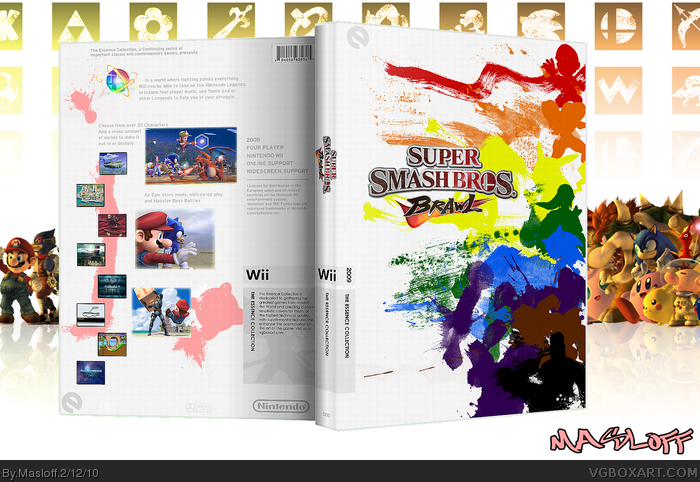
Essence? It doesnt really capture the essence of the game TBH. I dont think of brawl as random colourful paint splatters on a white canvas. And because of that, I'm not a big fan of this. The logo is really unattractive and there is a massive bald spot in the back. Also, I find the placing of the 2 larger screens on the back placed very randomly. I know everyone is liking this and I am probably gonna get destroyed for saying this, but I dont really like it :L
But if you play Brawl as much as I have , you know that it is as random crazy colorful as my cover, Like the Picto Chat Level with colors splashing all over the place.
People who are calling this 'random paint splatters?' How can you call yourself gamers? Look at the right side of the front--the silhouettes of the characters are plain as day. I think the front is fantastic. Most of my SSB matches end up in an orgy of color and particle effects and this front captures it perfectly.
My only quibble is that Kirby is kinda lonely on the back.
i agree that the 2 larger screens on the back placed very randomly but i actualy think that in a way it captures the game. back box does say "Nintendo Worlds collide" as a tag line and he captured that clash image.
expect for the logo and the screenshots i really think it great
Now that you added the official logo it comes together nicely. I have to say this is one of the better essence boxes I've seen. You really have a nice piece of work here.
How is this even close to the Essence of Brawl? I see no resemblance to the frantic, action-packed, random multiplayer of Brawl in this box... I would apologize, but I'm not sorry... I'm tired of seeing Essence boxes that rape silhouettes to death without any purpose, and still fail to show the Essence of the game.
 Super Smash Bros. Brawl Box Cover Comments
Front = WIN
Edited at 1 decade ago
[ Reply ]
Yeah i like the front, but the back is lacking a lot. Good concept though.
[ Reply ]
#1, Why thank you.
Gratz on your work as well
(I plan on printing that SA2 for my Dreamcast game)
[ Reply ]
#3, Thanks I will take into note
I noticed it to , but I didn't know what to add
[ Reply ]
Nice front, I will keep my eye on your next works, I'll fav you as an author :)
[ Reply ]
Brilliant. I don't think the back lacks at all, except it could use another screenshot at the bottom. Other than that, this is really outstanding.
[ Reply ]
I love the front, but you HAVE to change it to the official logo, than I'm sold.
[ Reply ]
Back>Front.
[ Reply ]
Very nice overall
[ Reply ]
Kickass front, but use the official logo. Those fonts you used are too recognizable.
[ Reply ]
i dont like the logo, kinda sucks
but ill fav for originality of the front
[ Reply ]
#8, Thanks, will do
[ Reply ]
#9, I will change it
so prepare to be sold
[ Reply ]
Essence? It doesnt really capture the essence of the game TBH. I dont think of brawl as random colourful paint splatters on a white canvas. And because of that, I'm not a big fan of this. The logo is really unattractive and there is a massive bald spot in the back. Also, I find the placing of the 2 larger screens on the back placed very randomly. I know everyone is liking this and I am probably gonna get destroyed for saying this, but I dont really like it :L
Edited at 1 decade ago
[ Reply ]
#16, I knew it was bound to happen.
But if you play Brawl as much as I have , you know that it is as random crazy colorful as my cover, Like the Picto Chat Level with colors splashing all over the place.
Edited at 1 decade ago
[ Reply ]
I don't like it. Sorry, i think you put a lot of work in this, but the front hasn't to do anything about Super Smash Bros.
much better than my first one, i must say. :o
[ Reply ]
#18, I will be making more, so don't worry, you might like those.
XP
[ Reply ]
#18, silhouettes of the characters?
[ Reply ]
#20, That's is correct
Mario ,Samus ,Pikachu ,Link ,Sonic ,Captain Falcon ,Donkey Kong ,Snake
Edited at 1 decade ago
[ Reply ]
Colors clash a bit, and the logo is not really selling it to me, but other than that, fantastic!
[ Reply ]
interesting...
[ Reply ]
#22, I fixed the logo, for everyone's pleasure
[ Reply ]
People who are calling this 'random paint splatters?' How can you call yourself gamers? Look at the right side of the front--the silhouettes of the characters are plain as day. I think the front is fantastic. Most of my SSB matches end up in an orgy of color and particle effects and this front captures it perfectly.
My only quibble is that Kirby is kinda lonely on the back.
Edited at 1 decade ago
[ Reply ]
#25, I am aware that there a silhouettes. I am saying that the splatters are random in the way that they are irrelevant and sort of pointless.
[ Reply ]
i agree that the 2 larger screens on the back placed very randomly but i actualy think that in a way it captures the game. back box does say "Nintendo Worlds collide" as a tag line and he captured that clash image.
expect for the logo and the screenshots i really think it great
Edited at 1 decade ago
[ Reply ]
Dude now it looks great
[ Reply ]
Amazing...
Fav+Author Fav!
[ Reply ]
Now that you added the official logo it comes together nicely. I have to say this is one of the better essence boxes I've seen. You really have a nice piece of work here.
[ Reply ]
#29, Awe thank you, so kind
#30, I'm glad to have done an Essence box (a good one), I work hard
[ Reply ]
#10, whoa wait are you saying the back is better? XP
lol
I just hope that somebody else besides mii prints it XD
Edited at 1 decade ago
[ Reply ]
how the hell is this not HoF yet??? this is MW material.
[ Reply ]
*smirks*
Lol I was thinking the same thing.... XP
(I just have to be humble)
[ Reply ]
I just uploaded a bigger printable
sadly it's a tad blurry, tell mii if I should re-upload the other printable
Edited at 1 decade ago
[ Reply ]
Hof NAO!
[ Reply ]
#36, I so agree XP
lol (for real)
but I must be humble....
[ Reply ]
I have reduxed this intire box , I'm wondering , if I should update it or not, because it's a slit differnt (nothing big, just the res)
Sorry for the double post (kinda) but Shall I update
(and if I do, I can always repost the old box)
[ Reply ]
Impressive front - +fav.
[ Reply ]
#39, Thank you for the fav.
This got a lot more attention then i thought it would.
[ Reply ]
This needs HoF
BUMP
[ Reply ]
#38, #41, please don't bump a box to get it into the hall. I know I have done it before, but I have managed to stop it, you should too.
[ Reply ]
I uploaded an Update, there aren't lines on the print, yeah.
Nobody said anything, so I just uploaded the update, hope it's not worse
[ Reply ]
Congrats on the second HOF!
[ Reply ]
wow, finally
#42, youre wrong there, i feel if its a good box, and it desserves attention, another person has every right to bump it.
Edited at 1 decade ago
[ Reply ]
Needs Masterworks.
[ Reply ]
#46, I agree 100%
[ Reply ]
Awesome job man, finally.
[ Reply ]
This box is awesome and DEFINITELY deserves a HoF but I don't believe it's MasterWorks worthy.
[ Reply ]
How is this even close to the Essence of Brawl? I see no resemblance to the frantic, action-packed, random multiplayer of Brawl in this box... I would apologize, but I'm not sorry... I'm tired of seeing Essence boxes that rape silhouettes to death without any purpose, and still fail to show the Essence of the game.
[ Reply ]
Congratulations, Chris!
Edited at 1 decade ago
[ Reply ]
#50, I see it as how each character has his or her own wild style.
[ Reply ]
ahh, thank you all. Another Hof. breaths in deep* ah....
thanks guys, as for #50,... #52 said it best. CX
[ Reply ]
I love the front, but the back is so bare! I'd love to see that fixed.
[ Reply ]
The front is just so magnificent
[ Reply ]