i likes it i was going to put the shadow of the cover but then since he wasn't jumping i decided not to so it didn't look like they were just floating but i like this box not my best but not bad its just right
ok...
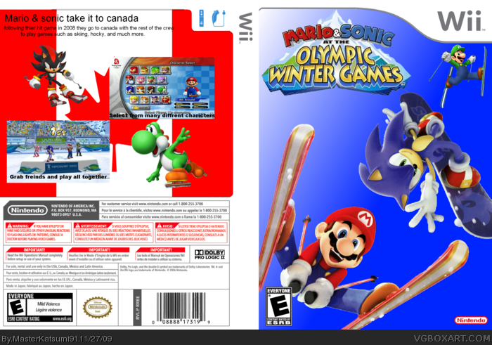
Pro's:
-Renders are rendered properly
-logo's and ESRB are rendered right
Con's:
-No Background on the front
-The characters look like they are just jumping or flying in the BLUE Universe...
-Yoshi and Shadow are just skiing on the Canadian Flag(Canadians wouldn't like that.
-You need some Screenborders
- And make the tagline look good, like make it bigger, add some effects, boombam! You've got yourself a tagline!
That's just my opinion though...
 Mario and Sonic at the Olympic Winter Games Box Cover Comments
i likes it i was going to put the shadow of the cover but then since he wasn't jumping i decided not to so it didn't look like they were just floating but i like this box not my best but not bad its just right
[ Reply ]
the characters selection screenshot is from Mario & Sonic at the Olympic games
[ Reply ]
ok...
Pro's:
-Renders are rendered properly
-logo's and ESRB are rendered right
Con's:
-No Background on the front
-The characters look like they are just jumping or flying in the BLUE Universe...
-Yoshi and Shadow are just skiing on the Canadian Flag(Canadians wouldn't like that.
-You need some Screenborders
- And make the tagline look good, like make it bigger, add some effects, boombam! You've got yourself a tagline!
That's just my opinion though...
[ Reply ]