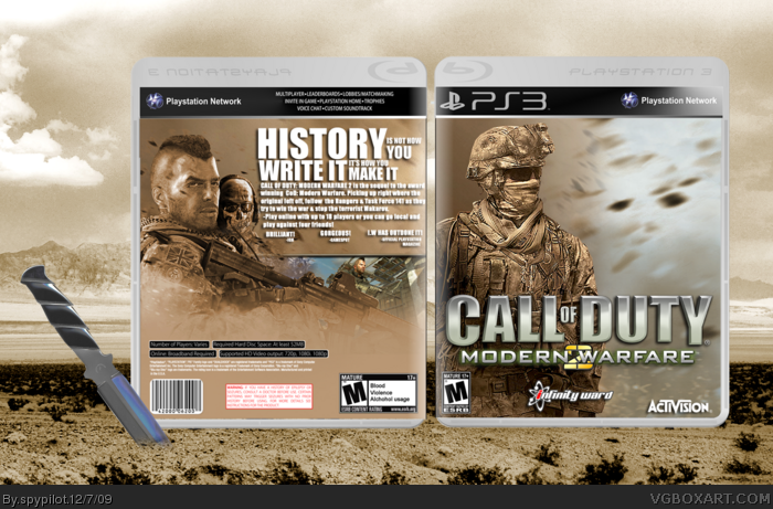
may latest and my COMEBACK BOX
y'know how i said i'd brush up on my Boxart skills then come back? well i did. and i think this is my best to date. also, sorry about the glare, but i couldnt remove it. anyways, enjoy & critique!
favs are welcome!
credit:
legoslayer: soap render & screen border
Afifan000: template
Give the tagline some detail to match the logo or something and try and replace the green lighting on the back with something else, it seems out of place. Looks great man =]
Front image has been killed, cremated and then buried it's been used so many times. Back is pretty goot but I think it's too bland. The green doesn't work with the rest on the back but it needs something to break up all the tan.
Love the presentation background but the guy on the front and the guy on the back with the mo-hawk have been used a lot. And there is no visible screenshots and I just hate that green squiggle it looks out of place.
I like the guy behind the guy with the mo-hawk, though .
3/5
#7, I featured soap on the back because he is a primary character in the story, along with ghost. The screens will be changed, and I used that one soldier on the front because no other render would have suited my design scheme.
Pretty nice box for your comeback. I would have added some green on the front so that the green is not so out of place-looking on the back. I would also move logo up a bit.
As far as the glare goes, it is a bit too much. If you can't fix it, find a template without a glare (hint).
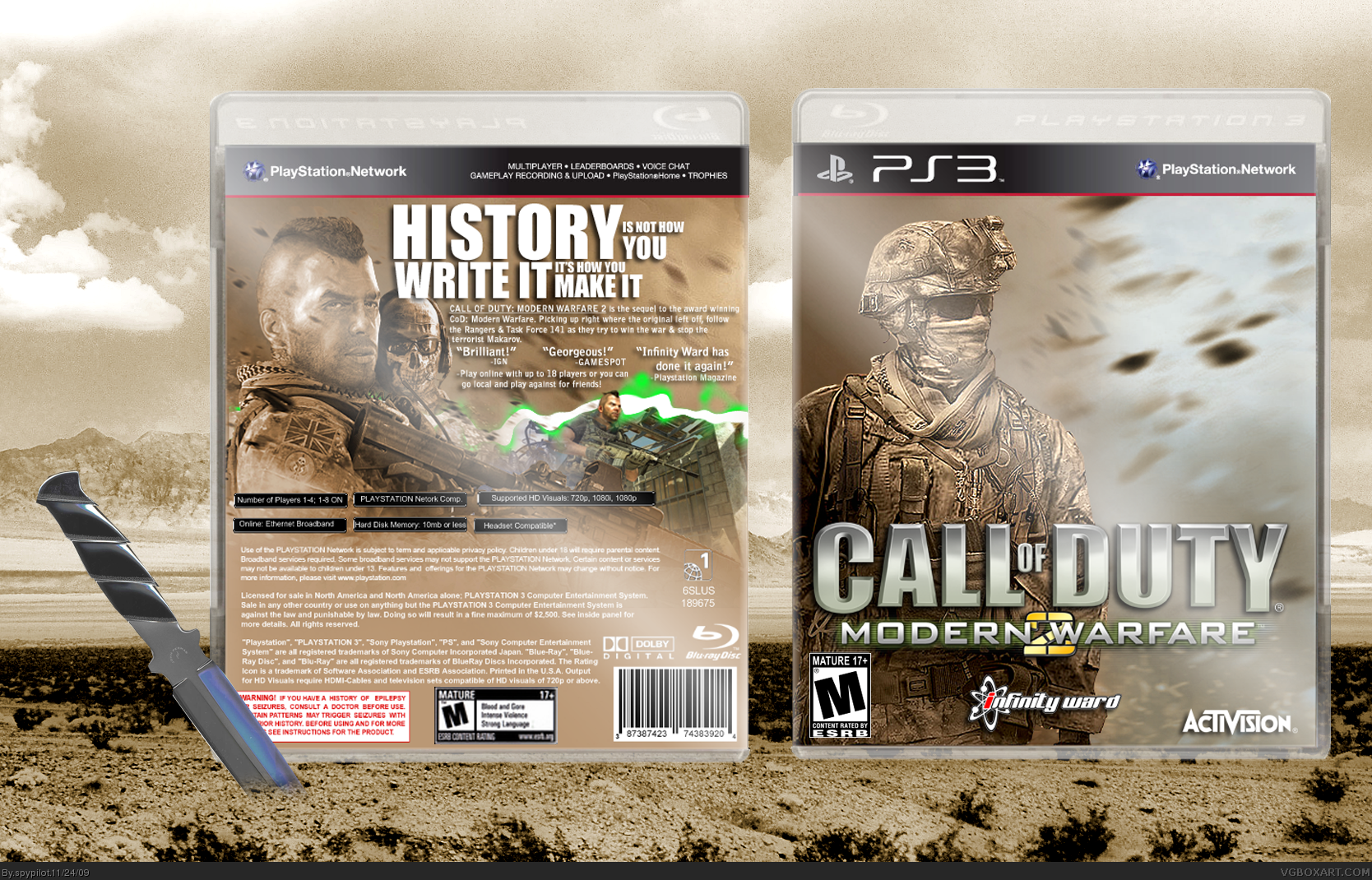
UPDATED!
-template change
-text layout changed
-screen border changed,
im not gonna update it again, because that temp tranfer was VERY hard to do (well for me :P)
credit goes to SO for the new border and temp.
 Modern Warfare 2 Box Cover Comments
may latest and my COMEBACK BOX
y'know how i said i'd brush up on my Boxart skills then come back? well i did. and i think this is my best to date. also, sorry about the glare, but i couldnt remove it. anyways, enjoy & critique!
favs are welcome!
credit:
legoslayer: soap render & screen border
Afifan000: template
[ Reply ]
Front logo needs to be centered, its just a tad off. Not a fan of the tagline font and the back text looks a little crushed together.
Fix those, and I'd be happy to fav.
[ Reply ]
Give the tagline some detail to match the logo or something and try and replace the green lighting on the back with something else, it seems out of place. Looks great man =]
[ Reply ]
#3 + #2
[ Reply ]
Front image has been killed, cremated and then buried it's been used so many times. Back is pretty goot but I think it's too bland. The green doesn't work with the rest on the back but it needs something to break up all the tan.
[ Reply ]
not bad in my opinion if anything back could be better but not anything specific
[ Reply ]
Love the presentation background but the guy on the front and the guy on the back with the mo-hawk have been used a lot. And there is no visible screenshots and I just hate that green squiggle it looks out of place.
I like the guy behind the guy with the mo-hawk, though .
3/5
[ Reply ]
#7, I featured soap on the back because he is a primary character in the story, along with ghost. The screens will be changed, and I used that one soldier on the front because no other render would have suited my design scheme.
[ Reply ]
Pretty nice box for your comeback. I would have added some green on the front so that the green is not so out of place-looking on the back. I would also move logo up a bit.
As far as the glare goes, it is a bit too much. If you can't fix it, find a template without a glare (hint).
[ Reply ]
Wow, I really like it. The only thing I don't really care for is the screenshot, you could probaly find a better one ;)
Fav.
[ Reply ]
The best one I have seen for this game on the PS3! Hall of Fame, Now!
[ Reply ]
UPDATED!
-template change
-text layout changed
-screen border changed,
im not gonna update it again, because that temp tranfer was VERY hard to do (well for me :P)
credit goes to SO for the new border and temp.
Edited at 1 decade ago
[ Reply ]
Nice update =)
[ Reply ]
I tried making a CoD box wants. Was too hard. You, on the other hand, finished it and it look amazing. +fav
[ Reply ]
I like it! could you give me that image of ghost?
[ Reply ]
ecelente jogo,recomendo
[ Reply ]