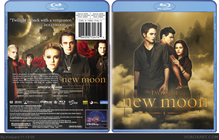
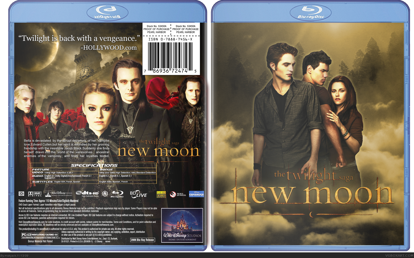
twilight [ Buy New Moon at Amazon ] By makjack 38 on November 13th, 2009 No Printable Available [ Box updated on November 13th, 2009 ] [ original ] New Moon Box Cover Comments Comment on makjack's New Moon Box Art / Cover. Cancel Reply Spiner_ 43 [ 1 decade ago ] Looks pretty cool, but I think you should high the contrast a bit. [ Reply ] makjack 38 [ 1 decade ago ] woah quick reply thanks to scorpion soldier for the back info on the template and of course google for its amazing image search guys please comment and fav Edited at 1 decade ago [ Reply ] makjack 38 [ 1 decade ago ] #1, thats not the cover its the template which has added a lot too much shine making it look somewhat odd anyways highered the contrast Edited at 1 decade ago [ Reply ] Reza 41 [ 1 decade ago ] You beat my comment to your WIP link!! Looks good, its like you read my mind. I think you could bring that logo out a bit more though with a textured glow, but looks good with the Contrast adjustment. It certainly seems quite well done though, nice one. EDIT: Agreed with Spiner, nice touch. Edited at 1 decade ago [ Reply ] Spiner_ 43 [ 1 decade ago ] Looks better now. :) Edited at 1 decade ago [ Reply ] makjack 38 [ 1 decade ago ] isn't it worth a fav guys??? [ Reply ] jevangod 50 [ 1 decade ago ] Not bad. I like how you atleast edited the front and adding clouds was a nice touch. [ Reply ] Vengeance 40 [ 1 decade ago ] You know, I really admire your bravery. The box is quite nice. [ Reply ] makjack 38 [ 1 decade ago ] #7, actually i did not add clouds , instead i added evrything else to the clouds- the renders, trees [ Reply ] makjack 38 [ 1 decade ago ] #8, how did bravery come into play here [ Reply ] dpmm07 15 [ 1 decade ago ] #10, Because Twilight is gay, and you made a box of it. [ Reply ] Scorpion Soldier 45 [ 1 decade ago ] I can't describe how much i hate Twilight, but the box is good. [ Reply ]
 New Moon Box Cover Comments
Looks pretty cool, but I think you should high the contrast a bit.
[ Reply ]
woah quick reply
thanks to scorpion soldier for the back info on the template
and of course google for its amazing image search
guys please comment and fav
Edited at 1 decade ago
[ Reply ]
#1, thats not the cover its the template which has added a lot too much shine making it look somewhat odd
anyways highered the contrast
Edited at 1 decade ago
[ Reply ]
You beat my comment to your WIP link!!
Looks good, its like you read my mind. I think you could bring that logo out a bit more though with a textured glow, but looks good with the Contrast adjustment. It certainly seems quite well done though, nice one.
EDIT: Agreed with Spiner, nice touch.
Edited at 1 decade ago
[ Reply ]
Looks better now. :)
Edited at 1 decade ago
[ Reply ]
isn't it worth a fav guys???
[ Reply ]
Not bad. I like how you atleast edited the front and adding clouds was a nice touch.
[ Reply ]
You know, I really admire your bravery. The box is quite nice.
[ Reply ]
#7, actually i did not add clouds , instead i added evrything else to the clouds- the renders, trees
[ Reply ]
#8, how did bravery come into play here
[ Reply ]
#10, Because Twilight is gay, and you made a box of it.
[ Reply ]
I can't describe how much i hate Twilight, but the box is good.
[ Reply ]