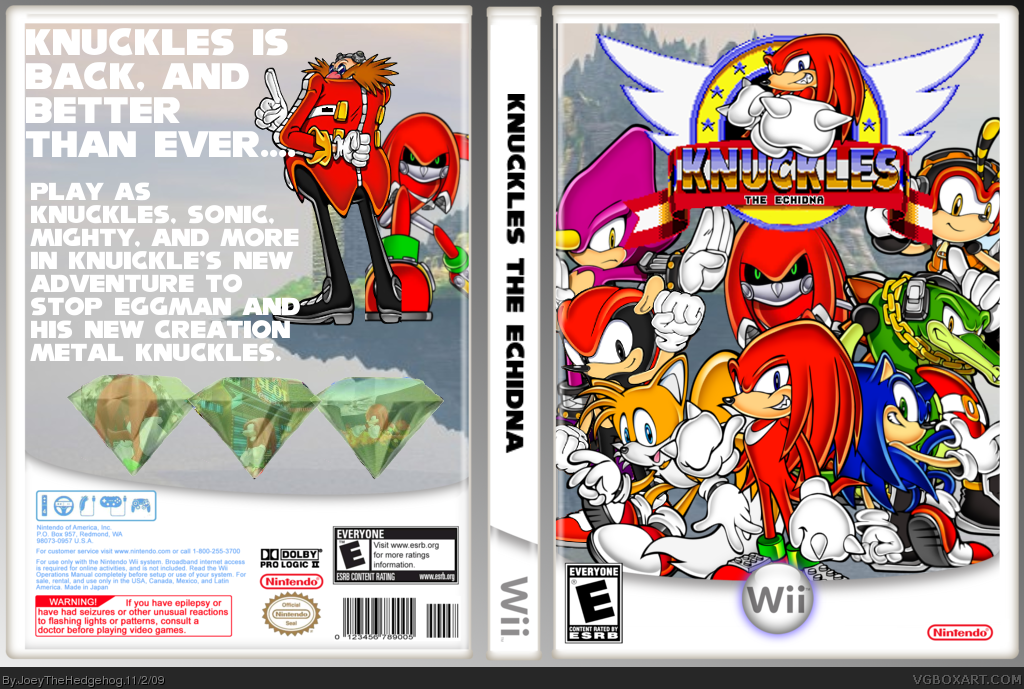
I like the front, but the logo is alittle jagged. Also since the Template is white, you should make the font a different color, also maybe a different font, something that stands out more. Overall 7/10
#2, Agreed, also the screen shots dont show very well through the emeralds on the back so i suggest either toning down the emeralds or making the opacity higher on the screen shots. And the text on the back is hard to read with the light greay background, perhaps change that to a darker grey or a different color text? But good design overall, 7/10.
 Knuckles The Echidna Box Cover Comments
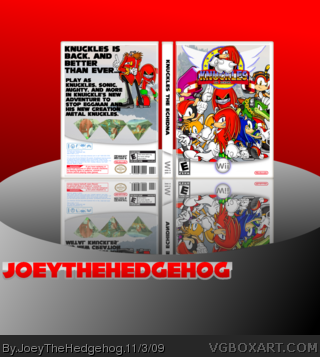
Thought this would be a good idea. Hope you like it.
~credit~
Template-koopadasher
borders-me
mighty art-http://professor-j.deviantart.com/art/Sonic-Channel-Project-Mighty-74482071
Metal Knuckles art-http://media.photobucket.com/image/metal%20knuckles/CS1futuresasuke/___Metal_Knuckles____by_aducknamedh.jpg
[ Reply ]
I like the front, but the logo is alittle jagged. Also since the Template is white, you should make the font a different color, also maybe a different font, something that stands out more. Overall 7/10
[ Reply ]
#2, Agreed, also the screen shots dont show very well through the emeralds on the back so i suggest either toning down the emeralds or making the opacity higher on the screen shots. And the text on the back is hard to read with the light greay background, perhaps change that to a darker grey or a different color text? But good design overall, 7/10.
[ Reply ]
i'll fix that
[ Reply ]
***V2 Update***
~Fixed~
Logo
Font Color
Borders
Background
[ Reply ]
Much better :) fav
[ Reply ]
Don't fix that box.it's awesome all ready.it doesn't matter what others think an artist makes art his own way.
[ Reply ]
This is pretty good.
[ Reply ]