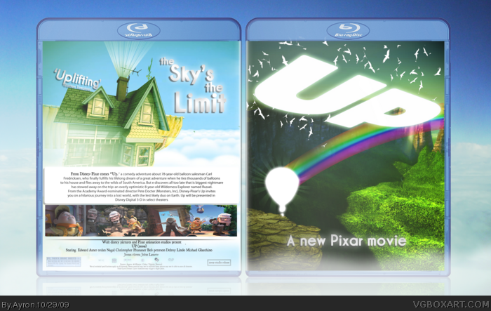
I like it, especially the back, but im not too sure about the front, it seems a bit bare and it doenst really show much to do with the film. But i like the artwork and the design of the back cover, so ill fav.
IMO, it's a little bland... and I don't care too much for the "A new pixar movie" part, I think you should delete that and change the font on the back.
#5-6,
I respect your opinions,even though they are not my own.
Perhaps my ideas about the front might enlighten you.
The film is about the house in the sky,traveling around the globe right?
Well,i picked this picture in particular because it displayed the ''open world'' theme very well.I tried to accentuate that with the birds and the entire presentation.
The simplicity, well, that was just a design choice I made for myself.
If your opinions differ from mine,that's not a big problem.
I would still like to thank you for taking the time for looking and commenting on my design.
So,hereby : Thank you.
Oh man I love the back of this, truly shows the movie. Personally not too keen on the front though. I think its just my personal opinion of silhouettes that gets me. Your idea was shown and I completely understand the front; just never was one for silhouettes. Still personal opinion on silhouettes aside I really do like it.
#7, Well, that's a very polite and mature response, and I believe you deserve one in response:
I see what you are trying to achieve, and yes, it does look quite nice already, but I think it could do with a bit of... oomph...
Here are my ideas for some minor improvement:
1) I like the way you've done with the sunburst effect around the balloon, however I think the "white-out" on the logo and balloon should be removed, it's leaving too much to the imagination.
2) I don't entirely like the way you've presented the screenshots either, maybe have fewer and put them in clouds, it looks a bit weird having them that far down.
3) Maybe have less birds? Not too much less, about 50% I'd say. :)
4) As I said, I'm not too keen on your choice of larger font. It may fit the movie but it doesn't fit the stylee of your box.
If you can do those 4 small things, I can see this zooming into the MasterWorks. :)
#14, I dis-agree with a lot of that. I love the font choices and the birds and don't think they should be changed. The way the screens had been presented blend really well into the background, and don't take away from the design as a whole. Though I do agree with the sunburst, but thats just a minor fault. The large font is part of what makes this really stunning though, and I really hope you don't decide to change it =)
#14, thanks for your response.
not alot of members check back after criticism,and decide to give even more. Even though chances are I won't change it,I really appreciate your effort of criticising.
#15,that was actually what my ideas were exactly. Thank you.
 ]
]
 Up Box Cover Comments
WOW. man that's amazing!
Edited at 1 decade ago
[ Reply ]
Ayron.. what happened to the beatles?
-nobody cares-
Anyways, Up. A great movie[or so I've heard ], and I'm dying to see it. I personally love the art-style, and gave it my own twist.
Credit to Master_general for the template.
Enjoy.
[ Reply ]
Pretty amazing dude.
The film's great too, go see it.
[ Reply ]
Incredible job on this, it fits the art style of the movie perfectly.
[ Reply ]
I like it, especially the back, but im not too sure about the front, it seems a bit bare and it doenst really show much to do with the film. But i like the artwork and the design of the back cover, so ill fav.
[ Reply ]
IMO, it's a little bland... and I don't care too much for the "A new pixar movie" part, I think you should delete that and change the font on the back.
[ Reply ]
#5-6,
I respect your opinions,even though they are not my own.
Perhaps my ideas about the front might enlighten you.
The film is about the house in the sky,traveling around the globe right?
Well,i picked this picture in particular because it displayed the ''open world'' theme very well.I tried to accentuate that with the birds and the entire presentation.
The simplicity, well, that was just a design choice I made for myself.
If your opinions differ from mine,that's not a big problem.
I would still like to thank you for taking the time for looking and commenting on my design.
So,hereby : Thank you.
[ Reply ]
Oh man I love the back of this, truly shows the movie. Personally not too keen on the front though. I think its just my personal opinion of silhouettes that gets me. Your idea was shown and I completely understand the front; just never was one for silhouettes. Still personal opinion on silhouettes aside I really do like it.
[ Reply ]
Seriously man, this is beautiful.
[ Reply ]
Wonderful. When this eventually comes out on blu ray i want this as a printable.
Edited at 1 decade ago
[ Reply ]
#10, it's pretty high resolution. I'm sure you could fix that up. =] thanks for the comments so far.=]
[ Reply ]
That back is amazing.
Great work.
[ Reply ]
Thank you S_O,and thanks for the favs everybody.
[ Reply ]
#7, Well, that's a very polite and mature response, and I believe you deserve one in response:
I see what you are trying to achieve, and yes, it does look quite nice already, but I think it could do with a bit of... oomph...
Here are my ideas for some minor improvement:
1) I like the way you've done with the sunburst effect around the balloon, however I think the "white-out" on the logo and balloon should be removed, it's leaving too much to the imagination.
2) I don't entirely like the way you've presented the screenshots either, maybe have fewer and put them in clouds, it looks a bit weird having them that far down.
3) Maybe have less birds? Not too much less, about 50% I'd say. :)
4) As I said, I'm not too keen on your choice of larger font. It may fit the movie but it doesn't fit the stylee of your box.
If you can do those 4 small things, I can see this zooming into the MasterWorks. :)
Well done.
[ Reply ]
#14, I dis-agree with a lot of that. I love the font choices and the birds and don't think they should be changed. The way the screens had been presented blend really well into the background, and don't take away from the design as a whole. Though I do agree with the sunburst, but thats just a minor fault. The large font is part of what makes this really stunning though, and I really hope you don't decide to change it =)
[ Reply ]
really nice. i give it a 4/5 almost a fav
[ Reply ]
#14, thanks for your response.
not alot of members check back after criticism,and decide to give even more. Even though chances are I won't change it,I really appreciate your effort of criticising.
#15,that was actually what my ideas were exactly. Thank you.
[ Reply ]