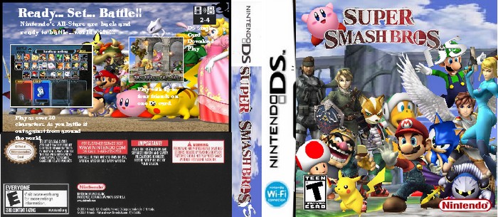
This is a big improvement. The only problem is that the box is a bit blurry and small. Also I'd get rid of the back, it doesn't look very good with the unprofessional font.
YouÂ’re getting better, not perfect far from it, blurry blocky choopy cut out logos and the back fonts do not stand out right but you have put a dozen of effort into and it looks decent enougth.
 Super Smash Bros. DS Box Cover Comments
well... u wanted better work from me so there u go 6 hours of work and it done i think its beautiful give me any suggestions for it
[ Reply ]
This is a big improvement. The only problem is that the box is a bit blurry and small. Also I'd get rid of the back, it doesn't look very good with the unprofessional font.
[ Reply ]
#2, what if i change the font to professinal font
[ Reply ]
YouÂ’re getting better, not perfect far from it, blurry blocky choopy cut out logos and the back fonts do not stand out right but you have put a dozen of effort into and it looks decent enougth.
[ Reply ]
i update it hope u like
[ Reply ]
resized it for update 3
[ Reply ]
What have you actually added except some more unprofessional looking text?
[ Reply ]
Why does it say T on the front but E on the back?
[ Reply ]
i like it alot but it couldve been more polished
[ Reply ]
cool!
5/5
[ Reply ]
Pay more attention to stuff like the ESRB logo's. Don't rush.
[ Reply ]
not so good...3/5 try not to just clobber pictures together
[ Reply ]