simplicity [ Buy Okami at Amazon ] By Death 41 on October 11th, 2009 No Printable Available Okami Box Cover Comments Comment on Death's Okami Box Art / Cover. Cancel Reply Death 41 [ 1 decade ago ] I wanted it to not only look simplistic, but like a painting. I think this turned out amazing. Credit to indexnos for the temp. Oh, and please no needs esrbs etc, i dont really care so dont waste your breath [ Reply ] afifan000 44 [ 1 decade ago ] HOLY JESUS MONKEYS. That's just extraordinary! p.s, nice Naruto font, lol [ Reply ] Death 41 [ 1 decade ago ] @#2, yea i couldnt find a better font that looked right XD [ Reply ] deiviuxs 46 [ 1 decade ago ] Not liking back for some reason, but front looks really nice, colorful, and just like a painting. Good job! =) [ Reply ] slimd1995 27 [ 1 decade ago ] Is it just me, or does the layout look exactly like the L4D box you made? [ Reply ] Death 41 [ 1 decade ago ] All my layouts are simple. I think that the layout should be minimal, and not take away from the box [ Reply ] spypilot 43 [ 1 decade ago ] this needs an essence label. my jaw dropped at the sheer awesomeness [ Reply ] Moogle 37 [ 1 decade ago ] DIVINE. <3. +Fav [ Reply ] mabik 1 [ 1 decade ago ] I see Master Chief on back:))) [ Reply ] Sven 32 [ 1 decade ago ] #7, nah, that would ruin the whole 'feel' of it. Good job Death. P.S. look here for better fonts: link [ Reply ] Silent Oblivion 45 [ 1 decade ago ] Oh my god. [ Reply ] Death 41 [ 1 decade ago ] Many thanks everyone. I really loved how this one turned out. BTW thanks sven :) [ Reply ] Grand 41 [ 1 decade ago ] I don't like the obvious photoshop filter you put on this. The art style was artistic enough. [ Reply ]
 Okami Box Cover Comments
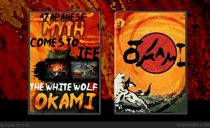
I wanted it to not only look simplistic, but like a painting. I think this turned out amazing. Credit to indexnos for the temp. Oh, and please no needs esrbs etc, i dont really care so dont waste your breath
[ Reply ]
HOLY JESUS MONKEYS. That's just extraordinary!
p.s, nice Naruto font, lol
[ Reply ]
@#2, yea i couldnt find a better font that looked right XD
[ Reply ]
Not liking back for some reason, but front looks really nice, colorful, and just like a painting.
Good job! =)
[ Reply ]
Is it just me, or does the layout look exactly like the L4D box you made?
[ Reply ]
All my layouts are simple. I think that the layout should be minimal, and not take away from the box
[ Reply ]
this needs an essence label.
my jaw dropped at the sheer awesomeness
[ Reply ]
DIVINE. <3. +Fav
[ Reply ]
I see Master Chief on back:)))
[ Reply ]
#7, nah, that would ruin the whole 'feel' of it. Good job Death.
P.S. look here for better fonts: link
[ Reply ]
Oh my god.
[ Reply ]
Many thanks everyone. I really loved how this one turned out.
BTW thanks sven :)
[ Reply ]
I don't like the obvious photoshop filter you put on this. The art style was artistic enough.
[ Reply ]