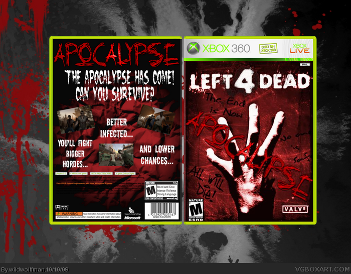
For a third, this is ok, but it does need alot of work. I actully like the front, its simple and looks nice. The spine has nothing on it, so you might want to change that. Now to the back. Blood splat is either A. badly rendered or B. has a white line around it. What ever it is get rid of it, it looks bad. Im ok with the concept of blood on the walls, but please dont use a streatched pitcure that looks bad for it. The red text at the bottom is totaly unreadable and to finish it off the box is very very low res. 2/5. Good effort, but needs vast improvments
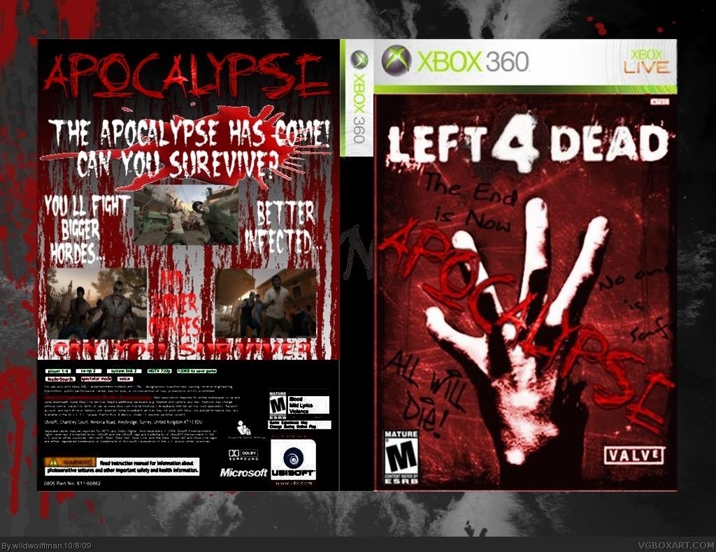
I actualy had a spine to it...I must have used the image without the spine when I changed the writing font, anyways I worked hard on it, and I feel I've done what I wanted(for now), but I will edit this over time. A I know the blood splat is badly rendered I didn't notice until after it was on the box and I saved it to my documents...I'll get around to fixing it. My computer is very low resolution, as is my eye site, someday I'll get a better computer(I hope).
Front is actually pretty good, but the back needs a lot of work. Back is too random and needs more detail, better arrangement, screenshot borders, game description, better background.
And in general, box is low-quality, looks a bit blurry.
To be honest I didn't like v1 but v2 is pretty great 5/5 for effort and 4.9/5 for actual boxart (the 0.1 of is becouse the back could have more info)but i like it fav
#1, dont say you give up, that could end up people thinking you dont put effort in and you dont care what your boxes look like, i know how you feel with your boxes being ignored or not getting favs it sucks but you have to deal with it and keep trying if you really want to get somewhere.
Now for the box, its very good the front is very eye catching 4.5/5 for that, however the back is a bit bare for info or a story but 3/5 for that and for effort ill give it 5/5 and a vast improvement from version 1. so overall 4.5/5 + fav
Saying 'I give up' was a bit much, I didn't give up on box making, I gave up on working on the box itself the night I uploaded it here, it was late, and I was tired...
 Left 4 Dead: Apocalypse Box Cover Comments
You know what, I give up...I finished the box and I liked it so I uploaded it, say whatever you wish...
Edited at 1 decade ago
[ Reply ]
For a third, this is ok, but it does need alot of work. I actully like the front, its simple and looks nice. The spine has nothing on it, so you might want to change that. Now to the back. Blood splat is either A. badly rendered or B. has a white line around it. What ever it is get rid of it, it looks bad. Im ok with the concept of blood on the walls, but please dont use a streatched pitcure that looks bad for it. The red text at the bottom is totaly unreadable and to finish it off the box is very very low res. 2/5. Good effort, but needs vast improvments
[ Reply ]
I actualy had a spine to it...I must have used the image without the spine when I changed the writing font, anyways I worked hard on it, and I feel I've done what I wanted(for now), but I will edit this over time. A I know the blood splat is badly rendered I didn't notice until after it was on the box and I saved it to my documents...I'll get around to fixing it. My computer is very low resolution, as is my eye site, someday I'll get a better computer(I hope).
[ Reply ]
There...Updated, unfortunatly it still doesn't have a spine, and I may never get around to it...oh well...
[ Reply ]
Front is actually pretty good, but the back needs a lot of work. Back is too random and needs more detail, better arrangement, screenshot borders, game description, better background.
And in general, box is low-quality, looks a bit blurry.
[ Reply ]
To be honest I didn't like v1 but v2 is pretty great 5/5 for effort and 4.9/5 for actual boxart (the 0.1 of is becouse the back could have more info)but i like it fav
[ Reply ]
#1, dont say you give up, that could end up people thinking you dont put effort in and you dont care what your boxes look like, i know how you feel with your boxes being ignored or not getting favs it sucks but you have to deal with it and keep trying if you really want to get somewhere.
Now for the box, its very good the front is very eye catching 4.5/5 for that, however the back is a bit bare for info or a story but 3/5 for that and for effort ill give it 5/5 and a vast improvement from version 1. so overall 4.5/5 + fav
Edited at 1 decade ago
[ Reply ]
Saying 'I give up' was a bit much, I didn't give up on box making, I gave up on working on the box itself the night I uploaded it here, it was late, and I was tired...
[ Reply ]
#3, could you pleasr give me a link to that font that says "APOCALYPSE"
[ Reply ]
that is bad a$$
[ Reply ]