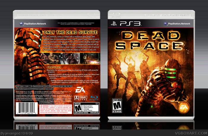
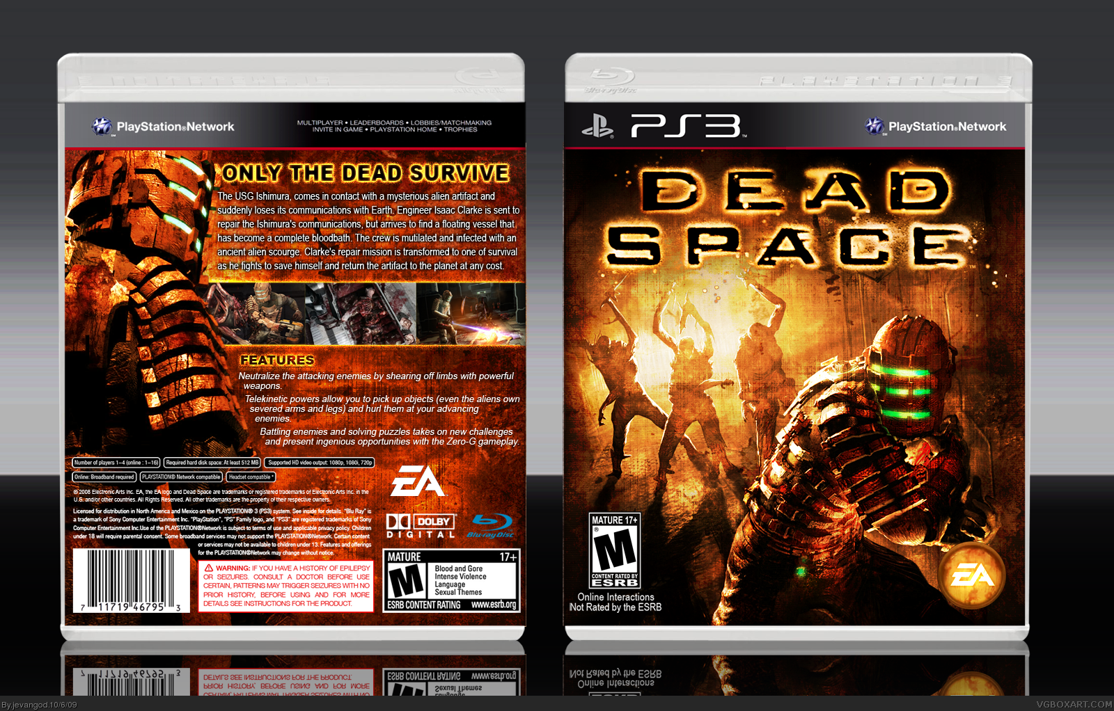
I dont usually post boxes this late but I just wanted to go ahead and this get this out there. Well the front I did a bit of a grungy thing and changed it up a bit. If you look at the original picture its alot different. Damn the logo was a pain in the ass the render.
Front is amazing!
Back is pretty good, I would suggest blending screens together.
Also, change M esrb rating on the front, since this game has no online play.
The biggest issue for this box is the template. I really don't like the way it looks (mostly 'cause of plastic).
I know you strive for perfection when you create your boxes. The plastic is not like that anymore, it just has the blu-ray logo on it, but to the right. I would suggest getting new non-ugly plastic though.
The entire box looks pretty fantastic. The front kind of makes me laugh because it looks like they're trick or treating and he stole their candy and ran.
#10, YEa your right it actually does. Cause there are all kinds of grunge. There are kinds you can use on little kiddie boxes all the way to the scary ones.
#12, Agreed, I love how the creatures are blended. It would look more awesome if the back and front where in the same shade of orange though but that's just being picky, fav'ed!
 Dead Space Box Cover Comments
I dont usually post boxes this late but I just wanted to go ahead and this get this out there. Well the front I did a bit of a grungy thing and changed it up a bit. If you look at the original picture its alot different. Damn the logo was a pain in the ass the render.
[ Reply ]
Keep up the good work
Edited at 1 decade ago
[ Reply ]
Front is amazing!
Back is pretty good, I would suggest blending screens together.
Also, change M esrb rating on the front, since this game has no online play.
The biggest issue for this box is the template. I really don't like the way it looks (mostly 'cause of plastic).
[ Reply ]
#3, Ohh my bad about the online thing. I read the booklet and it said something about online game.
[ Reply ]
I think we're starting to see that the new "PS3" template compliments the actual covers very well. Great box sir!
[ Reply ]
I know you strive for perfection when you create your boxes. The plastic is not like that anymore, it just has the blu-ray logo on it, but to the right. I would suggest getting new non-ugly plastic though.
The entire box looks pretty fantastic. The front kind of makes me laugh because it looks like they're trick or treating and he stole their candy and ran.
[ Reply ]
You like grunge look, don't ya?
[ Reply ]
#6, Yea I just saw this temp and loved it and wanted something different from everyone elses.
#7, Well it brings out the horror in horror game boxes.
[ Reply ]
Great job with the grunge effect, it worked perfectly on this box.
[ Reply ]
#8, I love grunge too. It works with almost any kind of title.
[ Reply ]
#10, YEa your right it actually does. Cause there are all kinds of grunge. There are kinds you can use on little kiddie boxes all the way to the scary ones.
[ Reply ]
Really great design work. Great composition, layout, and the orange color really draws you in.
[ Reply ]
Oh my god <3! This looks fantastic! 9.3/10 + fav =)
[ Reply ]
#12, Thats what I was going for.
#13, Thanks.
[ Reply ]
#12, Agreed, I love how the creatures are blended. It would look more awesome if the back and front where in the same shade of orange though but that's just being picky, fav'ed!
[ Reply ]
#15, I dont blame you. I tried as hard as I could to get them the same color, but the color tones werent co-operating with me.
[ Reply ]
#16, I know the feeling so I don't blame you either. It's just a minor annoyance :P
[ Reply ]
#17, Yea. Thanks. Most people dont realize that the colors dont co-operate and usually complain about it and they dont know the real reason.
[ Reply ]
Looks nice, Good job :)
[ Reply ]
Looks nice, Good job :)
Edited at 1 decade ago
[ Reply ]
there needs to be a printable version of this. great work!!
[ Reply ]