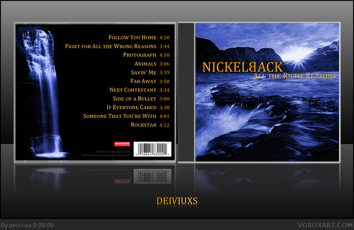
My first ever music cover box! =)
I recently started listening to "NickelBack" and I really like their music so I though I try and make a cover for one of their albums.
This has taken me several hours (believe it or not). Front is composed of two different images. Don't ask why I chose waterfalls, because I don't have an answer. =P
I suggest viewing in full view. Also, comments are very appreciated on this one since it's my first music cover. If you like it (as much as I do) I might make some more in the future.
Credit goes to Rokudaime for the template.
Haha, I remember when I used to like this album. I still like a couple of songs to an extent, though...
as for the box, it's nice, but I don't get it. Is there some meaning behind the picture, or is it just a pretty landscape? It looks good, but I don't really understand the concept.
#2, does it really needs to have a meaning? Most of the CD covers have no meaning behind. They have the most unique and weird designs in the industry. I like to play around images and music covers seem most appropriate as to showing the end result.
Yeah, I have to agree with Mr. Pointy Finger there, if you do a CD cover, you need to have a reason behind your design. The landscapes are nice, but I don't see how they fit the album.
#5, and there are albums that have no meaning on the art..
I think people should focus more on the art and not on the "meaning" behind the art, because the concept of meaning or understanding is very abstract. For someone it can mean one thing, and for someone else it can be completely opposite. Again, I would appreciate if you look at the art itself and not on the meaning behind it, because for everyone it's their own meaning.
#6, Yes, but that's the thing. What is YOUR meaning? As for album meanings, Pretty much every album I've ever seen has at least some meaning to its cover. As for this one, the original album cover really has a journey vibe to it, that I felt went along with the album. So I would ask you to explain why you chose this art, but from your comments I'm guessing you don't have one. Ah well.
#8, Why do you think that the journey vibe went along with the album?
And for you (and others) that seem to care more about meaning and reasons behind things (maybe this should be a philosophical website after all) I give you my reason behind the art of this album.
I chose a nature scene, particularly waterfalls, because water never stops "moving" just like various reasons in our life (we always have our own reasons [right or wrong] for things).
Again, you might not understand my reasoning, which is completely fine, but again, rate the art and composition and not personal opinion.
I respect everyone's opinion, but I think this is not a place to discuss whether you like particular band (in this case Nickelback) or not. You should be judging the art and not the music/band.
So please, be mature, put your biases aside and judge the art.
I thank those who did actually judged the art and Favorited the box.
#14, believe me it's not a stock photo. I have heavily edited the pictures and nothing on this box is in its "original" form. However, I cannot discuss the "generic" issue. Everyone has their own opinion as what looks generic to them and what does not.
Load, the album that came before it, used a piece of art called 'Semen & Blood III' which was a mixture of the artist's semen & cow blood between plexiglass.
ReLoad, the 'sequel' to Load, used a piece of art by the same artist entitled 'Piss & Blood.' It's not just art.
I do know that. It doesn't have anything to do with the songs or the theme of the album, though. The songs aren't about "The juxtaposition of pleasure and pain" or something like that. Metallica just thought they were cool designs.
 Nickelback - All the Right Reasons Cover Comments
My first ever music cover box! =)
I recently started listening to "NickelBack" and I really like their music so I though I try and make a cover for one of their albums.
This has taken me several hours (believe it or not). Front is composed of two different images. Don't ask why I chose waterfalls, because I don't have an answer. =P
I suggest viewing in full view. Also, comments are very appreciated on this one since it's my first music cover. If you like it (as much as I do) I might make some more in the future.
Credit goes to Rokudaime for the template.
[ Reply ]
Haha, I remember when I used to like this album. I still like a couple of songs to an extent, though...
as for the box, it's nice, but I don't get it. Is there some meaning behind the picture, or is it just a pretty landscape? It looks good, but I don't really understand the concept.
[ Reply ]
#2, does it really needs to have a meaning? Most of the CD covers have no meaning behind. They have the most unique and weird designs in the industry. I like to play around images and music covers seem most appropriate as to showing the end result.
[ Reply ]
Yeah, I have to agree with Mr. Pointy Finger there, if you do a CD cover, you need to have a reason behind your design. The landscapes are nice, but I don't see how they fit the album.
[ Reply ]
#3, Actually yeah, they're albums that have a meaning on the art. Eminem's relapse, has his face formed from pills.
[ Reply ]
#5, and there are albums that have no meaning on the art..
I think people should focus more on the art and not on the "meaning" behind the art, because the concept of meaning or understanding is very abstract. For someone it can mean one thing, and for someone else it can be completely opposite. Again, I would appreciate if you look at the art itself and not on the meaning behind it, because for everyone it's their own meaning.
[ Reply ]
Looks great, I like the colors.
[ Reply ]
#6, Yes, but that's the thing. What is YOUR meaning? As for album meanings, Pretty much every album I've ever seen has at least some meaning to its cover. As for this one, the original album cover really has a journey vibe to it, that I felt went along with the album. So I would ask you to explain why you chose this art, but from your comments I'm guessing you don't have one. Ah well.
[ Reply ]
#8, Why do you think that the journey vibe went along with the album?
And for you (and others) that seem to care more about meaning and reasons behind things (maybe this should be a philosophical website after all) I give you my reason behind the art of this album.
I chose a nature scene, particularly waterfalls, because water never stops "moving" just like various reasons in our life (we always have our own reasons [right or wrong] for things).
Again, you might not understand my reasoning, which is completely fine, but again, rate the art and composition and not personal opinion.
Edited at 1 decade ago
[ Reply ]
Nickelback sucks balls. One of the worst bands to ever exist.
[ Reply ]
#6, well said. I'm sure you have a reason for picking this background. None the less, this box is well done.
#10, He didn't make this box so you could leave opinions on the band, He made it so you could leave opinions on the BOX.
[ Reply ]
I think it's original and nice. :)
[ Reply ]
#10, this
but the box is so nice that i have to fav
[ Reply ]
#11, OK -- well I think the box is too generic. It looks like some stock photos you'd find with CD printing software.
[ Reply ]
I respect everyone's opinion, but I think this is not a place to discuss whether you like particular band (in this case Nickelback) or not. You should be judging the art and not the music/band.
So please, be mature, put your biases aside and judge the art.
I thank those who did actually judged the art and Favorited the box.
#14, believe me it's not a stock photo. I have heavily edited the pictures and nothing on this box is in its "original" form. However, I cannot discuss the "generic" issue. Everyone has their own opinion as what looks generic to them and what does not.
Edited at 1 decade ago
[ Reply ]
Great, the back could seem plain, but in fact it's not, i really like the scheme and the colors, great job ! =D
[ Reply ]
It looks great, but it needs meaning almost every CD cover has some sort of meaning behind it.
[ Reply ]
#17, almost every CD..almost..however, it does have a meaning (read post #6).
[ Reply ]
Look's Great!
[ Reply ]
Not a bad design, I especially like the colors. +fav
[ Reply ]
Looks like it should be a Yanni CD. Lame.
[ Reply ]
Nickleback is Awesome!
[ Reply ]
Omfg people, CD covers don't need a meaning. Cases in point
One Day Remains link
Scream Aim Fire link
Like all of Dream Theater's albums
Reload link
Hell, the official cover for this album has a car driving down a highwy at sunset.
[ Reply ]
#23, ReLoad doesn't have meaning?
Load, the album that came before it, used a piece of art called 'Semen & Blood III' which was a mixture of the artist's semen & cow blood between plexiglass.
ReLoad, the 'sequel' to Load, used a piece of art by the same artist entitled 'Piss & Blood.' It's not just art.
[ Reply ]
I do know that. It doesn't have anything to do with the songs or the theme of the album, though. The songs aren't about "The juxtaposition of pleasure and pain" or something like that. Metallica just thought they were cool designs.
[ Reply ]