[ Box updated on October 3rd, 2009 ] [ original ]
 Pokemon HeartGold Version: Special Edition Box Cover Comments
Comment on Geno's Pokemon HeartGold Version: Special Edition Box Art / Cover.
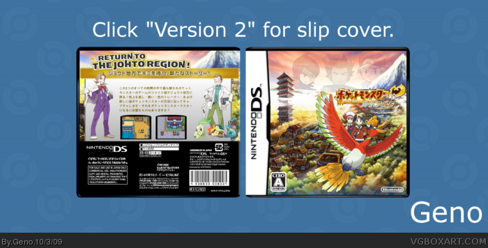
what happened to the slip cover?
3rd time's a charm :p
anyway, looking very good +fav.
Edited at 1 decade ago
[ Reply ]
#1, you didn't give me enough time to add it :P. Yeah, I had to reupload it one more time because I uploaded the wrong slip cover :P.
Re-uploaded to fix tiny thumbnail.
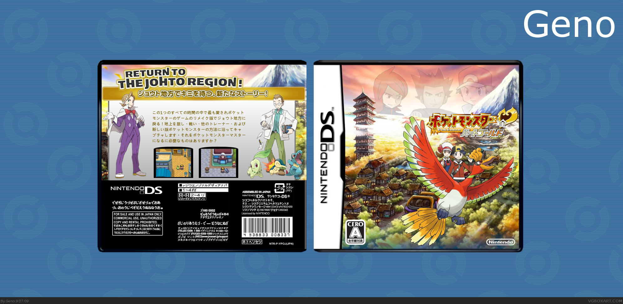
Version 2 is the slip cover. Version 1 is the box.
I wasn't planning on making this a Japanese box, but I LOATHE the English logo, so I went with it.
Credit to Drakxxx and ADFD for the template, which I edited slightly, and Bulbapedia for the renders.
Enjoy.
Edited at 1 decade ago
[ Reply ]
Extremely Tasty.
[ Reply ]
Love this, man.
[ Reply ]
its insane
[ Reply ]
Thanks everyone :).
[ Reply ]
One of your best, I love it.
[ Reply ]
#2, Loathe, or love? If you loathed it, why would you choose to use it? Granted, using an English logo when you're an English speaking citizen on an English speaking forum gets you nothing but points with me. I can't stand it when users create boxes in another language that they don't know.
EDIT: I wasn't paying attention and, by your comment, thought that you had chosen to use the English logo. Upon further investigation I realized I misunderstood.
I can't really say that I'm that impressed. I mean, its simplicity in this case is its downfall. At the same time, though, I think I would be more inclined to like it if it didn't have the various character images. I think they make it look less "designed" and more "thrown together." In addition I think that slapping characters on a cover is an amateurish technique. Not that you're an amateur, we both know you can do better.
What I'm trying to say is: If you're going to do something like a minimalist silhouette design, I would strongly recommend against using non-silhouetted character images. Keep it simple, like a hardback book cover, you know?
It's a decent look, but the characters ruin it for me.
As for the inside, it's a little busy, and the characters look really awkward standing on Ho-oh's back like that. I'm also not entirely sure if that's the appropriate size-ratio.
A big thing about the Pokemon games is that they've always been about the Pokemon, not the characters. In my opinion, flooding a box with characters is kind of stealing the thunder that the game deserves. I'm all for breaking the general pattern of gradient background with pokemon picture, but I'm also all for respecting the original conceptualization of the game's covers. It's risky to venture so far from the norm like you did, and even though I don't care for it much, I commend you for it.
Edited at 1 decade ago
[ Reply ]
#8, First of all, yeah, I made a bit of a typo, but what I meant to say was that the box would've been made in English had it not been for the disgusting English logo.
Also, I appreciate the wall of text (I'm not being sarcastic), I really do. I also feel special for being commended :). And yeah, the size-ratio for the front is way off :P.
Do you think I should just delete the slip cover? I'm not sure if it looks nice anymore.
[ Reply ]
I think you would be better off to show them both off on one image. I didn't realize that I had to look at version one to see the inside box at first. Not everyone will read your comment before looking at your work, you know?
[ Reply ]
#10, I did that at first, but the thumbnail became ridiculously low-res.
[ Reply ]
Hm, why not update it again and put the actual front and back, and put some visible text in the image that says 'Look at Version 2 for slip cover'
?
[ Reply ]
#12, how's that?
[ Reply ]
fix the blending in the sky.
[ Reply ]
#14, could you be a bit more specific please?
[ Reply ]
??????????????????????????????????????????
[ Reply ]
what the
[ Reply ]