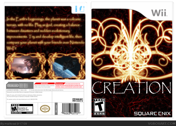
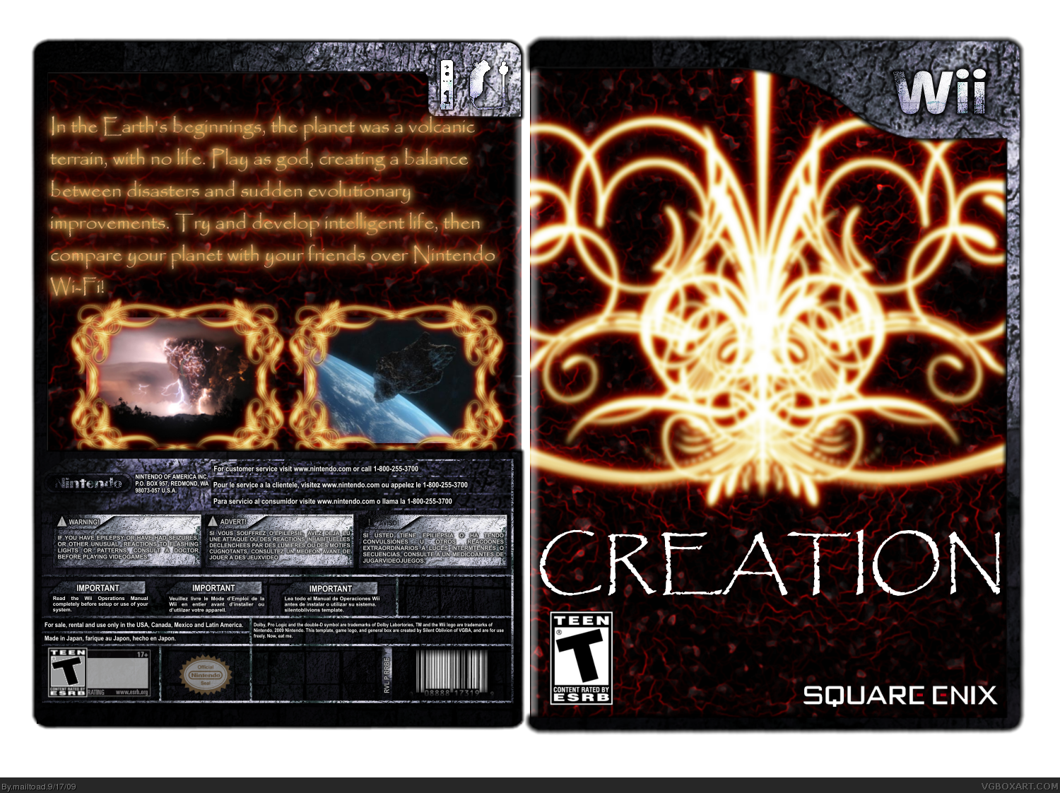
This one took me ages to make as I made everything save for the template (credit to Silent Oblivion). I wasn't originally intending to make this, I was going to make a dance game box, but couldn't get the renders, right, so I thought that as I hadn't done a box based on an EPIC game, I thought I might try it out. Please view in full, and comments and favs are welcome!
Yeah not feeling this one :/
Don't like the temp chose for this box.
The screenshots are WAY to big.
I can not read the text on the back.
I also hate the background of the box
the box.
But apart from that I like the idea of the box :)
Nice job! I realy like the design on the front, even if it is a little overpowering, but I'm not so keen on the back... It's hard to read the text and the screens' borders are rather too complex. But i enjoy the front enough for me to give this box a fav.:)
EDIT: Oh, almost forgot...Change the template- it realy doesn't work.
 Creation Box Cover Comments
This one took me ages to make as I made everything save for the template (credit to Silent Oblivion). I wasn't originally intending to make this, I was going to make a dance game box, but couldn't get the renders, right, so I thought that as I hadn't done a box based on an EPIC game, I thought I might try it out. Please view in full, and comments and favs are welcome!
Edited at 1 decade ago
[ Reply ]
I kinda like it, the front seems very bright and nice to look at. + Fav.
[ Reply ]
This looks really interesting. Really nice game concept too. I would place on a normal Wii temp though, this one doesn't really work here =)
[ Reply ]
I like the concept and final design, great job!
[ Reply ]
The gold stuff is cool. But please use a different temp. It ruins the look you seem to be going for.
[ Reply ]
Yeah not feeling this one :/
Don't like the temp chose for this box.
The screenshots are WAY to big.
I can not read the text on the back.
I also hate the background of the box
the box.
But apart from that I like the idea of the box :)
Edited at 1 decade ago
[ Reply ]
Nice job! I realy like the design on the front, even if it is a little overpowering, but I'm not so keen on the back... It's hard to read the text and the screens' borders are rather too complex. But i enjoy the front enough for me to give this box a fav.:)
EDIT: Oh, almost forgot...Change the template- it realy doesn't work.
Edited at 1 decade ago
[ Reply ]
I've changed the template to the traditional white. Hope it works better.
[ Reply ]
Are you still in the spypilot comp? Because you submitted this but you haven't submitted one for the comp.
[ Reply ]
I think I'm going to have to drop out - I don't have the time.
Edited at 1 decade ago
[ Reply ]
I can't see the box...
[ Reply ]
You've got a Teen ESRB but on the back, it's a Teen rated game with a Mature ESRB.
[ Reply ]
#12 thanks for noticing. I'll change that soon.
[ Reply ]
Never mind
Edited at 1 decade ago
[ Reply ]
cool! the front are great but the back need more pictures and screenshots! the logo teen in the front and mature in the back are wrong!
[ Reply ]
#13 nice one, looks a bit better now...:)
[ Reply ]
#10, okay then.
[ Reply ]
Thanks for the favs guys!
[ Reply ]
Nice idea. I'd rather 3 smaller screens and the borders are a little blurry. The back also lacks structure.
But nice concept.
[ Reply ]
I am sorry but this just looks terrible, its blurry and has a very bad outer glow.
[ Reply ]