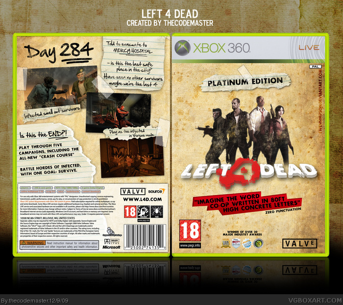
I'm not feeling this one...The work and quality is good, only I don't think the torn paper look quite suits L4D, it just doesn't have the nightly, dark or gloomy feel, if you get what I mean.
Maybe not the torn paper itself, but the brownish dry wall look seems too bright. If the wall was like bark or like cabin wood or something, paler and darker, it might look better. I feel it needs some more red on the back too, just to balance it out. It might be a bit cliche, but I think if the notes were splattered with small amounts of blood or red fingerprints or something it may look better.
Very well done, fantastic job! It probobly would not be accepted as official 'Platnum Hits' boxartt, saying at it does not match they leyout or style of any other Platnum Hits title. But if you had done it in that style it would have ruined it.
In my opinion this looks more like a Game of the Year edition, rather than a Platnum hit, I don't think they add extras in Platnum Hits (like pre-downloaded DLC).
Overall, the art and layout are great, even if it doesn't seem much like a Platnum Hits box, 9/10
#14, It's not a Platinum Hits box... it's a Platinum Edition.
(Referring both to good sales and the inclusion of the Crash Course campaign on the disc).
 Left 4 Dead Box Cover Comments
Left 4 Dead. My favourite game on PC.
Can't wait for L4D2 :)
[ Reply ]
Oh my god that looks awesome.
[ Reply ]
*claps*
[ Reply ]
#3, haha thank you.
...ADDED PRINTABLE VERSION...
[ Reply ]
It's refreshing to see L4D work without green everywhere.
[ Reply ]
Quoting Yahtzee Croshaw is an epic win :P.
[ Reply ]
#6, I just loved his review of L4D :)
[ Reply ]
By far the best L4D box on the site.
[ Reply ]
I find it awesome that you avoided the green theme and made it better for it.
[ Reply ]
I'm not feeling this one...The work and quality is good, only I don't think the torn paper look quite suits L4D, it just doesn't have the nightly, dark or gloomy feel, if you get what I mean.
Maybe not the torn paper itself, but the brownish dry wall look seems too bright. If the wall was like bark or like cabin wood or something, paler and darker, it might look better. I feel it needs some more red on the back too, just to balance it out. It might be a bit cliche, but I think if the notes were splattered with small amounts of blood or red fingerprints or something it may look better.
Edited at 1 decade ago
[ Reply ]
I agree strongly with E_G. Great job here.
[ Reply ]
I think you should have not had a white square for the copy right. Looks better without it I think. Example link. But if you like it then its cool.
[ Reply ]
Updated to Version 2.
NEW LAYOUT.
[ Reply ]
Very well done, fantastic job! It probobly would not be accepted as official 'Platnum Hits' boxartt, saying at it does not match they leyout or style of any other Platnum Hits title. But if you had done it in that style it would have ruined it.
In my opinion this looks more like a Game of the Year edition, rather than a Platnum hit, I don't think they add extras in Platnum Hits (like pre-downloaded DLC).
Overall, the art and layout are great, even if it doesn't seem much like a Platnum Hits box, 9/10
[ Reply ]
#14, It's not a Platinum Hits box... it's a Platinum Edition.
(Referring both to good sales and the inclusion of the Crash Course campaign on the disc).
[ Reply ]