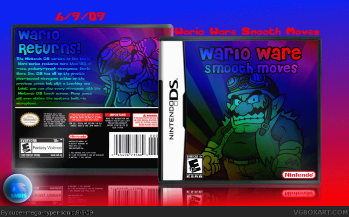
firstly, you need screen shots.
secondly, you need to make the wario on the back smaller to make room for screens and to make more room for text as the text is squashed into one corner.
lastly, you really need to sort out those quality problems. a few blurry renders i don't mind but that's bad.
but putting the quality out of the way, i would say 3.5/5
with those things fixed, this could be a very good box.
wario ware is a very colourful game and this style really works.
 Wario Ware Smooth Moves Box Cover Comments
Hi.Anyone mind telling me why it is sutch low quality?
I saved as PNG...
Cred to Jeven and PR.
Edited at 1 decade ago
[ Reply ]
smooth moves is wii.
touched is ds.
Edited at 1 decade ago
[ Reply ]
#2, I know that was an early mistake but I just went with it XD.
[ Reply ]
I remember seeing this in the wip thread. I thought to myself, finally you're spending some time on something! But no, sadly I was wrong YET again.
[ Reply ]
#4, What do you mean by that?
[ Reply ]
#5 - He means, when he saw it, it looked great, but then the rest was just rushed, completed quickly and posted.
Though, it is better.
[ Reply ]
Well I didn't have Ideas for the back really.I'm open for suggestions
[ Reply ]
#7, well ok,
firstly, you need screen shots.
secondly, you need to make the wario on the back smaller to make room for screens and to make more room for text as the text is squashed into one corner.
lastly, you really need to sort out those quality problems. a few blurry renders i don't mind but that's bad.
but putting the quality out of the way, i would say 3.5/5
with those things fixed, this could be a very good box.
wario ware is a very colourful game and this style really works.
[ Reply ]
#8, I'm sorry bout quality but I don't know what PDN is messing up.
Also any one got any fitting screen borders?
Edited at 1 decade ago
[ Reply ]
Well, you could use the report-thing on the back. "Wario Report" lol.
Nah, just kidding.
But I agree with others, spend some time on your next box.
[ Reply ]
It looks pretty plain. Wario looks like he's ashamed to be on this game.
Edited at 1 decade ago
[ Reply ]
#7, then you shouldnt have posted! doy-duh!
[ Reply ]
Nope, you should have spent A LOT more time on this box.
[ Reply ]
I like these colors ! =D Um maybe screenshots would be good ^^
[ Reply ]