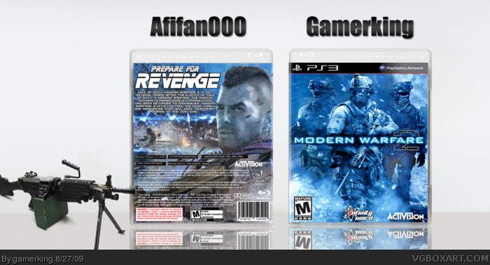
I tried doing the back so many times but kept failing so it became a collab box with afifan! I did the front and he did the back. I know it doesn't have the title "Call of Duty" above the Modern Warfare but that's because it just didn't look right when i tried putting it there so yeah. enjoy! =D
Well I like the front but your back is lacking. The color scheme is bit different, MGS text is not a good idea, and all the back info is blurry. Fix it up and it'll be great.
well i just informed afifan of your thoughts on the tagline and text so he should have a new update sometime soon i hope. thanks for the favs and comments so far guys. :)
The MGS font doesn't work. The front looks overly sharpened. The photo filter or whatever you used to color it looks artificial, if you will. What I mean by that is that I can tell it was added to those pictures as opposed to a lot of boxes where the color scheme looks to be apart of the pictures. I think the back is good but for some reason I feel I've seen it before. I'm not saying I have but maybe it's a tad generic.
 Call Of Duty: Modern Warfare 2 Box Cover Comments
I tried doing the back so many times but kept failing so it became a collab box with afifan! I did the front and he did the back. I know it doesn't have the title "Call of Duty" above the Modern Warfare but that's because it just didn't look right when i tried putting it there so yeah. enjoy! =D
credit to kyle for our names at the top. lol
[ Reply ]
Not bad, I like that you went for a blue theme. It stands out nicely from the other MW2 boxes. Nice job, guys.
Edited at 1 decade ago
[ Reply ]
This turned out real nice Joe, can't wait to do another collab with you!
[ Reply ]
Amazing! The blue color scheme makes it very original too, I love everything about it.
[ Reply ]
Blue color scheme looks nice.
[ Reply ]
Awesome collab, and the colour direction is equally as awesome. Great work guys!!
[ Reply ]
Only thing I dont like is the Metal Gear sold font on back.
[ Reply ]
I'm not keen on the Metal Gear font either, but other than that, you guys did a terrific job across the board on this one!
Edited at 1 decade ago
[ Reply ]
Well I like the front but your back is lacking. The color scheme is bit different, MGS text is not a good idea, and all the back info is blurry. Fix it up and it'll be great.
[ Reply ]
I like the blue colour scheme. But, the tagline is kinda choppy and I don't like the font used.
Other than that though, really original!
[ Reply ]
Damn thats good
[ Reply ]
well i just informed afifan of your thoughts on the tagline and text so he should have a new update sometime soon i hope. thanks for the favs and comments so far guys. :)
[ Reply ]
great job guys! really well done!
gk, you should make more game boxes!
Edited at 1 decade ago
[ Reply ]
Greatest part is front, so different, same with the back, but front just stands out
[ Reply ]
front is spectacular +fav
[ Reply ]
good job joe front = tank! =D
[ Reply ]
The MGS font doesn't work. The front looks overly sharpened. The photo filter or whatever you used to color it looks artificial, if you will. What I mean by that is that I can tell it was added to those pictures as opposed to a lot of boxes where the color scheme looks to be apart of the pictures. I think the back is good but for some reason I feel I've seen it before. I'm not saying I have but maybe it's a tad generic.
[ Reply ]
i dont like the template that much. Other than that its great! 4/5
[ Reply ]
oh wow, I missed all these comments. xD thanks for the critiques guys!
@loosejuice: agree to disagree. =P
[ Reply ]
The front is awesome, but the back doesn't "really" live up to the potential of the front.
[ Reply ]
How have so many people fav'd this, it's nowhere near wither of these guy's best work.
[ Reply ]
either***
[ Reply ]
they faved it cause they...i don't know...liked it? xD =P and thanks xcore!
[ Reply ]
One Question, how do you print these?
[ Reply ]