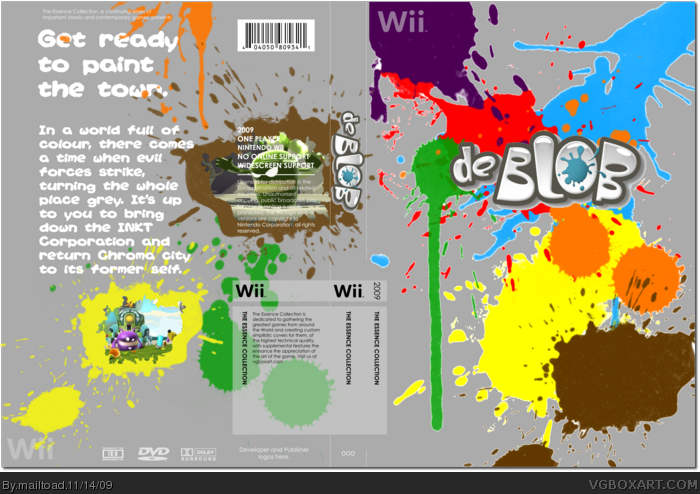
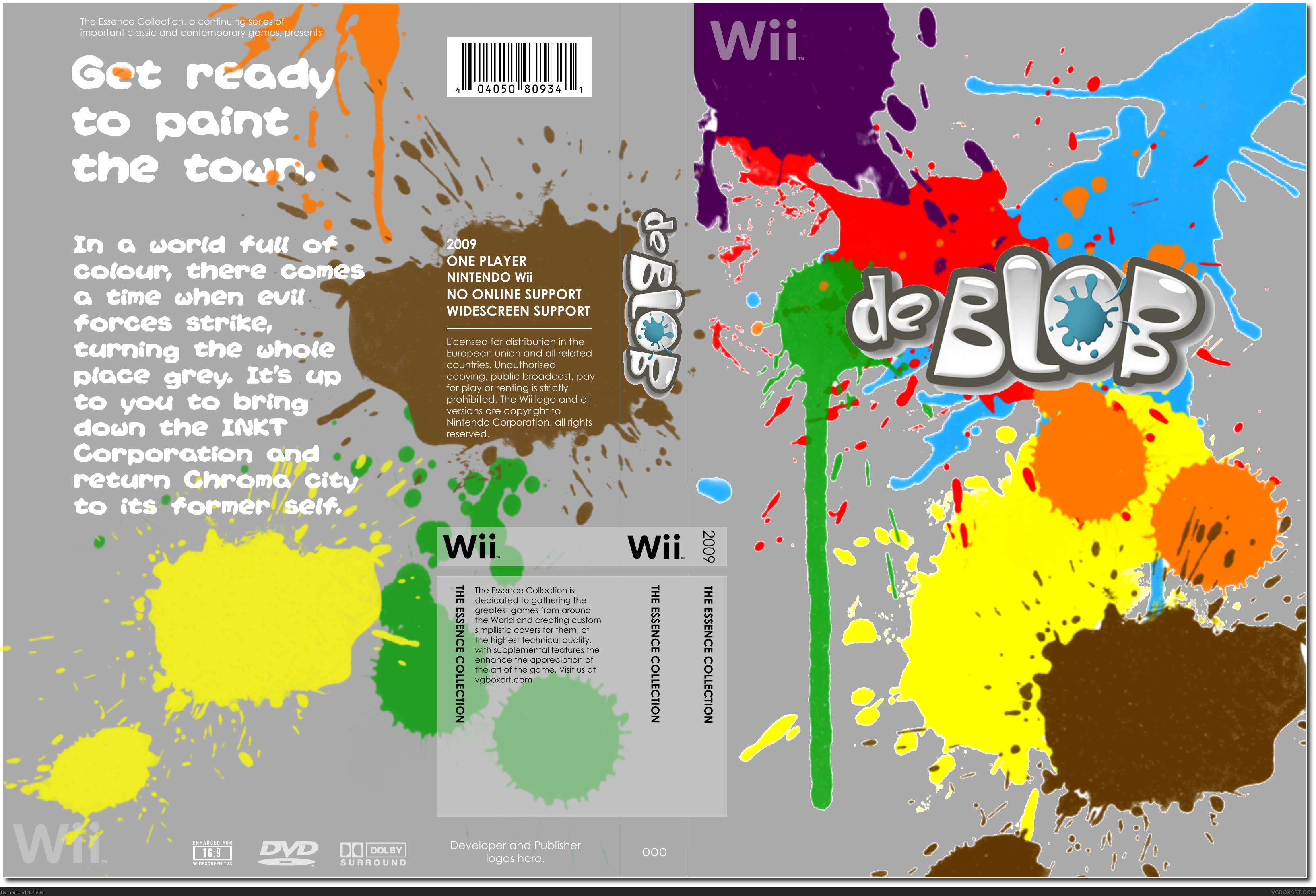
I thought that it would be nice to have a go at this essences thing. I believe that I managed to capture the essence of the game in the contrasts between the dull grey background and the vibrant paint splats. Credit to silent oblivion for the temp. As always - comments are more than welcome. The paint splats are not renders by the way - they are meant to have the white outline.
The logo has a odd drop shadow that you forgot to get rid of. but the box is good, and really captures the essence of the game.
youre improving mailtoad, i just cant believe how long it took for that to happen.
It's good.. But it could have been so much better. The outlines on the colours feels weird, and I think the logo would have been better if it blended in better. 7/10
Very nice front, I'll +fav for that, but the back does need a tad, I'd love to see it revamped, and maybe a different color than grey? Message me when you've updated it. :]
 de Blob Box Cover Comments
I thought that it would be nice to have a go at this essences thing. I believe that I managed to capture the essence of the game in the contrasts between the dull grey background and the vibrant paint splats. Credit to silent oblivion for the temp. As always - comments are more than welcome. The paint splats are not renders by the way - they are meant to have the white outline.
Edited at 1 decade ago
[ Reply ]
The logo has a odd drop shadow that you forgot to get rid of. but the box is good, and really captures the essence of the game.
youre improving mailtoad, i just cant believe how long it took for that to happen.
Edited at 1 decade ago
[ Reply ]
I really like the front. It's amazing, but the back, well, needs a better layout.
[ Reply ]
I like it!
[ Reply ]
I love the front, but the back seems to be a bit empty... Maybe you can place screenshots in form of splats, I think. Fav!
[ Reply ]
Good, but the game has already been made. Maybe you could make 'De Blob 2'?
[ Reply ]
Awesome! + Fav. It's just simply lovely.
[ Reply ]
Good job! You're close to getting an author fav from me!
[ Reply ]
:3 Nice ;D Fav.
[ Reply ]
Wow... this did even better than mini ninjas! I was not expecting that. Thanks for the favs everyone!
[ Reply ]
I've added some screenshots in the form of splats.
[ Reply ]
It's good.. But it could have been so much better. The outlines on the colours feels weird, and I think the logo would have been better if it blended in better. 7/10
[ Reply ]
i like it except it dosent look official and i hate the grey.other than that it looks great
[ Reply ]
It's nice,it really captures the essence of the game+fav
[ Reply ]
#3 I feel the same way, i love the front, but im not feelin the back
[ Reply ]
Very nice front, I'll +fav for that, but the back does need a tad, I'd love to see it revamped, and maybe a different color than grey? Message me when you've updated it. :]
[ Reply ]
[Double Post]
Edited at 1 decade ago
[ Reply ]
Edited at 1 decade ago
[ Reply ]