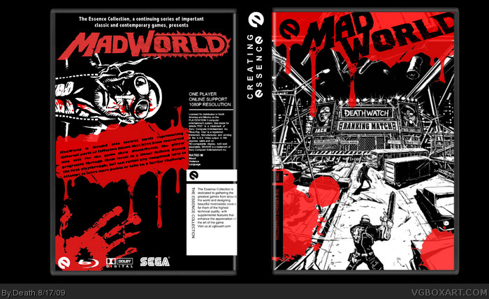
I tried as hard as i could to capture the "essence" of this game. To me this game is lots of blood, and you playing to get free in deathwatch. So i put a match from deathwatch on the front, and lots of blood ;) Enjoy
I really like the design, but I think as an Essence box, it might be a bit to much for me. As silly as it sounds, I think your concept about the essence of Mad World being about the Deathwatch show would go over better if you edited the 2 characters out of the picture on the front. That way, it would essentially just be an image of the Deathwatch stadium.
I've said this before, but I hate handprints on boxes. Is that really the size of your hand? When I hold a box my hand almost covers the whole thing, and I don't think I'm some sort of giant.
the design is awesome, however, there is one thing that bugs me.
the title is too high, which, considering the fact that you made it the same colour as the essence logo, makes it look like "eMad World".
 Mad World Box Cover Comments
I tried as hard as i could to capture the "essence" of this game. To me this game is lots of blood, and you playing to get free in deathwatch. So i put a match from deathwatch on the front, and lots of blood ;) Enjoy
[ Reply ]
I really like the design, but I think as an Essence box, it might be a bit to much for me. As silly as it sounds, I think your concept about the essence of Mad World being about the Deathwatch show would go over better if you edited the 2 characters out of the picture on the front. That way, it would essentially just be an image of the Deathwatch stadium.
[ Reply ]
I've said this before, but I hate handprints on boxes. Is that really the size of your hand? When I hold a box my hand almost covers the whole thing, and I don't think I'm some sort of giant.
[ Reply ]
Its ok drakxxx, i understand what your saying. It makes sense. And i understand what your saying too delicious, i will remeber that in the future
[ Reply ]
Front is WAAAAAAAAAAAAAAAAAAAAAAAYYYYY low quality, ill fave, but promise me you'll raise it...
[ Reply ]
@#5, it was good quality before, i have no clue why it gets so crappy when i upload it. I will try again
[ Reply ]
the design is awesome, however, there is one thing that bugs me.
the title is too high, which, considering the fact that you made it the same colour as the essence logo, makes it look like "eMad World".
Edited at 1 decade ago
[ Reply ]