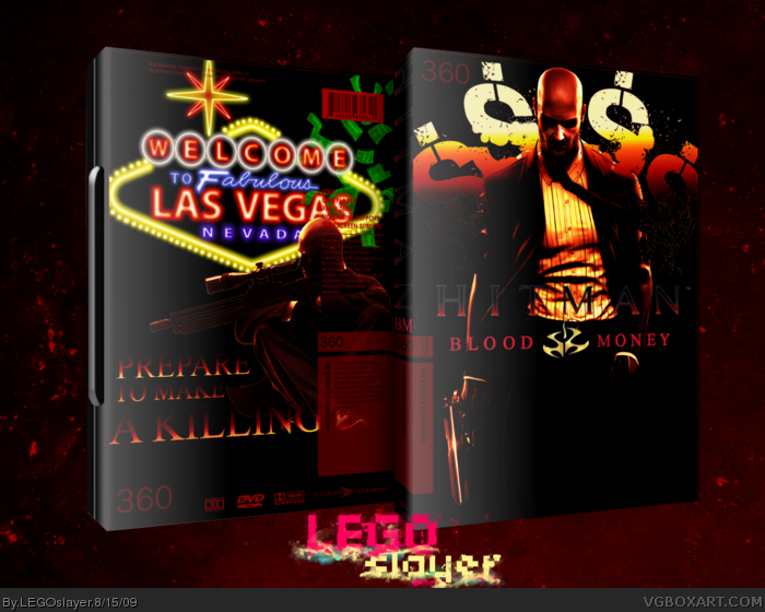
This doubles as my entry to the color comp as well.
I tried to capture the less "clean" parts of 47's job with the messy dollar signs. Hitman will go to great lenghs to earn his kill, but in the end its all about the money...
I love this essence collection because it allows me to use complete freedom since I'm not inclined by formality to a set list of things to add, like screenshots or lots of text.
Don't worry..I have the same with my latest box (Gears of War 2).
As fay as the box goes, it's a bit too dark for me and I'm not sure why you have Las Vegas sign on the back, since the game doesn't take place in Las Vegas.
Anyways, I like the top part on the front good enough for a..
+FAV
To be honest, I love the front, but the back, I just really dislike. The Las Vegas sign was a good idea, but is really blurred, and doesn't really look good, and I also don't like the tagline.
 Hitman: Blood Money Box Cover Comments
This doubles as my entry to the color comp as well.
I tried to capture the less "clean" parts of 47's job with the messy dollar signs. Hitman will go to great lenghs to earn his kill, but in the end its all about the money...
I love this essence collection because it allows me to use complete freedom since I'm not inclined by formality to a set list of things to add, like screenshots or lots of text.
Edited at 1 decade ago
[ Reply ]
Oh damn it is good!!
[ Reply ]
Hitman-logo on front is pretty hard to read. But otherwise it's awesome!
[ Reply ]
Really reminds me of the dark, grungy parts of Hitman.
Awesome box.
[ Reply ]
94 views and 4 comments? Could someone tell me what's wrong with this box?
[ Reply ]
Don't worry..I have the same with my latest box (Gears of War 2).
As fay as the box goes, it's a bit too dark for me and I'm not sure why you have Las Vegas sign on the back, since the game doesn't take place in Las Vegas.
Anyways, I like the top part on the front good enough for a..
+FAV
[ Reply ]
#6
link
link
link
[ Reply ]
To be honest, I love the front, but the back, I just really dislike. The Las Vegas sign was a good idea, but is really blurred, and doesn't really look good, and I also don't like the tagline.
But great, great work on the front =)
[ Reply ]
Sweet!
[ Reply ]
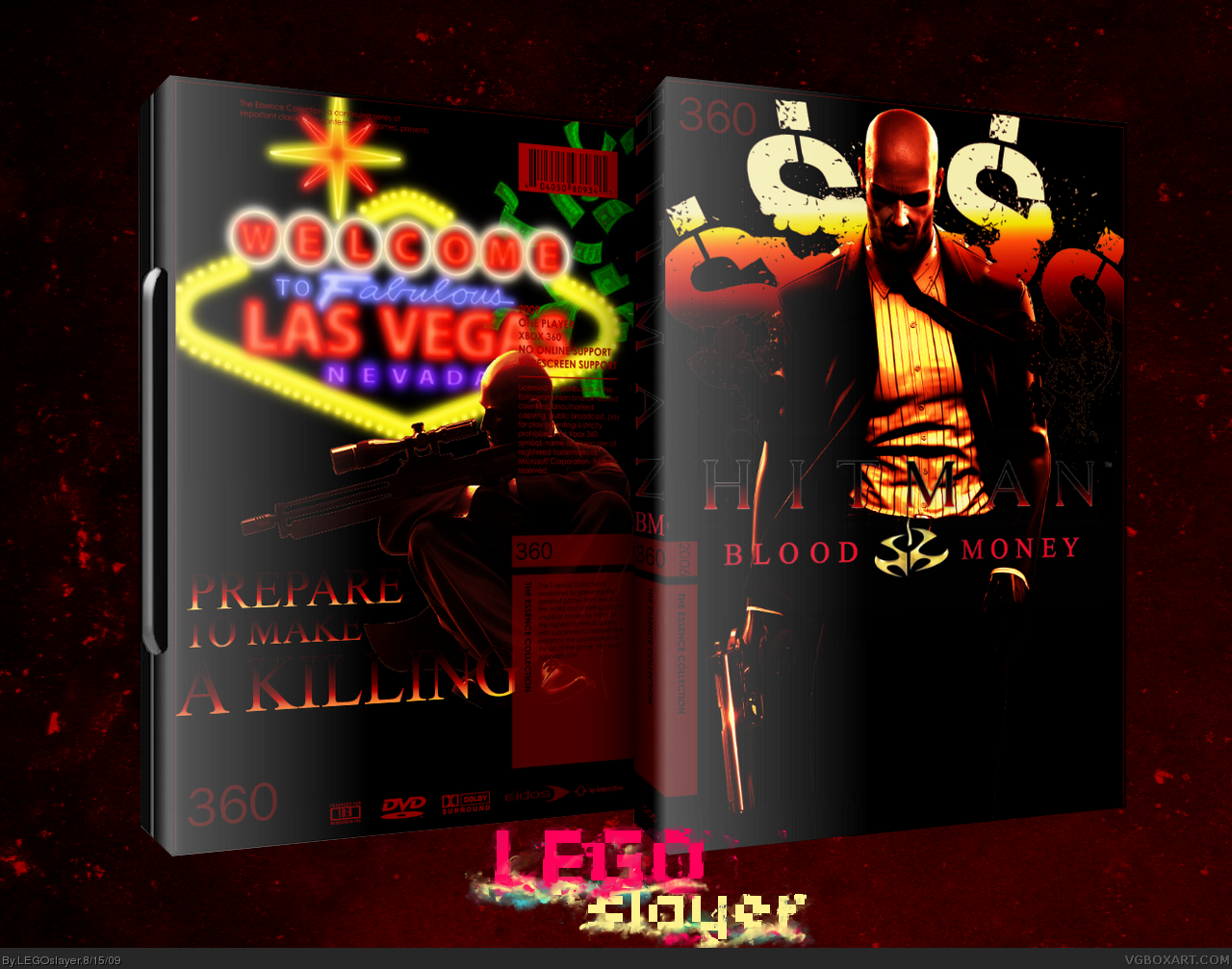
UPDATE: de-blurricized the vegas sign
[ Reply ]
I was looking at it from the front page and giggled a little. Cool box though.
[ Reply ]
Nice box Lego.
[ Reply ]
Nice one man. I like the front design a lot.
[ Reply ]
I think the glow/shine may be a bit overkill on the plastic. Also, the money on the back isn't needed. If you fix that, I'm sold.
[ Reply ]
I like it very much i just wish i could see the logo more :/
[ Reply ]