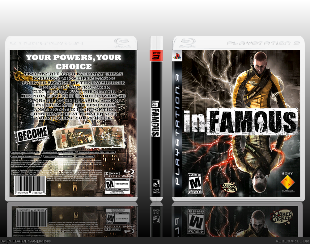
Front - WIN
Back - Not a Win. The back is a let down to the front. Its hard to read the text, and the background needs to be changed. thats my opinion though.
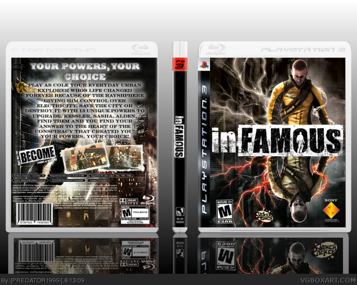
thanks for all the comments and i have updated box! and sorry couldnt change the background it would take forever to do the editing anyway the glow on the words gives the effect of radiating energy, it sort of fits the theme!
 inFAMOUS Box Cover Comments
credit to techne for his killer template and credit to a website( forgot the name sorry) for the mint screen borders thanks dudes!
[ Reply ]
Front - WIN
Back - Not a Win. The back is a let down to the front. Its hard to read the text, and the background needs to be changed. thats my opinion though.
[ Reply ]
Front is really nice and creative.
Back needs more work!
[ Reply ]
I Can Dig It Great Job Perfect.......
[ Reply ]
#3, This.
[ Reply ]
thanks for all the comments and i have updated box! and sorry couldnt change the background it would take forever to do the editing anyway the glow on the words gives the effect of radiating energy, it sort of fits the theme!
Edited at 1 decade ago
[ Reply ]
nice but change the font or the tagline, thats what i think but great work anyway, love the front, +fav
[ Reply ]
The reflection isn't even reflecting right...
[ Reply ]