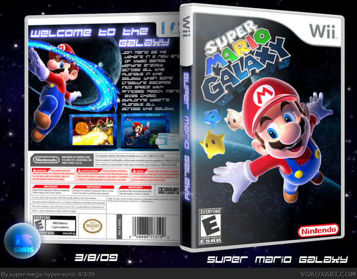
I hate how everything is in such low quality...Not very important, but it makes a box look better. The front is very plain and boring IMO. I don't like how the logo is tilted,plus it's very choppy and the bottom of the logo looks sorta bad. Moving on to the back, it's alright, but it feels like you should add more.
#6, The "Super" part of the logo is very choppy...How could you not see that? Also, the bottom of the logo "Between the L and A" looks like if you erased a big chunk of it.
pretty good, but It is too obvious that the '2'2 has been rendered from the logo, and that puts me off a bit too much, maybe move it behin mario so it is less obvious
The background makes me feel like I'm going to play an M-rated Mario game, and the front is a bit bland if you ask me. Maybe you could add some colorful planets, or something? The back is your strong point, and I love the tagline. However, the description makes me want to puke. It's not your best, IMO. But, if you touch up a few things here and there, I'll fav.
Still makes me think of Halo Reach. The front is still very generic, and I know there is not much else to do with a galaxy box, but still. On the backs description I'd say choose a different font.
 Super Mario Galaxy Box Cover Comments
My best!
Cred to PR Tecnee and IGN.com
I'll Look up who did the logo.
EDIT Also cred to StevenCho and
Vegeta1056
Edited at 1 decade ago
[ Reply ]
I like it! The front is a bit plain but that's OK. Good job!
[ Reply ]
#2, No Fav?
[ Reply ]
The background is way too serious for a Mario game.
But other than that, not bad.
[ Reply ]
Sorry, not that good.
I hate how everything is in such low quality...Not very important, but it makes a box look better. The front is very plain and boring IMO. I don't like how the logo is tilted,plus it's very choppy and the bottom of the logo looks sorta bad. Moving on to the back, it's alright, but it feels like you should add more.
Sorry man, 3/5 from me :(
[ Reply ]
#5, Logo isn't my problem.I tried two logos and people said they were choppy.I also don't see the choppyness.
[ Reply ]
#6, The "Super" part of the logo is very choppy...How could you not see that? Also, the bottom of the logo "Between the L and A" looks like if you erased a big chunk of it.
[ Reply ]
#7, I haven't done any editing
Maybe cos the 2 was edited out.
[ Reply ]
Hmmm..... The front is alittle empty, but the back is awesome! I'll fav ;)
[ Reply ]
pretty good, but It is too obvious that the '2'2 has been rendered from the logo, and that puts me off a bit too much, maybe move it behin mario so it is less obvious
[ Reply ]
#10, I'll try...
[ Reply ]
Definitely your best, however, it's hard to read description on the back.
[ Reply ]
The background makes me feel like I'm going to play an M-rated Mario game, and the front is a bit bland if you ask me. Maybe you could add some colorful planets, or something? The back is your strong point, and I love the tagline. However, the description makes me want to puke. It's not your best, IMO. But, if you touch up a few things here and there, I'll fav.
[ Reply ]
Still makes me think of Halo Reach. The front is still very generic, and I know there is not much else to do with a galaxy box, but still. On the backs description I'd say choose a different font.
[ Reply ]
wow
[ Reply ]