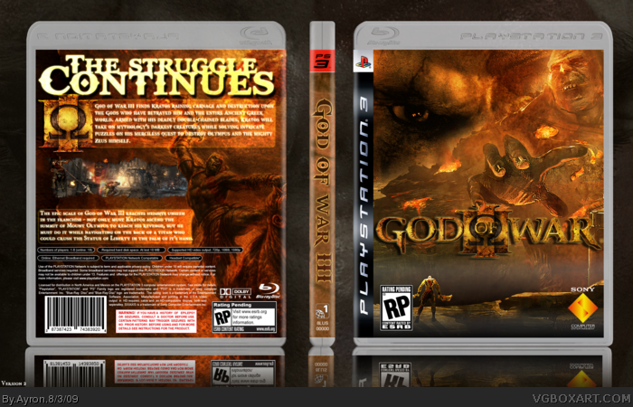
I rarely ever make a grunge-type box, and i have made maybe one or two ''good'' grunge boxes.
A friend of mine told me,due to the wave of gow3 boxes on the site,to try one myself.
Well,here it is.
[credit to techne for ps3 template]
Enjoy.
I like the update. However, I would suggest reducing glow on the text and making the tagline a bit smaller (with lowered glow as well). Also, maybe try and make screenshots a bit bigger.
Anyways, still a great box and effort..so...
+FAV
 God of War III Box Cover Comments
I rarely ever make a grunge-type box, and i have made maybe one or two ''good'' grunge boxes.
A friend of mine told me,due to the wave of gow3 boxes on the site,to try one myself.
Well,here it is.
[credit to techne for ps3 template]
Enjoy.
[ Reply ]
I love it. It has a different look to the rest of the GOW 3 boxes but it uses that well. I hope this one doesn't get ignored.
[ Reply ]
wow dude, this is just awesome
[ Reply ]
wow, love the blending on the front, maybe keep the same colour on the front though theres grey on there change it NOW!
love what youve done with the back too :D
+fav
[ Reply ]
#4, the grey on the front is meant as a type of fog man ;).
Thanks for the replies,guys (:
[ Reply ]
I love this.
[ Reply ]
I like how you fit the "III" On the back.
[ Reply ]
Hey,thanks #6-7 (:
[ Reply ]
I know I shouldn't be criticizing such an amazing box, but, the text on the back bores me. But, that's not enough to keep me from faving.
[ Reply ]
I really like the front, but the back..not so much..
Text on the back doesn't fit and the background picture (if it's even a pic) is low-res.
[ Reply ]
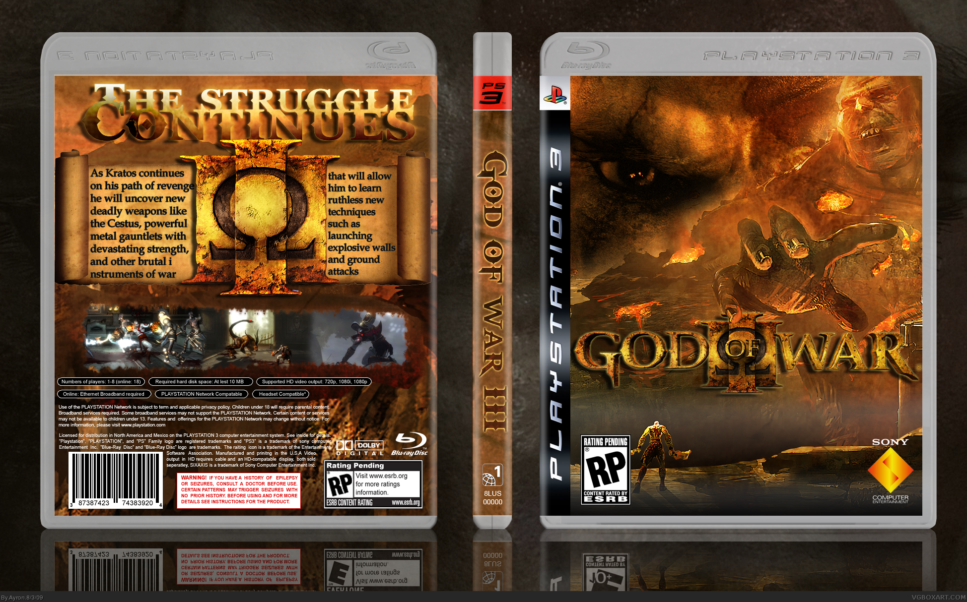
#9-10,thanks alot for the criticism.
I have taken it into account,and made a new back that I hope you will like.
enjoy :D
[ Reply ]
Great update.
[ Reply ]
NICE
[ Reply ]
Looking at V1 then V2, the new back is so, so much better.
[ Reply ]
Best GoW3 box on the site, I think. :)
[ Reply ]
Thanks #12-15 (:
[ Reply ]
Amazing work sir! The front is beyond epic.
[ Reply ]
take the fog out! :p
and i'll suck your ass!
[ Reply ]
#18, You do know that now i'll never take the fog out,right?
[ Reply ]
Very nice ;)
I love the design and style man! It just blends together to make a masterpiece
[ Reply ]
I like the update. However, I would suggest reducing glow on the text and making the tagline a bit smaller (with lowered glow as well). Also, maybe try and make screenshots a bit bigger.
Anyways, still a great box and effort..so...
+FAV
[ Reply ]
What I like about this is that it isn't your typical GOW box with just a Kratos model on a mundane background, it's much more thought out than that.
[ Reply ]
This is amazing. i did one too,but this blows mine out the water.FANTASTIC!
[ Reply ]
#11, it looks much better now! I wish I could fav again.
[ Reply ]
Thanks for the comments and favs everyone ! glad you liked it.
[ Reply ]
This should be in the hall. Alot of Ayron's boxes are going unnoticed and it really isn't fair.
[ Reply ]
-epic attempt at bump-
[ Reply ]
#26-7, that was kinda obvious.:P
[ Reply ]