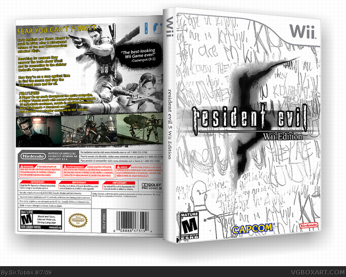
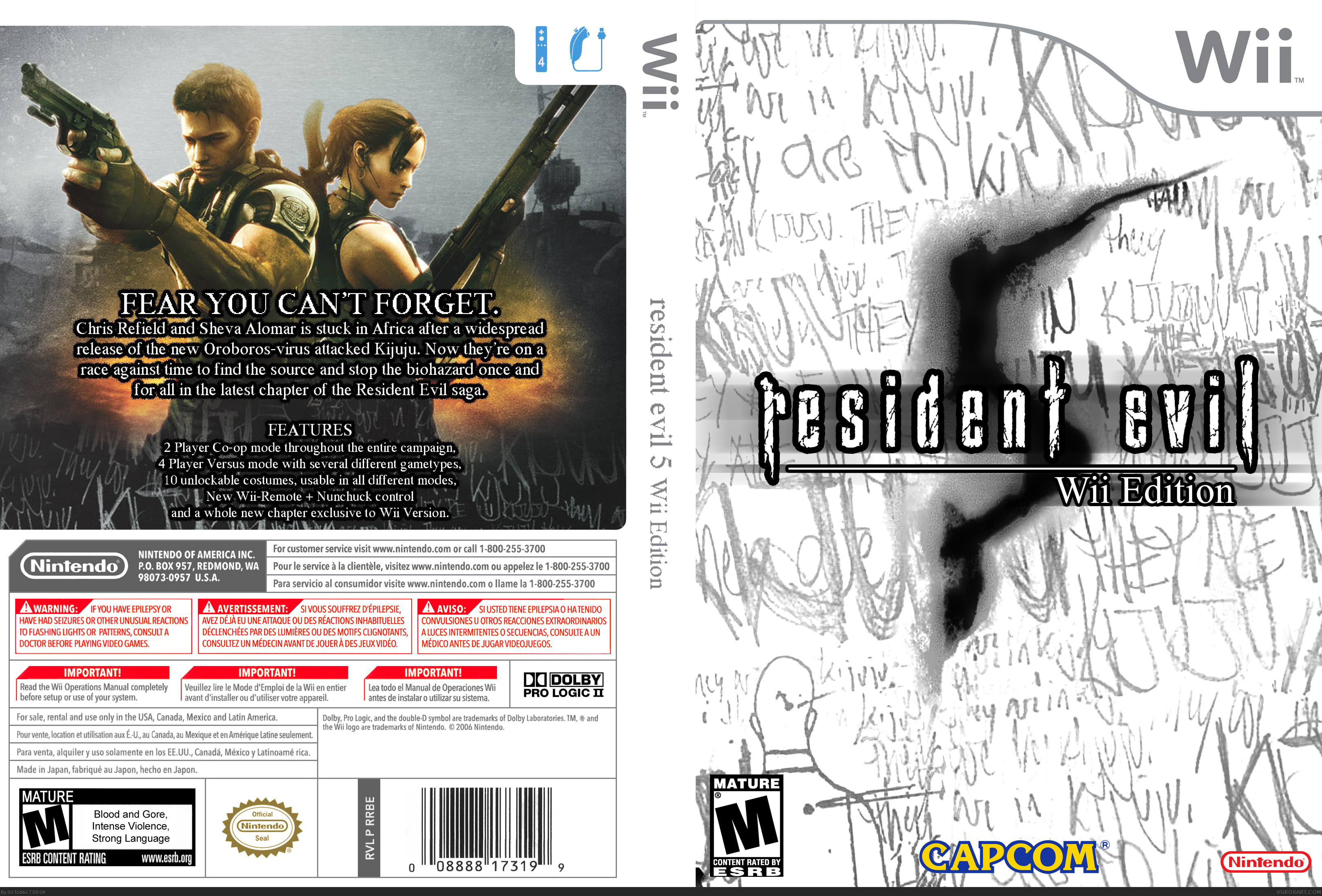
Special Thanks to StardogChampion for his Wii Cover Template. Hope you guys will like this, I'm not entirely pleased myself. But I decided I would post it anyway.
Edit: Guess I should mention that I wanted to design it with a Euro-RE cover style, but went with ESRB instead of PEGI because I couldn't find any good pics of the new coloured ratings. So that's why it's a bit plain. ^^
#1, when youre not pleased, make it so you are pleased.
this can do with some screenshots and a not so plain front.
im also not diggin the change of approach of the front and back. keep it constant.
#3, I will, this is just the first version. I tried to work with screenshots, but it's too clear that it's not a Wii Game, so I'm gonna have to modify those a bit first. And with plain font, do you mean on the back or the resident evil logo? Because the logo is the old resi4, TUC and Degeneration logos.
That's (for me) really good. I like the thing that you used a lot of white in the front, because it looks really like :"It's RE5, but not just RE5, It's RE5 Wii!". In a shop, this front will catch the eyes :)
After that, bad points: The kijuju back is too pixelised and should be blurred. I also think that this back picture could be a front image for another box, instead of the back of this one, because it doesn't match very well.
Looks very artistic on the front, but has a completely different style on the back. also you see a lot of white until... you reach the back. the front aint too bad though.
#4, i said FRONT not font.
you are also saying this is a WIP, if the box isnt complete, put it here:http://www.vgboxart.com/forums/forumdisplay.php?f=4
and click on new thread.
#5,6:
I've actually been modifying the back (and fixing the pixelated font.) and will be updating this boxart once the 24 hours have past.
#7:
Sorry, missed the r. And I did realize that I should have done that shortly after I uploaded it, hence why I wrote the comment. Also, as I specified in the first comment, the entire idea of the front was for it too look like one of the European Resident Evil fronts. And if you look at Resi 0, Remake, 4 or 5 you'll notice that they are very plain.
#9, The screenshots or the art with Chris and Sheva? The art is pretty easy to find actually. Go to google.com, search images (Only Extra Large) on "Resident Evil 5 Wallpapers and found two pieces of art on page 2 and 4, the one on page 4 was the one I uesd.
Link: link
you do not have to write "Wii Edition" at the Cover ;) But ist really nice :D The font of the front cover is from RESIDENT EVIL 4 ...its better you take from RESIDENT EVIL 5
- Nintendos logo is no longer red (for months)
- I don#t know about the template. The plastic of the package seems a bit squeezed, almost like it is just cover and no package (just look at some package and you might understand link. Besides that plastic parts of the package should be more rounded.
-makeup of the text could be better and some quality issues as well.
 Resident Evil 5: Wii Edition Box Cover Comments
Special Thanks to StardogChampion for his Wii Cover Template. Hope you guys will like this, I'm not entirely pleased myself. But I decided I would post it anyway.
Edit: Guess I should mention that I wanted to design it with a Euro-RE cover style, but went with ESRB instead of PEGI because I couldn't find any good pics of the new coloured ratings. So that's why it's a bit plain. ^^
Edited at 1 decade ago
[ Reply ]
Its sort of meh. But, I like the simplicity. It needs more work, but I'll fav. +fav.
[ Reply ]
#1, when youre not pleased, make it so you are pleased.
this can do with some screenshots and a not so plain front.
im also not diggin the change of approach of the front and back. keep it constant.
Edited at 1 decade ago
[ Reply ]
#3, I will, this is just the first version. I tried to work with screenshots, but it's too clear that it's not a Wii Game, so I'm gonna have to modify those a bit first. And with plain font, do you mean on the back or the resident evil logo? Because the logo is the old resi4, TUC and Degeneration logos.
[ Reply ]
That's (for me) really good. I like the thing that you used a lot of white in the front, because it looks really like :"It's RE5, but not just RE5, It's RE5 Wii!". In a shop, this front will catch the eyes :)
After that, bad points: The kijuju back is too pixelised and should be blurred. I also think that this back picture could be a front image for another box, instead of the back of this one, because it doesn't match very well.
Thank you :)
[ Reply ]
Looks very artistic on the front, but has a completely different style on the back. also you see a lot of white until... you reach the back. the front aint too bad though.
[ Reply ]
#4, i said FRONT not font.
you are also saying this is a WIP, if the box isnt complete, put it here:http://www.vgboxart.com/forums/forumdisplay.php?f=4
and click on new thread.
Edited at 1 decade ago
[ Reply ]
#5,6:
I've actually been modifying the back (and fixing the pixelated font.) and will be updating this boxart once the 24 hours have past.
#7:
Sorry, missed the r. And I did realize that I should have done that shortly after I uploaded it, hence why I wrote the comment. Also, as I specified in the first comment, the entire idea of the front was for it too look like one of the European Resident Evil fronts. And if you look at Resi 0, Remake, 4 or 5 you'll notice that they are very plain.
[ Reply ]
This is nice! Mind telling me where you got the renders on the back from?
[ Reply ]
#9, The screenshots or the art with Chris and Sheva? The art is pretty easy to find actually. Go to google.com, search images (Only Extra Large) on "Resident Evil 5 Wallpapers and found two pieces of art on page 2 and 4, the one on page 4 was the one I uesd.
Link: link
[ Reply ]
you do not have to write "Wii Edition" at the Cover ;) But ist really nice :D The font of the front cover is from RESIDENT EVIL 4 ...its better you take from RESIDENT EVIL 5
[ Reply ]
- Nintendos logo is no longer red (for months)
- I don#t know about the template. The plastic of the package seems a bit squeezed, almost like it is just cover and no package (just look at some package and you might understand link. Besides that plastic parts of the package should be more rounded.
-makeup of the text could be better and some quality issues as well.
[ Reply ]