Is there something wrong with the box i mean 2 comments not by me, 86 views, and 6 favs also i forget to mention this is a sequel to super mario 64 ds so like that game added luigi, wario, yoshi, and multiplayer, i added luigi and yoshi to play as.
#6, There's nothing "wrong" with the box, but honestly, most Mario-themed boxes tend to look alike so unless you do something radical to make it stand out, it's likely that it won't get a ton of attention right away.
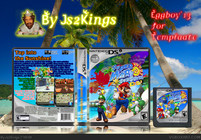
I like the cover. The layout and the integration into the template is well done. The back has a few problems that I can see. The typography is unattractive. Most of the paragraphs feel like they are squeezed in and there's not negative space to let the text breathe. I'm not very fond of the color changes in the main description. I say stick with one color and go with it. Obviously multi-colored text CAN work, but at that size and weight it just makes it hard to read.
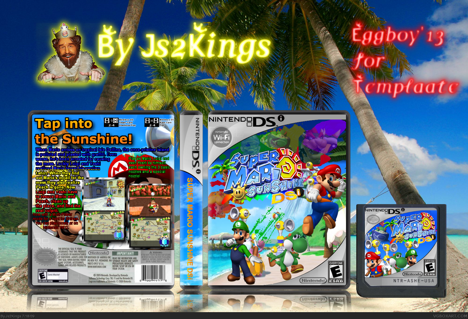
Looks better. I still feel like the typography on the back is the weakest part of the design, but I think it's an improvement over version 1. +FAV for the obvious effort you've put into this one. Keep it up!
 Super Mario Sunshine DSi Box Cover Comments
My second box using Eggboy'13's temp Since people made SMS for DS i decided to make one for DSi. I could say this my best box yet.
Template: Eggboy13 (was slightly edited by me)
Cartridge: Me (Idea by and made using Eggboy’s template)
Screen border: me
Logo: Me
Edited at 1 decade ago
[ Reply ]
Very nice, man.
[ Reply ]
I updated the front seriously why is this getting no comments or favs
[ Reply ]
Your best box yet.
But I don't like the reflection, seems to be in the air.
+Fav
[ Reply ]
Thanks i was just testing it i'll get rid of it
[ Reply ]
Is there something wrong with the box i mean 2 comments not by me, 86 views, and 6 favs also i forget to mention this is a sequel to super mario 64 ds so like that game added luigi, wario, yoshi, and multiplayer, i added luigi and yoshi to play as.
[ Reply ]
#6, There's nothing "wrong" with the box, but honestly, most Mario-themed boxes tend to look alike so unless you do something radical to make it stand out, it's likely that it won't get a ton of attention right away.
I like the cover. The layout and the integration into the template is well done. The back has a few problems that I can see. The typography is unattractive. Most of the paragraphs feel like they are squeezed in and there's not negative space to let the text breathe. I'm not very fond of the color changes in the main description. I say stick with one color and go with it. Obviously multi-colored text CAN work, but at that size and weight it just makes it hard to read.
[ Reply ]
Okay thanks for the advice
[ Reply ]
Ok I changed up the back.
[ Reply ]
Looks better. I still feel like the typography on the back is the weakest part of the design, but I think it's an improvement over version 1. +FAV for the obvious effort you've put into this one. Keep it up!
[ Reply ]