#1, watch the effort in your spelling, or get banned!
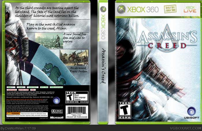
Its... ok. The spine is horrible, the front feels empty.
The back text is bad, it needs a tagline and screenborders.
That was not constructive criticism. You basically told him it sucks. Congrats bro.
Dude I think the front is tight. It blends the assassin feel with the blurriness of the memories and the animus. Very good feel. Spine could use an image, or maybe the assassin logo at the bottom? I love the front, the other 2 sections are just meh. Good job though.
 Assassin's Creed Box Cover Comments
2nd box thought i would to AC 1 cos i did 2.
Btw: i know it isnt just on xbox and live but the template didnt have any layers to delete them
P.S please veiw in full
Edited at 1 decade ago
[ Reply ]
#1, watch the effort in your spelling, or get banned!
Its... ok. The spine is horrible, the front feels empty.
The back text is bad, it needs a tagline and screenborders.
[ Reply ]
@ #2
That was not constructive criticism. You basically told him it sucks. Congrats bro.
Dude I think the front is tight. It blends the assassin feel with the blurriness of the memories and the animus. Very good feel. Spine could use an image, or maybe the assassin logo at the bottom? I love the front, the other 2 sections are just meh. Good job though.
[ Reply ]
#3, That comment was two years ago.
[ Reply ]