Very nice. Very clean. Very suspiscious. How much of this did you make/edit? It's awesome, but usually people with only one point ranks make...well, kind of bad boxes. Including I when I was at rank one.
Wow, nicely done man. I love it when fighting games have that 'striped' effect, really gives the 'versus' impression (if that makes sense!) Haven't seen much of your stuff mate, but will be on the lookout in future, again, great work.
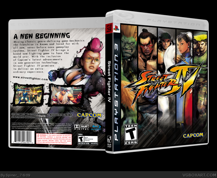
 Street Fighter IV Box Cover Comments
I think this is my best SF IV-box.
Credit to Sens for the template.
[ Reply ]
Very nice. Very clean. Very suspiscious. How much of this did you make/edit? It's awesome, but usually people with only one point ranks make...well, kind of bad boxes. Including I when I was at rank one.
[ Reply ]
Well, i think I used about 13 images/renders or something... So, I did pretty much.
Took me about 2 hours.
Edited at 1 decade ago
[ Reply ]
Good job then dude, definitely needs more attention.
[ Reply ]
The logo make me think of Mario Strikers Charged, lol.
[ Reply ]
Not docking the box in anyway, but all street fighter boxes should have Ken on the front.
good box tho. really like the front
[ Reply ]
Wow, nicely done man. I love it when fighting games have that 'striped' effect, really gives the 'versus' impression (if that makes sense!) Haven't seen much of your stuff mate, but will be on the lookout in future, again, great work.
And this box does definatly needs more attention.
[ Reply ]
front lovely back not so sure
[ Reply ]
beutiful
[ Reply ]