#8, any suggestion on what to do with the back text? Also the multi player symbol has got to stay, but I did add the text that's supposed to go with it on the printable.
#9, maybe change the font,move it near the paper thingy, turn it a bit so it's like the text on the paper. Hard to explain with this poor english of mine!
The only complaint I have is the back tagline's word "hold" doesn't look right to me, but another well improved Castlevania concept. Also, I'd like to have seen Richter somewhere in there, but definitely not necessary.
the background is distracting here too and the headline on the back is too far on the top. you should try to align it to the upper edge from the "1-4 player" icon
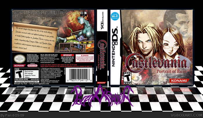
 Castlevania: Portrait of Ruin Box Cover Comments
Inspired a lot by wasa-bi's Castlevania boxes, also I just didn't like the artwork for this game.
[ Reply ]
Sweet. I love it.
[ Reply ]
I'm gone for almost 5 hours and I've gotten 1 comment? Thanks alldreamsfalldown for being the only person to actually say something about my box.
[ Reply ]
Never really played castlevania, but the box makes me want to. Its looking good =]
[ Reply ]
Great stuff Pan. I prefer this artwork myself, and your design here captures the feeling of the game a lot better than the silly official.
[ Reply ]
The front has really nice blending.
[ Reply ]
#4, You should. Castlevania is probably my second favorite series ever, most 2D games in the series are always great.
#5, Thanks, the official for this and Dawn of Sorrow(which I'm also working on)looked like an anime, that's not the look Castlevania should have.
[ Reply ]
Looks awesome but the back has some minor flaws. I'd change that "The Portraits Hold..."-text a bit and I would remove that multiplayer symbol :)
[ Reply ]
#8, any suggestion on what to do with the back text? Also the multi player symbol has got to stay, but I did add the text that's supposed to go with it on the printable.
[ Reply ]
#9, maybe change the font,move it near the paper thingy, turn it a bit so it's like the text on the paper. Hard to explain with this poor english of mine!
[ Reply ]
The only complaint I have is the back tagline's word "hold" doesn't look right to me, but another well improved Castlevania concept. Also, I'd like to have seen Richter somewhere in there, but definitely not necessary.
Edited at 1 decade ago
[ Reply ]
the background is distracting here too and the headline on the back is too far on the top. you should try to align it to the upper edge from the "1-4 player" icon
[ Reply ]
This is great. I was hoping I could find something to replace the GOD-AWFUL anime artwork for the Castlevania DS games. Great job!
[ Reply ]