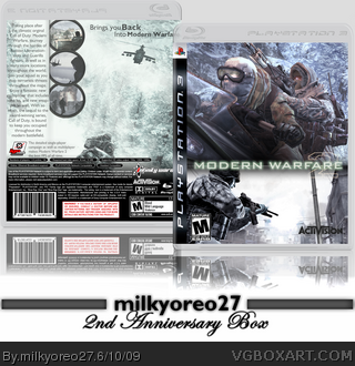
I just realized that today marks my two year anniversary on VGBoxart. I was thinking what game or movie I should post, and I finally came with Modern Warfare 2.
I like the theme that I put into this. It is a light bluish feel.. now about the back. As you might notice, the back right side looks slightly empty. I didn't know what to put there exactly, so I just left it blank. After consideration, I think I will decide to leave it blank.. just for the effect.
Credit goes to Techne for the template. Please rate and comment, Favs are always appreciated, and a cheers to my third year of VGBoxart.
Hmm, not bad, but I just feel like the green logo doesn't match with the blueish feel of the box. Maybe play with the shade of green or something, or maybe render it out (you could actually find that font on the internet and make one yourself). And I think if you maybe changed the size/arrangement of the screens that awkward blank part on the back might look better. With minor tweaks this would be really cool, because I like the cover shot a lot.
 Modern Warfare 2 Box Cover Comments
I just realized that today marks my two year anniversary on VGBoxart. I was thinking what game or movie I should post, and I finally came with Modern Warfare 2.
I like the theme that I put into this. It is a light bluish feel.. now about the back. As you might notice, the back right side looks slightly empty. I didn't know what to put there exactly, so I just left it blank. After consideration, I think I will decide to leave it blank.. just for the effect.
Credit goes to Techne for the template. Please rate and comment, Favs are always appreciated, and a cheers to my third year of VGBoxart.
Please view in full.
Edited at 1 decade ago
[ Reply ]
Hmm, not bad, but I just feel like the green logo doesn't match with the blueish feel of the box. Maybe play with the shade of green or something, or maybe render it out (you could actually find that font on the internet and make one yourself). And I think if you maybe changed the size/arrangement of the screens that awkward blank part on the back might look better. With minor tweaks this would be really cool, because I like the cover shot a lot.
[ Reply ]
Back is not bad, but I don't like the front. Try blending the images together and make a logo stand-out more.
[ Reply ]
could u make a printable version ?
[ Reply ]