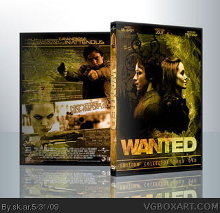
a lot of covers were already made for this one, this is what i've done for a cover duel (that is now running).
it looks blurry ou dusty, it's because of the texture applied, looks better in full res, that will come later...
Hmmm, okay here's an issue I noticed-the text in the Special Features section is difficult to read due to color issues. The picture of Wesley on the back actually made me laugh because of his facial expression.
If the info was in English I would want to put this on my Wanted DVD's cover.
Well here are some tips:
The names of the actors should be on all black and the background shouldn't go over them.
I'm not a fan of the textured pattern on the actual faces, it's okay on the background.
I don't like the way Wesley and Fox cut off before the logo.
The tagline is too long and doesn't stand out enough.
The supposed screenshot on the back doesn't make sense.
The bullets are a little thin and long.
The characters on the front are out of proportion.
It's well made but with alot of flaws. I don't like it at all but that is not to say it isn't a very good box.
#2, i've done shadow on full res version for the features. And about the face you are right, makes me also smile.. and this is why i keep it
#4 i think it's the idea of the textile message, mistake on the textile makes 0 an 1, then it gives bianry, and then names
#5 1) he names of the actors should be on all black and the background shouldn't go over them: it's unofficial, i don't think that really matters
2)The tagline is too long and doesn't stand out enough: it's not really a tagline, it's more an info about the film, tagline is in the supposed screenshot area
3) bullets: they are like that, not my choice. as they split in three parts it have to be long
4) what do you mean they are out of proportion? may be it's only the 3D view that makes you think so, i always take care of proportions!
Thanks for those comments, i'll correct what have to be
#7, 1) It should matter if you want to go anywhere.
2) My mistake but still seems weird.
3) You could easily shorten them and yet keep them realistic.
4) A little to thin and unrealistic. They do not look right.
#4, What sk.ar said was right, the 1's and 0's are the code that the Fraternity uses to determine their targets and is found by examining the cloth that the Loom of Fate produces.
#10, It should matter if sk.ar wants to go anywhere? It looked fine. Your idea of changing up the actors names and tagline are your personal preference, nothing more. And as he mentioned, the bullets are special bullets designed for the movie that split apart as they go through the air so the remains left behind cannot be traced by others.
Like I said before, I think this box is excellent.
EDIT: I can't believe I missed the Goodbye bullet on the spine! Nice touch!
#15, No problem! I thought coolguy was getting upset for little issues that were a matter of personal preference, not rules that were set in stone, which he made the one about the actor's names sound like that.
I'm sure you could have taken care of it yourself, but I was frustrated that people didn't understand what you were going for.
I like this a lot. Loved the movie, and love this box. The front is highly original.
I'm gonna be honest here, coolguy. I think you shouldn't spend so much time critiquing other peoples work and start improving on your skills. I'm not saying you have no right to, but I feel that if you can put so much effort into critiquing other peoples boxes, you should be able to improve your own skills tenfold.
#17, I worded it wrongly,it was my personal preference and I did sound overly harsh. I did not mean to unrealisticly attack the box,it's nicely made, just not to my taste.
#18, I understand what you mean. I do try with my boxarts and I have a wip which so far I have put alot of effort into and often my wording makes it look like I am attacking the box and sounds overly harsh. I didn't mean to do that, the box obviously took alot of effort and is great but I personally don't like it. So, I am genuinely sorry.
 Wanted Box Cover Comments
hello!!
a lot of covers were already made for this one, this is what i've done for a cover duel (that is now running).
it looks blurry ou dusty, it's because of the texture applied, looks better in full res, that will come later...
bye bye
[ Reply ]
Hmmm, okay here's an issue I noticed-the text in the Special Features section is difficult to read due to color issues. The picture of Wesley on the back actually made me laugh because of his facial expression.
If the info was in English I would want to put this on my Wanted DVD's cover.
The colors are excellent.
[ Reply ]
Lord.
[ Reply ]
#2, I was thinking the same about his face :D
Overall good box, i'm not sure why you've got the ones and zeros on there though.
[ Reply ]
Well here are some tips:
The names of the actors should be on all black and the background shouldn't go over them.
I'm not a fan of the textured pattern on the actual faces, it's okay on the background.
I don't like the way Wesley and Fox cut off before the logo.
The tagline is too long and doesn't stand out enough.
The supposed screenshot on the back doesn't make sense.
The bullets are a little thin and long.
The characters on the front are out of proportion.
It's well made but with alot of flaws. I don't like it at all but that is not to say it isn't a very good box.
[ Reply ]
That face on the back made me lol.
ALSO THIS IS AWESOME.
[ Reply ]
#2, i've done shadow on full res version for the features. And about the face you are right, makes me also smile.. and this is why i keep it
#4 i think it's the idea of the textile message, mistake on the textile makes 0 an 1, then it gives bianry, and then names
#5 1) he names of the actors should be on all black and the background shouldn't go over them: it's unofficial, i don't think that really matters
2)The tagline is too long and doesn't stand out enough: it's not really a tagline, it's more an info about the film, tagline is in the supposed screenshot area
3) bullets: they are like that, not my choice. as they split in three parts it have to be long
4) what do you mean they are out of proportion? may be it's only the 3D view that makes you think so, i always take care of proportions!
Thanks for those comments, i'll correct what have to be
link
[ Reply ]
Here my versions for PS3:
link
link
Greetings!
[ Reply ]
#8, thanks for the comment???
[ Reply ]
#7, 1) It should matter if you want to go anywhere.
2) My mistake but still seems weird.
3) You could easily shorten them and yet keep them realistic.
4) A little to thin and unrealistic. They do not look right.
[ Reply ]
#10, 3) it's realistic according to what was made for the movie, not real bullets
some others modified
link
[ Reply ]
#4, What sk.ar said was right, the 1's and 0's are the code that the Fraternity uses to determine their targets and is found by examining the cloth that the Loom of Fate produces.
#10, It should matter if sk.ar wants to go anywhere? It looked fine. Your idea of changing up the actors names and tagline are your personal preference, nothing more. And as he mentioned, the bullets are special bullets designed for the movie that split apart as they go through the air so the remains left behind cannot be traced by others.
Like I said before, I think this box is excellent.
EDIT: I can't believe I missed the Goodbye bullet on the spine! Nice touch!
Edited at 1 decade ago
[ Reply ]
Could you upload the printable? Good work.
[ Reply ]
#7, Ah, i had forgotten about that. its like it was a big part of the plot but it wasn't even important.
[ Reply ]
#13, printable added
and thx Tleeart for your comments...
[ Reply ]
#15, Thanks for the printable.
[ Reply ]
#15, No problem! I thought coolguy was getting upset for little issues that were a matter of personal preference, not rules that were set in stone, which he made the one about the actor's names sound like that.
I'm sure you could have taken care of it yourself, but I was frustrated that people didn't understand what you were going for.
[ Reply ]
I like this a lot. Loved the movie, and love this box. The front is highly original.
I'm gonna be honest here, coolguy. I think you shouldn't spend so much time critiquing other peoples work and start improving on your skills. I'm not saying you have no right to, but I feel that if you can put so much effort into critiquing other peoples boxes, you should be able to improve your own skills tenfold.
[ Reply ]
#17, I worded it wrongly,it was my personal preference and I did sound overly harsh. I did not mean to unrealisticly attack the box,it's nicely made, just not to my taste.
#18, I understand what you mean. I do try with my boxarts and I have a wip which so far I have put alot of effort into and often my wording makes it look like I am attacking the box and sounds overly harsh. I didn't mean to do that, the box obviously took alot of effort and is great but I personally don't like it. So, I am genuinely sorry.
[ Reply ]
Where did you get those two pictures of the two characters on the front?
[ Reply ]
#20, it's one pic found on a forum about the guy, don't ask the name of it, it's only luck and some hours looking for the fitting one
here it is: link
sorry for my late answer
[ Reply ]