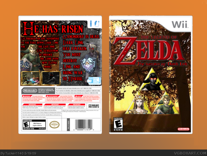
Hey guys! Made a new box. This one has 2 perspectives (Like Sonic Adventure 2: Battle), I thought it would be cool to do that. Ummm..... I've noticed 1 mistake. I'll update it and add an easter egg soon.
#1, Beat me!
Credits:
Temp: Techne
Logo: Me
Renders: Zelda Wiki
Triforce: Zelda Wiki
Screen Borders: LK
ESRB/Dev: Attached to temp.
Screenshots: Google.
Well, a word of advice, NEVER use the logo font for the back's description unless it works well, in this case it does but try to avoid it next time ;)
The back could do with a little more blending and I don't like the front. I don't like the way the people are in the triforce, maybe take that away and then put some real renders there but make them fit in?
 The Legend of Zelda: The Return of Dark Link Box Cover Comments
Nice, you have improved, but the backs background could use some blending. And the front is plain.
[ Reply ]
Hey guys! Made a new box. This one has 2 perspectives (Like Sonic Adventure 2: Battle), I thought it would be cool to do that. Ummm..... I've noticed 1 mistake. I'll update it and add an easter egg soon.
#1, Beat me!
Credits:
Temp: Techne
Logo: Me
Renders: Zelda Wiki
Triforce: Zelda Wiki
Screen Borders: LK
ESRB/Dev: Attached to temp.
Screenshots: Google.
It took about 2 hours to make.
Enjoy!
Edited at 1 decade ago
[ Reply ]
Ah nice Tucker, nice. I'm in agreeance with RoarShark, but i must also admit i like your idea behing the 'split' background.
[ Reply ]
i agree with what he's agreeing with cuz i like agreeing ^^
and because they're right :)
[ Reply ]
Thanks guys! What do you think I should add to the front?
[ Reply ]
#5, I'm not sure, but I agree with the others - it's good - ish, but the front seems to be missing something, I'm just not too sure what.
Edited at 1 decade ago
[ Reply ]
This would be a great game. Nice execution. But "The Legend of" is a little hard to read. I like it, though. 4.8/5!!!
[ Reply ]
#7, Why thank you, kind sir.
[ Reply ]
Well, a word of advice, NEVER use the logo font for the back's description unless it works well, in this case it does but try to avoid it next time ;)
The back could do with a little more blending and I don't like the front. I don't like the way the people are in the triforce, maybe take that away and then put some real renders there but make them fit in?
Axel
[ Reply ]
Is the font you found on the front's logo named Ravenna?
Because if so you haven't credited me for finding it. It was really hard you know.
[ Reply ]
good box i will fave
[ Reply ]