This was the box I was going to submit instead of SatBK, but that changed, because I beat the game (100%) and decided to celebrate, I have 5 WIP's right now, and they are:
1. Viewtiful Joe 2
2. SSBB (With Eggboy)
3. N:UN:S
4. SSB
...aaaaaaaaaaaaaand
5. Zelda: Ocarina of Time Master Quest.
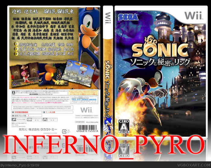
Credit to Techne for the front and spine.
For me, the back's blurb really turns me off.I can see its just a Jap font, which doesn't really bother me, but the colouring is a little bizzar. Also, a few renders on the back would go pretty good too in my opinion. The backs just a bit bare thats all, everything else seems to be fine (temp, logos, front) just the back.
I would fav, but the back doesn't do it for me. If you can get some renders on the back and change the colours of the text blurb, i'll more than likely fav it. Otherwise, nice stuff.
 Sonikku to Himitsu no Ringu Box Cover Comments
This was the box I was going to submit instead of SatBK, but that changed, because I beat the game (100%) and decided to celebrate, I have 5 WIP's right now, and they are:
1. Viewtiful Joe 2
2. SSBB (With Eggboy)
3. N:UN:S
4. SSB
...aaaaaaaaaaaaaand
5. Zelda: Ocarina of Time Master Quest.
Credit to Techne for the front and spine.
[ Reply ]
Doesn't the actual logo say 'Sonic and the Secret Rings'
[ Reply ]
#2, I don't know, I'm using Wikipedia, and it's how the Japanese pronounce it without saying it in english.
Edited at 1 decade ago
[ Reply ]
#3, No, I mean, you named the box: Sonikku to Himitsu no Ringu
But the logo is the Japanese Secret Rings logo.
[ Reply ]
#4, I know. Anything else not about the actual box?
[ Reply ]
#5, Not bad.
[ Reply ]
#6, no fav? I fa ur bawckz... :(
[ Reply ]
#7, It's not bad... delete the back and I'll fav.
[ Reply ]
#8, uh huh... no. The back stays. What's one fav anyways?
[ Reply ]
#9, Shame, that front is HoF worthy, however, the back ruins it.
[ Reply ]
#10, so? My back ruins my almost perfect torso.
[ Reply ]
I love the front, but I think the back needs more.
[ Reply ]
Those screenshots look choppy! Oh wait, It's the wii.... (xD)
Box is great, man. Back is a bit, bland.
[ Reply ]
#11, Indeed, deleting it will help with favs.
[ Reply ]
#14, I don't care about favs or comments. Your looking at my box. That's enough for me.
[ Reply ]
#15, I dont know how to react to that sentence... How inconsiderate.
[ Reply ]
I don't know why, but I really am in love with this, tought the color choice for the back text could be better. faved none the less!
[ Reply ]
#16, um, whatever.
#17, thanks.
Edited at 1 decade ago
[ Reply ]
#10, UH, no, the fronts great but not HoF.
[ Reply ]
For me, the back's blurb really turns me off.I can see its just a Jap font, which doesn't really bother me, but the colouring is a little bizzar. Also, a few renders on the back would go pretty good too in my opinion. The backs just a bit bare thats all, everything else seems to be fine (temp, logos, front) just the back.
I would fav, but the back doesn't do it for me. If you can get some renders on the back and change the colours of the text blurb, i'll more than likely fav it. Otherwise, nice stuff.
[ Reply ]
Everybody's going apeshit over the back, so I fixed it.
[ Reply ]
Not bad, your name is way too big and distracting.
[ Reply ]
#10, Look at the back of your last Sonic box... be more constructive. It seems like your just bashing.
I agree with Electric General, lol.
Edited at 1 decade ago
[ Reply ]
#7, NO.
That's an awful way to get fav's.
[ Reply ]
#24, I was kidding.
[ Reply ]
amazazazing!
[ Reply ]