Not so bad..The one thing I really hate is the tagline on the back. It's just too simple and boring. Change the font, change the color, make it more stand out and more "tahline'ish". Also, you could make spine more interesting too.
It's not bad but you should have requested a logo and try and find a more official logo for the game. The back is a good start but I think you should try and color outside the lines if that makes sense.
I dont think they would make the Modern Warfare box look like the first one cause that would give a bad impression of the game saying that its going to be the same as the first one and we didnt change anything.
 Modern Warfare 2 Box Cover Comments
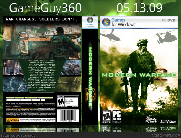
Not my best box but i think it looks ok. Comments are welcome :D
[ Reply ]
Not so bad..The one thing I really hate is the tagline on the back. It's just too simple and boring. Change the font, change the color, make it more stand out and more "tahline'ish". Also, you could make spine more interesting too.
- dE -
[ Reply ]
It's not bad but you should have requested a logo and try and find a more official logo for the game. The back is a good start but I think you should try and color outside the lines if that makes sense.
[ Reply ]
I really like the front. But the back, not so much.
3/5
[ Reply ]
thanks for the feedback guys. yeah i'm not so proud of the back, if i get time i'll try to remake it and be more creative with it.
[ Reply ]
Amazing! Looks very professional!
[ Reply ]
I dont think they would make the Modern Warfare box look like the first one cause that would give a bad impression of the game saying that its going to be the same as the first one and we didnt change anything.
[ Reply ]
THANKS
[ Reply ]