[ Buy Super Smash ... at Amazon ] By jayhog 20 on May 10th, 2009 No Printable Available Super Smash Bros. Annihilation Box Cover Comments Comment on jayhog's Super Smash Bros. Annihilation Box Art / Cover. Cancel Reply jayhog 20 [ 1 decade ago ] I think I can say this is officially my best box to date. Credit to: Kracker624 for the template Google images for the images (I dont know the websites that they're from) Hope you all like it, it took me from 12.30pm until 9pm and i put a lot of effort into this box. Is it good enough? [ Reply ] nothing94 35 [ 1 decade ago ] The front is nice, the back is very boring. [ Reply ] Cerium 43 [ 1 decade ago ] I dislike the focus on Sonic characters on the front, considering this game is primarily about Nintendo. [ Reply ] jayhog 20 [ 1 decade ago ] I added the Sonic characters because I thought it would be a good idea to have more than just one of them [ Reply ] jayhog 20 [ 1 decade ago ] #2, Could you tell me how i could improve the back? [ Reply ] HalfSwiss 43 [ 1 decade ago ] #3, wow. [ Reply ] Bbbbbbbb126 1 [ 1 decade ago ] the back is nice and the front has too many sega characters on it maybe just keep shadow and sonic and tails the rest have to go [ Reply ] stephen12693 1 [ 1 decade ago ] #3, Def agreed. The box has too much red. 2/5 [ Reply ] stimpyrules 1 [ 1 decade ago ] I don't like the color scheme. 2.5/5 [ Reply ] jayhog 20 [ 1 decade ago ] Thanks for the comments, ill update soon [ Reply ]
 Super Smash Bros. Annihilation Box Cover Comments
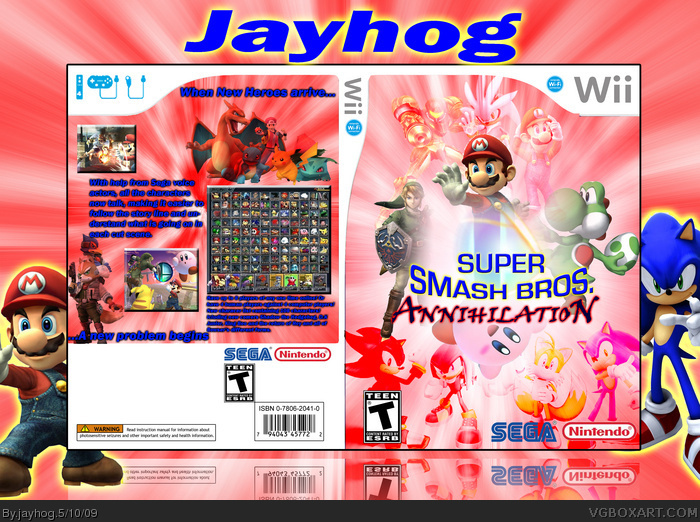
I think I can say this is officially my best box to date.
Credit to:
Kracker624 for the template
Google images for the images (I dont know the websites that they're from)
Hope you all like it, it took me from 12.30pm until 9pm and i put a lot of effort into this box.
Is it good enough?
[ Reply ]
The front is nice, the back is very boring.
[ Reply ]
I dislike the focus on Sonic characters on the front, considering this game is primarily about Nintendo.
[ Reply ]
I added the Sonic characters because I thought it would be a good idea to have more than just one of them
[ Reply ]
#2, Could you tell me how i could improve the back?
[ Reply ]
#3, wow.
[ Reply ]
the back is nice and the front has too many sega characters on it maybe just keep shadow and sonic and tails the rest have to go
[ Reply ]
#3, Def agreed.
The box has too much red.
2/5
[ Reply ]
I don't like the color scheme. 2.5/5
[ Reply ]
Thanks for the comments, ill update soon
[ Reply ]