New box. I really hope that this can get more attention than my last few, because I am sick of putting alot of effort into a box, and then having it get ignored. Anyways, hope you like it.
Sorry, but this looks a bit awkward, especially for your rank (7!). The front looks uninspired and has a bad composition (just 2 picutres!), the back looks plein. sorry :( 5.2/10
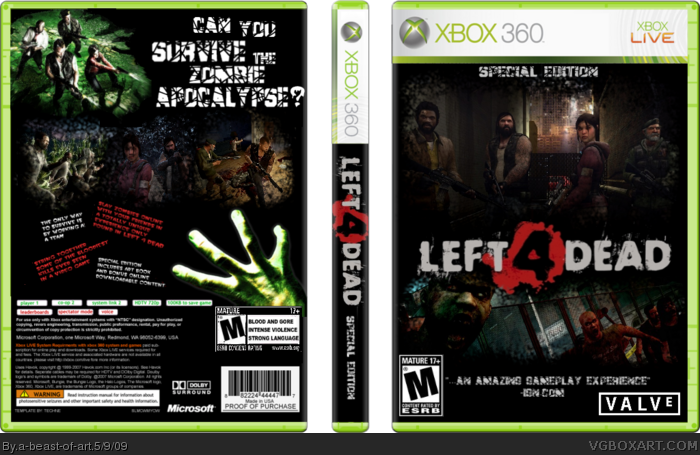
#4, It's a special edition, so I was trying to go for a minimalistic feel, and the way you talked about the front made it sound like I just took 2 pictures and slapped them onto a temp, these are blended in with the black. The back I didn't think looked plain. 2 renders, 3 screens, 4 text descriptions, and a tagline. This WAS NOT a lazy box. I put alot of effort into this, but nevertheless, thanks for your opionion.
#6, what is that supposed to mean?!?!? I worked really hard on this, and I guess on this site you get critized whenever your design is simple. I was in no way trying to be lazy on this box.
Odd. I actually fealt the need to register JUST to comment on this. Please, learn to take constructive criticism. The front cover isn't interesting, and no, it's not just because it's 'Simple'. Eventually people will learn that simple doesn't have to be boring ; anywho. The "Left4Dead" text on the front isn't centered as it should be, the front does look relatively like 2 pictures and some text, albeit blended in, it really needs something extra to actually make it interesting and give it a bit of oomph.
The back is also un-inspired, and needs something extra, primarily a background of some form and then...something. At the moment it is essentially pictures and text, regardless of how you view it, i'm not denying you might have put a lot of work in it, simply saying it needs more work. Also, considering you created this box-art recently, I think using a character in one of the images who isn't even in the game any more might not have been the best idea.
 Left 4 Dead Box Cover Comments
New box. I really hope that this can get more attention than my last few, because I am sick of putting alot of effort into a box, and then having it get ignored. Anyways, hope you like it.
[ Reply ]
That is awesome. 5/5 + fav.
[ Reply ]
Nice box.
[ Reply ]
Sorry, but this looks a bit awkward, especially for your rank (7!). The front looks uninspired and has a bad composition (just 2 picutres!), the back looks plein. sorry :( 5.2/10
[ Reply ]
#4, It's a special edition, so I was trying to go for a minimalistic feel, and the way you talked about the front made it sound like I just took 2 pictures and slapped them onto a temp, these are blended in with the black. The back I didn't think looked plain. 2 renders, 3 screens, 4 text descriptions, and a tagline. This WAS NOT a lazy box. I put alot of effort into this, but nevertheless, thanks for your opionion.
[ Reply ]
#5, ah yes, the ol' special edition excuse.
[ Reply ]
#6, what is that supposed to mean?!?!? I worked really hard on this, and I guess on this site you get critized whenever your design is simple. I was in no way trying to be lazy on this box.
[ Reply ]
#7, "I guess on this site you get critized whenever your design is simple."
Sadly this has some truth to it, good box.
[ Reply ]
#4, I think it looks plain because of the missing background.
[ Reply ]
It needs a background. I'll fav anyway.
[ Reply ]
#9, That gives more of the horror aspect.
I really like this one,the atmosphere is done well and it is blended well.
[ Reply ]
Odd. I actually fealt the need to register JUST to comment on this. Please, learn to take constructive criticism. The front cover isn't interesting, and no, it's not just because it's 'Simple'. Eventually people will learn that simple doesn't have to be boring ; anywho. The "Left4Dead" text on the front isn't centered as it should be, the front does look relatively like 2 pictures and some text, albeit blended in, it really needs something extra to actually make it interesting and give it a bit of oomph.
The back is also un-inspired, and needs something extra, primarily a background of some form and then...something. At the moment it is essentially pictures and text, regardless of how you view it, i'm not denying you might have put a lot of work in it, simply saying it needs more work. Also, considering you created this box-art recently, I think using a character in one of the images who isn't even in the game any more might not have been the best idea.
[ Reply ]
the desing is simple and good but the title shoudn't be placed from the center down and the back neads a background
[ Reply ]