[ Box updated on May 7th, 2009 ] [ original ]
 Metal Gear Solid 2: Sons of Liberty Box Cover Comments
Comment on Silent Oblivion's Metal Gear Solid 2: Sons of Liberty Box Art / Cover.
[ Box updated on May 7th, 2009 ] [ original ]
Comment on Silent Oblivion's Metal Gear Solid 2: Sons of Liberty Box Art / Cover.
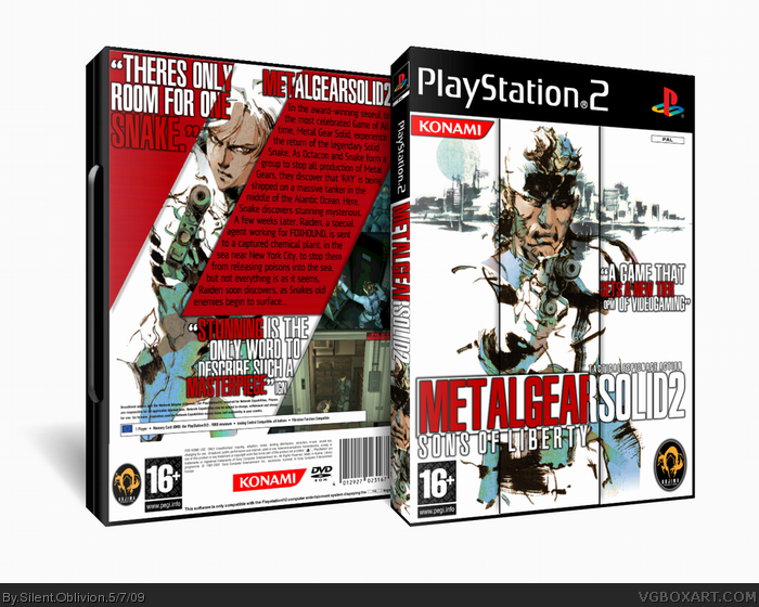
Ka-pow.
New box, originally just a 3D test, but I got into it and have wanted to do a MGS box for a while.
C&C as usual!
Enjoys!
Also, printable up for the first time, which I will be using from now on =)
[ Reply ]
Whoa, this is really cool, man. Nice job. :)
[ Reply ]
I like it but where are the ratings?
[ Reply ]
#3 - Well, um *coughs* they are invisible to.. um.. match and stuff
EDIT:
Updated =P
Edited at 1 decade ago
[ Reply ]
*drops chopsticks* Amazing +Fav * Starts eating noodles again* ;D
[ Reply ]
amazing! only problems i see are ESRB on Pal and the PSN info(wasnt on MGS2) but still amazing! fav!
[ Reply ]
Pretty sweet.
[ Reply ]
Very nice! I love the setup of the back. Fav
[ Reply ]
an interresting cover, i really like the work done on the typo and the details... the only things that disturbs me is the difference between characters textures and global red texturing, let me explain, characters are like painted and the red colors (mostly) is too clean, adding a bit noise or somekind texture can soften the red colors and make eveything "flat" like one piece... but it's only my point of view
Edited at 1 decade ago
[ Reply ]
nice, looks official +FAV
[ Reply ]
#9 - I'll update with your ideas =)
[ Reply ]
All I can say is this is awesome. +fav.
[ Reply ]
#6, Same issues I had, but this is very nice.
Experimental with the placement of the rating and Kojima logo and the text effects, very sleek design.
[ Reply ]
You've earned my fave.
However, I there was no ESRB or Net Play on the cover. So fixing them up would be right
[ Reply ]
Very visually appealing sir. Nice flow and balance.
[ Reply ]
Great design!
[ Reply ]
It's a shame. This is a wonderfully done box. The back especially, but the netplay and logos floating towards the top really degrade its quality, and quotations on the cover is something I've always loathed.
[ Reply ]
Wow, thanks for all the comments, favs and critques!
I'll update the template, and fix all the issues.
Should I put the ESRB at the bottum, along with the Developer logos?
[ Reply ]
Updated!
Template fix, dev and ratings fixed.
[ Reply ]
it seems better this way, congrats!!
[ Reply ]
WHAAAAAAAAAAT!? NO HALL!?!??!!?!!?!!?
People, you know what to do!
[ Reply ]