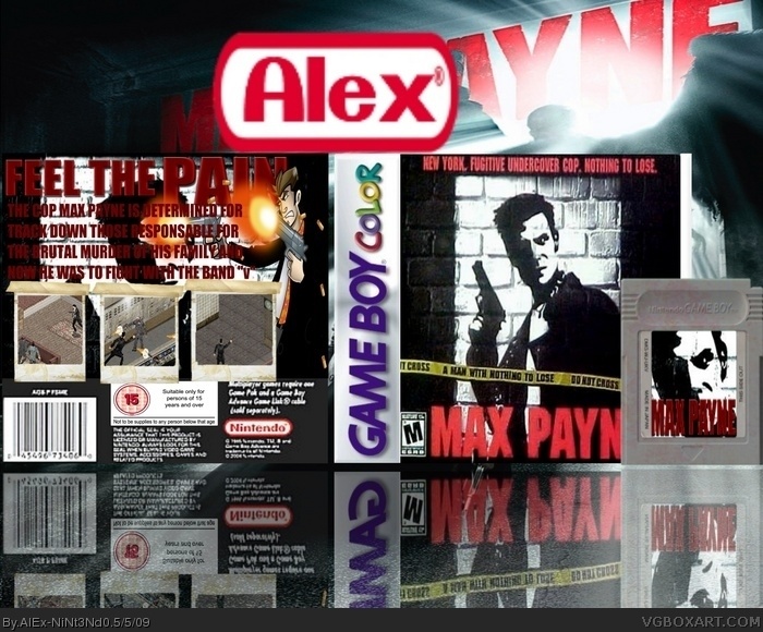
I would change the color of the back text, and make sure it doesn't flow onto the back character. The screenshots are good, but I would add a little something about each one on the space below. Also, I would say that you should keep consistent with your art style for the front, back, and cartridge. So, if you want the art style of the front, you're going to have to replace the character on the back. If you work on some of those things it should turn out nice.
the front is the official logo and the back sucks (I know I'm not supposed to cuz' it's a comment rule and I tought you're an old member and YOU SHOULD KNOW THIS!!!).
 Max Payne Box Cover Comments
Yep my max payne box
Temp By me XD
[ Reply ]
I would change the color of the back text, and make sure it doesn't flow onto the back character. The screenshots are good, but I would add a little something about each one on the space below. Also, I would say that you should keep consistent with your art style for the front, back, and cartridge. So, if you want the art style of the front, you're going to have to replace the character on the back. If you work on some of those things it should turn out nice.
Edited at 1 decade ago
[ Reply ]
#2, hmmm i'll try to work on the back
[ Reply ]
At first i thought "Cooool!!!", when i saw it on the front page, but after i saw the back, im like: Ewwwwww....
[ Reply ]
arent they my screen borders?
[ Reply ]
the front is the official logo and the back sucks (I know I'm not supposed to cuz' it's a comment rule and I tought you're an old member and YOU SHOULD KNOW THIS!!!).
[ Reply ]