The back feels too empty. For one thing, the tagline should stand out more. I don't know why, but I don't like the circle screenshot borders or the way they are positioned. The front is good. So overall it's a nice box. :)
Umm.... I love your work but this isnt up to your par at all. The front is lifeless and boring... maybe some sort of starry effect behind the characters would have been awesome. The layout of the characters are awesome but it just feels flat, it also feels like a replica of E_G's. It's not really creative... The back is almost similiar to his as well. It just feels kinda noobish. Sorry Numero love your stuff but you can do waaaaaay better. Also think of your own ideas.
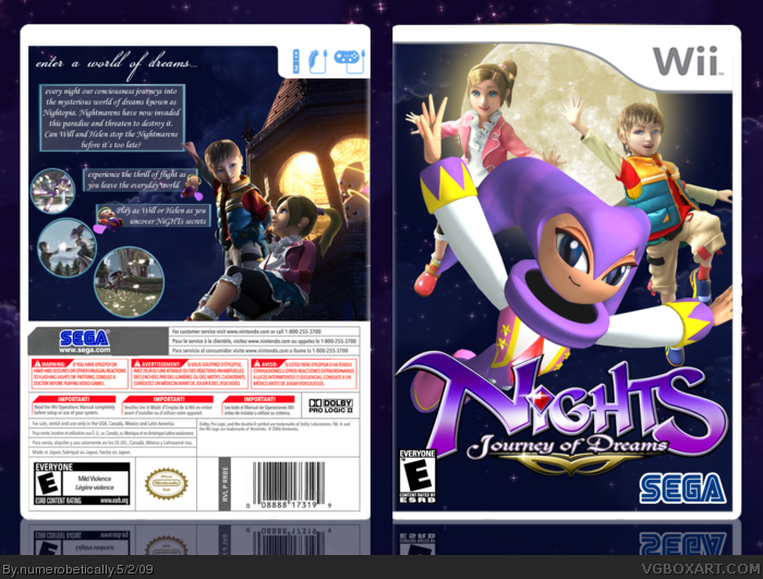
 Nights: Journey Of Dreams Box Cover Comments
Um... I don't know. I just felt like making it.
[ Reply ]
I love you!
[ Reply ]
The back feels too empty. For one thing, the tagline should stand out more. I don't know why, but I don't like the circle screenshot borders or the way they are positioned. The front is good. So overall it's a nice box. :)
Edited at 1 decade ago
[ Reply ]
#2
...
Don't you love me too?
#3
I agree the back is to empty. I suggest to make the font and boxes a little bigger. Great job though numberotically, impressive as ussual! 4.5/5
[ Reply ]
It looks good and all, but feels a bit empty.
[ Reply ]
You got the feel of the game, the only thing I do not like is that you used the wrong design for Nights, still I'll fav it.
[ Reply ]
Umm.... I love your work but this isnt up to your par at all. The front is lifeless and boring... maybe some sort of starry effect behind the characters would have been awesome. The layout of the characters are awesome but it just feels flat, it also feels like a replica of E_G's. It's not really creative... The back is almost similiar to his as well. It just feels kinda noobish. Sorry Numero love your stuff but you can do waaaaaay better. Also think of your own ideas.
[ Reply ]