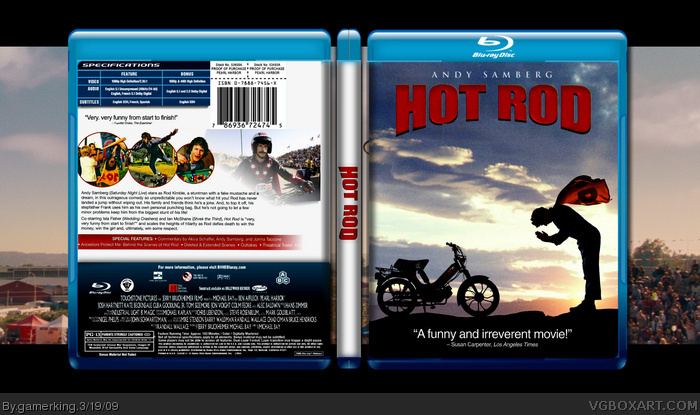
I like the emotion the front captures, but the back falls short with the exclusion of the sky background. I really think it should have carried over, even if faded into a white background. The sidebar is also very plain.
Hey, happy 100th my man! I love, never seen nor heard of the movie but it looks pretty good, i'll try to track it down. In the mean time, i agree with Rayblade on a few things but just have to fav it! Great work mate!
But, I'd change some of these things:
The size of the "ISBN" logo, and maybe change the sharpness of the main picture on the back (maybe not, because that might look fine on my computer at home).
Otherwise, pretty nice job!
I would like to update this later but i'm not sure what to do. any suggestions?...anyone?...anyone?...bueller? :P
----------------------------------------
oh and this is now my 99th cause i just deleted an old box, but it's still technically my 100th. xD
 Hot Rod Box Cover Comments
Make a twister box
[ Reply ]
my 100th box!!! YAY!!!!!!!!!!
i LOVE this movie, so i made a nice little box for it. :P
credit to Sentry for the template
Edited at 1 decade ago
[ Reply ]
The back is very nice!
[ Reply ]
I agree with SilentMan that back is awesome, Great job on your 100th! Fav
[ Reply ]
ive never heard of this movie. but cool box though.
[ Reply ]
thanks guys. :)
[ Reply ]
NOt your best, but its still good. Good job man..
[ Reply ]
yeah i know. i just wanted to get that 100th box in there. :P
[ Reply ]
I agree not your best, but still good.
[ Reply ]
I like the emotion the front captures, but the back falls short with the exclusion of the sky background. I really think it should have carried over, even if faded into a white background. The sidebar is also very plain.
BTW Happy 100th!
[ Reply ]
Hey, happy 100th my man! I love, never seen nor heard of the movie but it looks pretty good, i'll try to track it down. In the mean time, i agree with Rayblade on a few things but just have to fav it! Great work mate!
[ Reply ]
Looks really good, my only gripe is the quality of it seems a bit grainy.
[ Reply ]
I think it's pretty nice!
But, I'd change some of these things:
The size of the "ISBN" logo, and maybe change the sharpness of the main picture on the back (maybe not, because that might look fine on my computer at home).
Otherwise, pretty nice job!
[ Reply ]
well that's the way it was with the template, but i guess i can shrink it down a bit. :)
[ Reply ]
100 boxes wow nice really good not seen this movie yet............:P
[ Reply ]
i loved this movie!
[ Reply ]
thanks guys. :)
[ Reply ]
i hate you and pan for getting master-chief-rocks-halo banned, but i'm still gonna fav
Edited at 1 decade ago
[ Reply ]
i loved this espicaily because it's my nick name lol.... but the boxart is pretty good. 5 out of 5
[ Reply ]
#18:....umm....okay then. o_____O
and thanks Rod. :)
I would like to update this later but i'm not sure what to do. any suggestions?...anyone?...anyone?...bueller? :P
----------------------------------------
oh and this is now my 99th cause i just deleted an old box, but it's still technically my 100th. xD
Edited at 1 decade ago
[ Reply ]
Joe, the back is sensational man. Incredible! Congrats on the 100th box!!!
[ Reply ]
#21, I actually like the front better.
[ Reply ]
Decent box, but not your best. Still worth a fav though
[ Reply ]
The front image makes a for a really good cover, and the the back in particular really shows that you've come a long way with your designs.
I hated this movie by the way.
Edited at 1 decade ago
[ Reply ]
thanks guys.
and WHAT!? this movie was awesome Joel! lol
[ Reply ]
COOOOOOL BEEEAAAAAAANNNNSSSS!!! xD (good job joe!)
[ Reply ]
Decent but nice.
[ Reply ]
Front is nice, the back just feels kinda like everything's floating.
Never saw this movie, it looked stupid when I heard about it. *shrugs*
[ Reply ]