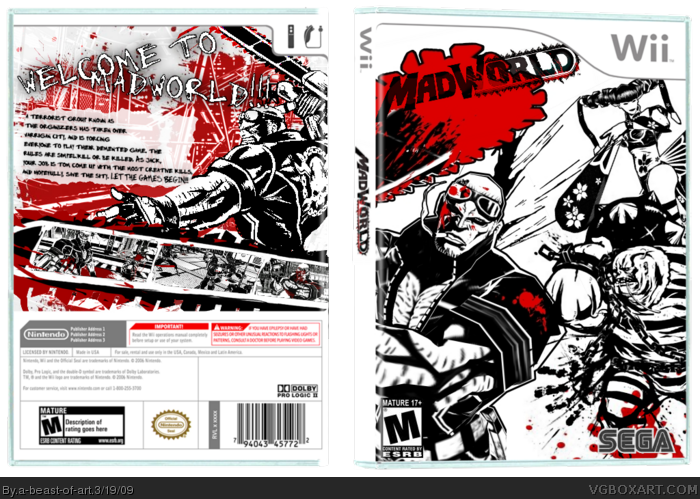
Okay, I LOVE the art style for this game, and I love how it is so stylized and cool, and I tried to capture that in this box art. I don't know who made the blood splatter that I used as a red filter on the back, but credit to them (I don't think it's from this site). I hope you like it as much as I do. Enjoy!
Absolutely gorgeous. The tagline on the back doesn't really resemble the theme of the game, it seems very dark the way you made it, but nonetheless, great box. Your getting much better. I'm also in the midst of finishing my MadWorld box. I thought, "What the hey?", and worked on one. Almost done, I may submit it tonight or tomorrow.
It's nice, but low quality. I really liked the back, but then I realized how choppy the Jack was and the tagline. As for the front, eh... just doesn't feel right.
But if you fix up the back, I mkight fav, because that looks really nice at first glance.
 Mad World Box Cover Comments
Okay, I LOVE the art style for this game, and I love how it is so stylized and cool, and I tried to capture that in this box art. I don't know who made the blood splatter that I used as a red filter on the back, but credit to them (I don't think it's from this site). I hope you like it as much as I do. Enjoy!
[ Reply ]
Whats with all the mad world boxes at least they are all good including this one Well done mate
[ Reply ]
Absolutely gorgeous. The tagline on the back doesn't really resemble the theme of the game, it seems very dark the way you made it, but nonetheless, great box. Your getting much better. I'm also in the midst of finishing my MadWorld box. I thought, "What the hey?", and worked on one. Almost done, I may submit it tonight or tomorrow.
Great job mate.
[ Reply ]
Thanks for the feedback guys!
[ Reply ]
It's nice, but low quality. I really liked the back, but then I realized how choppy the Jack was and the tagline. As for the front, eh... just doesn't feel right.
But if you fix up the back, I mkight fav, because that looks really nice at first glance.
[ Reply ]
#5, I can see what you mean about Jack, but I meant for the tagline to be like that. And what exactly don't you like about the front?
[ Reply ]
#6, on the front, it just... doesn't look right. And you should move the logo.
[ Reply ]