[ Buy Dirge of Cer... at Amazon ] By dark_rage00 9 on February 28th, 2009 No Printable Available Dirge of Cerberus - Final Fantasy VII Box Cover Comments Comment on dark_rage00's Dirge of Cerberus - Final Fantasy VII Box Art / Cover. Cancel Reply dark_rage00 9 [ 1 decade ago ] Well, this is my seventeenth box. Comments and tips appreciated. Credit to Rasengan_Boi for the wicked WII template and the image borders used on the screenshots. Peace, D_R [ Reply ] Blazyx 17 [ 1 decade ago ] The front looks awesome! +fav [ Reply ] dark_rage00 9 [ 1 decade ago ] #2, thanks! [ Reply ] Airwalker 18 [ 1 decade ago ] Woah, too red! You might want to put this in the critique forums first because this looks effortless Edited at 1 decade ago [ Reply ] afifan000 44 [ 1 decade ago ] Nice job here, though the back is a bit plain, but a overall good job. Can you give me a link to that Dirge of Cerberus logo? [ Reply ] dark_rage00 9 [ 1 decade ago ] #4, whaaat? Oh please. It's supposed to be crimson! (crimson, not red.) And are you kidding me? Effortless? Pffft. #5, well, I rendered it myself but I'll try. Edited at 1 decade ago [ Reply ] rasengan_boi 35 [ 1 decade ago ] ESRB and Dev logo in wrong place. Place them like you were using a normal temp [ Reply ] dark_rage00 9 [ 1 decade ago ] #7, okay, will update tomorrow! Edited at 1 decade ago [ Reply ] tleeart 45 [ 1 decade ago ] I think the front and back are too contrasting in my opinion... Your font doesn't have much flair to it. The front (apart from what r_boi mentioned) is pretty simple, yet slick. Don't know what to do about changing the back, aside from using some different font choices and pick something more along the lines of a script font. [ Reply ] YoshiStar 46 [ 1 decade ago ] The front is amazing. But the back is completely different and I really don't like it. I'm faving for the front. [ Reply ] dark_rage00 9 [ 1 decade ago ] #9 and #10, Thanks! Should I make the back more of a red color to match the front? What should I change the font to? EDIT: HELP! I can't open the PSD file. This is what it looks like when I open it: link Edited at 1 decade ago [ Reply ] rpgfreak 14 [ 1 decade ago ] the covers awesome but the the back is pure ICK! 4/5 Good job though =P [ Reply ] dark_rage00 9 [ 1 decade ago ] #12, thank you. [ Reply ] Richie 2 [ 1 decade ago ] cool [ Reply ]
 Dirge of Cerberus - Final Fantasy VII Box Cover Comments
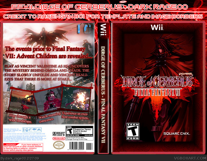
Well, this is my seventeenth box. Comments and tips appreciated. Credit to Rasengan_Boi for the wicked WII template and the image borders used on the screenshots.
Peace,
D_R
[ Reply ]
The front looks awesome! +fav
[ Reply ]
#2, thanks!
[ Reply ]
Woah, too red! You might want to put this in the critique forums first because this looks effortless
Edited at 1 decade ago
[ Reply ]
Nice job here, though the back is a bit plain, but a overall good job.
Can you give me a link to that Dirge of Cerberus logo?
[ Reply ]
#4, whaaat? Oh please. It's supposed to be crimson! (crimson, not red.) And are you kidding me? Effortless? Pffft.
#5, well, I rendered it myself but I'll try.
Edited at 1 decade ago
[ Reply ]
ESRB and Dev logo in wrong place. Place them like you were using a normal temp
[ Reply ]
#7, okay, will update tomorrow!
Edited at 1 decade ago
[ Reply ]
I think the front and back are too contrasting in my opinion...
Your font doesn't have much flair to it. The front (apart from what r_boi mentioned) is pretty simple, yet slick.
Don't know what to do about changing the back, aside from using some different font choices and pick something more along the lines of a script font.
[ Reply ]
The front is amazing. But the back is completely different and I really don't like it.
I'm faving for the front.
[ Reply ]
#9 and #10,
Thanks! Should I make the back more of a red color to match the front? What should I change the font to?
EDIT: HELP! I can't open the PSD file. This is what it looks like when I open it: link
Edited at 1 decade ago
[ Reply ]
the covers awesome but the the back is pure ICK! 4/5 Good job though =P
[ Reply ]
#12, thank you.
[ Reply ]
cool
[ Reply ]