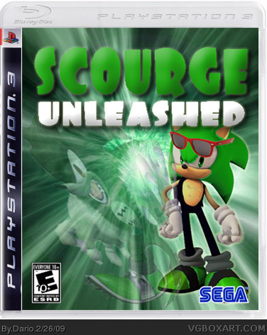
Since i just found out Scourge the Hedgehog even existed a few months ago, i decided to create a box about him. It took me about a few days to complete. Enjoy! :)
not a bad edit, but he bears a jacket, the scars on his chest are in the form or the roman numerals, II, but still... not bad. needs a better logo, and un stretch Scourge the werehog

 Scourge Unleashed Box Cover Comments
Since i just found out Scourge the Hedgehog even existed a few months ago, i decided to create a box about him. It took me about a few days to complete. Enjoy! :)
[ Reply ]
not a bad edit, but he bears a jacket, the scars on his chest are in the form or the roman numerals, II, but still... not bad. needs a better logo, and un stretch Scourge the werehog
[ Reply ]
It's only a background with Scourge placed in front of it!
5/10
[ Reply ]
The werehog is extremly streched, the background looks awekward, the colour doesnt make it bedder and the title doesnt look good.
4.3/10
[ Reply ]
Dario, Take a look at mine.http://vgboxart.com/view/24979/sonic.vs.scourge/?replies=1
[ Reply ]
I think its pretty good. Try to un-stretch the werehog. ohterwise its good.
[ Reply ]
Werehog is now unstretched.
[ Reply ]
Now it looks better
[ Reply ]