Second, this is design will also be an entry into a competition being held by Mr. Axel_Master, were in round one I'll be up against the talented Sentry.
And finally, about this design:
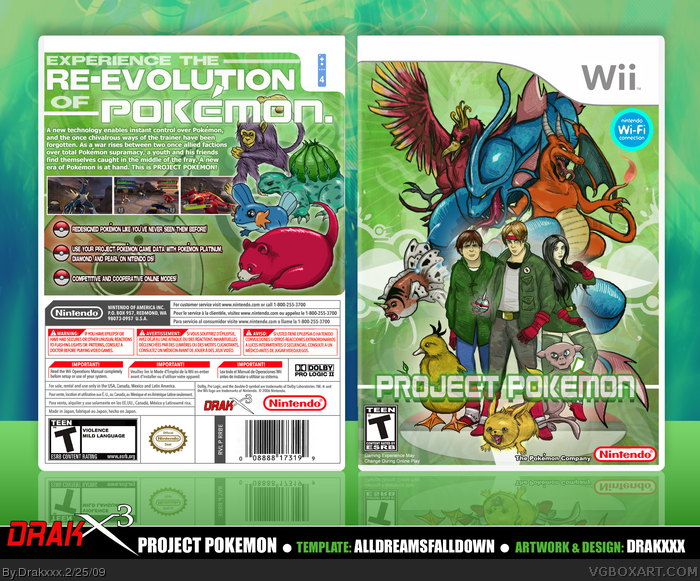
I've always been an avid Pokemon fan, and the inspiration for this idea originally sparked a few years ago when I came across the
artwork of a guy named Jonas Stenius link on Elfwood (an Art Community), who created a series of drawings depicting Pokemon characters with natural and realistic features. Ever since then, I've been fascinated by the idea, and eventually the stream of consciousness lead me to a complete game idea that featured a slightly more mature and edgy take on Nintendo's popular series.
Like a few of my other custom designs, this is one I've been wanting to see come about for some time, and I'm pretty happy with the result. Much like Mr. Stenius, I took reference from animals I believe the certain Pokemon I depicted in the design would share characteristics with if they were real (lol), so before I actually did any drawings, I did a fair amount of animal research. To make sure the
realistic versions I created were more easily identified with there chibi counterparts, I more or less kept the colors the same. I actually drew over 20 different takes of Pokemon for this design, but found that the ones you see here worked best when i started putting together the composition. The human characters are not in fact representations of Ash, Misty and Brok, but are meant to fit there character archetypes to some extend.
I suppose that about sums it up for now. In the future I might put another one of these together were Pokemon have contracted some kind of psycho virus and...nah....hehe.
Anyways...I hope you guys get a kick out of this, as I definitely had a blast creating it!
Amazing, as usual.
Like your logo in the template too :P
Charizard kinda looks like Kraid. Well not really, but I thought of Kraid when I saw Charizard lol.
Not saying the irradiated cousins of the pokemon we've all come to love are worse, they look more menacing and really gives the box itself a different feel. I like it!
I love that new pokeball design the main character is holding on the front, only wish you've gone with the same design for the bullets on the back. Fantastic front composition too, btw. Awesome job.
The pokemon look great, the trainers...not so much. They don't look horrible, it's just awkward seeing thirty-something looking people associated with Pokemon.
Good job, though, as usual.
Seriously, though. How did James, Eddy, and Angela (Silent Hill 2) get their hands on some pokemon?
#18, I forget which Pokemon movie it is, but the one with Celebi and the time traveling and everything, there were adults trying to capture and hunt for the Pokemon.
Thanks everyone, I'm glad you guys are enjoying my more monstrous Pokemons.
#13: The idea of Pokemon being scary was a major concept I had going into this. Lets face it, if Pokemon were real, I think theres a good amount of them I wouldn't want to find in my bushes.
#20: Wow, they do resemble the cast of Silent Hill 2, hah! I agree the more grown up protagonists look even more out of place from traditional Pokemon than the more animalistic Pokemon themselves. I actually originally did a sketch of a young boy with the intentions of making all three characters children, but I didn't care for how they looked on the composition, so I decided to go with the older characters to potentially add even more drama to the concept.
The design is extremely professional. You could make alot of money if you sold some of your work or went into art. Because this stuff is just beautifully done and I can't find any thing wrong in it. You have your own distinct style and it's brilliant, absolutely brilliant!
That's very artistic! Although some of those Pokemon look a tad more horrific than I'd expect. I wouldn't wish that Charizard on my worst enemy! But I would like one of those Gyarados.
But, like you said, this is a more edgy and mature representation of Pokemon. So for that, I'd have to say you nailed it. The only thing I'm not liking so much here is the Green color-scheme. Somehow it's not fitting for me.
Outside of that, everything else is superb. Really really nice job here!
It cracks me up in a good way. I love how they are kinda grotesque. I wanna see you make a rendition of Lucario, lol. I wanted to do something like this as well, except setting up the scene as if Microsoft came up with the idea and released it for Xbox.
but yeah though, it's really nice. It looks very official. The drawings don't look anything "pokemonish", but you explained all that. The guy on the left looks like a drug dealer
My only gripe is the logo on the front. I'm not feeling it at all.
wow
most people who render realistic pokemon make them look retarded
but, you sir, made them perfect
love everything about it, right down to the wii template
it appears no one had said it yet :L
so i will
the front people remind me of Ben Gwen and Kevin (sorry if i spelled it wrong...) from "Ben 10 Ultimate Alien"
just had to get it off the noggin lol
but love the box! :D
 Project Pokemon Box Cover Comments
First off guys, my Pokeman, look at them please.
Second, this is design will also be an entry into a competition being held by Mr. Axel_Master, were in round one I'll be up against the talented Sentry.
And finally, about this design:
I've always been an avid Pokemon fan, and the inspiration for this idea originally sparked a few years ago when I came across the
artwork of a guy named Jonas Stenius link on Elfwood (an Art Community), who created a series of drawings depicting Pokemon characters with natural and realistic features. Ever since then, I've been fascinated by the idea, and eventually the stream of consciousness lead me to a complete game idea that featured a slightly more mature and edgy take on Nintendo's popular series.
Like a few of my other custom designs, this is one I've been wanting to see come about for some time, and I'm pretty happy with the result. Much like Mr. Stenius, I took reference from animals I believe the certain Pokemon I depicted in the design would share characteristics with if they were real (lol), so before I actually did any drawings, I did a fair amount of animal research. To make sure the
realistic versions I created were more easily identified with there chibi counterparts, I more or less kept the colors the same. I actually drew over 20 different takes of Pokemon for this design, but found that the ones you see here worked best when i started putting together the composition. The human characters are not in fact representations of Ash, Misty and Brok, but are meant to fit there character archetypes to some extend.
I suppose that about sums it up for now. In the future I might put another one of these together were Pokemon have contracted some kind of psycho virus and...nah....hehe.
Anyways...I hope you guys get a kick out of this, as I definitely had a blast creating it!
Edited at 1 decade ago
[ Reply ]
Wowz.
[ Reply ]
If I said I hated this I would be lying, but if I said I was jealous that would be true! lol
Good Job Joel!
[ Reply ]
This box can only be described as one word: EPIC.
[ Reply ]
As usual, I'm speechless. Whatever it is that you're doing...just...keep doing it.
BTW, the Mudkip? Pure win my friend, pure win
Edited at 1 decade ago
[ Reply ]
Wow! Incredible, the only thing I can suggest is moving the wifi logo into the upper left corner. Other than that, amazing!
[ Reply ]
Dude. Dude. Dude. Dude. Dude.
This is incredible.
That Mudkip,Aipom,Bulbasaur,And Charizard look freaking epic.
Edited at 1 decade ago
[ Reply ]
You make people like me feel bad this is incredible. Good luck in ur competition. +fav +author fav
[ Reply ]
Amazing, as usual.
Like your logo in the template too :P
Charizard kinda looks like Kraid. Well not really, but I thought of Kraid when I saw Charizard lol.
Edited at 1 decade ago
[ Reply ]
Fantastic. Absolutely love the style of it, you're amazing dude.
[ Reply ]
Holy. Shit.
In addition to drawing the most epic fanart ever, you've managed to make my Pokemon fettish much more masculine :).
#5, so i herd u liek reel mudkipz? :p
[ Reply ]
Dammit Geno, I was gonna say that mudkipz line.
Anyway, I agree with what everyone else has said. favz0ard.
[ Reply ]
Oh man this is awesome. If I lived in that Poke world, I wouldn't leave the house. lol, Scary looking.
[ Reply ]
The guy on the left looks drunk. Other than that the box is incredible in every aspect except if you made screens out of fanart...
[ Reply ]
Epic win.
[ Reply ]
I can't get over how amazing this looks every Pokemon looks amazing great job man.
[ Reply ]
Looks like Fallout 3 meets Pokemon. ;)
Not saying the irradiated cousins of the pokemon we've all come to love are worse, they look more menacing and really gives the box itself a different feel. I like it!
I love that new pokeball design the main character is holding on the front, only wish you've gone with the same design for the bullets on the back. Fantastic front composition too, btw. Awesome job.
[ Reply ]
The pokemon look great, the trainers...not so much. They don't look horrible, it's just awkward seeing thirty-something looking people associated with Pokemon.
Good job, though, as usual.
Seriously, though. How did James, Eddy, and Angela (Silent Hill 2) get their hands on some pokemon?
[ Reply ]
#18, I forget which Pokemon movie it is, but the one with Celebi and the time traveling and everything, there were adults trying to capture and hunt for the Pokemon.
[ Reply ]
#19, It's the art style that makes it weird, though. The more realistic style.
Something I just noticed, though. Bulbasaur is based on the frog, not turtle.
[ Reply ]
totally badass. the revamped pokemon look is so freaking awesome :)
[ Reply ]
Whooooa!!
[ Reply ]
It too Drakxx, it too?
Looks fantasmic!
[ Reply ]
Thanks everyone, I'm glad you guys are enjoying my more monstrous Pokemons.
#13: The idea of Pokemon being scary was a major concept I had going into this. Lets face it, if Pokemon were real, I think theres a good amount of them I wouldn't want to find in my bushes.
#20: Wow, they do resemble the cast of Silent Hill 2, hah! I agree the more grown up protagonists look even more out of place from traditional Pokemon than the more animalistic Pokemon themselves. I actually originally did a sketch of a young boy with the intentions of making all three characters children, but I didn't care for how they looked on the composition, so I decided to go with the older characters to potentially add even more drama to the concept.
[ Reply ]
Serious Pokemon FTW.
[ Reply ]
I herd u liek Mudkipz?
[ Reply ]
#20, I thought Bulbasaur was a dinosaur-thing...
[ Reply ]
top notch man keep it up. +fav
[ Reply ]
Oh my god, this is just epic! Its really great, man! 9.5/10 +fav!
[ Reply ]
The design is extremely professional. You could make alot of money if you sold some of your work or went into art. Because this stuff is just beautifully done and I can't find any thing wrong in it. You have your own distinct style and it's brilliant, absolutely brilliant!
[ Reply ]
That's very artistic! Although some of those Pokemon look a tad more horrific than I'd expect. I wouldn't wish that Charizard on my worst enemy! But I would like one of those Gyarados.
But, like you said, this is a more edgy and mature representation of Pokemon. So for that, I'd have to say you nailed it. The only thing I'm not liking so much here is the Green color-scheme. Somehow it's not fitting for me.
Outside of that, everything else is superb. Really really nice job here!
[ Reply ]
The logo shouldn't be transparant in my opinion. Other than that, it's nice looking and you chose a nice look.
8/10
[ Reply ]
BEN 10 crossed with pokemon!
[ Reply ]
It cracks me up in a good way. I love how they are kinda grotesque. I wanna see you make a rendition of Lucario, lol. I wanted to do something like this as well, except setting up the scene as if Microsoft came up with the idea and released it for Xbox.
I find that Mew is the ugliest one, lol.
Shouldn't Aipom have no hands?
[ Reply ]
my gawd.
[ Reply ]
LOL, I smirked so hard when I first saw this.
but yeah though, it's really nice. It looks very official. The drawings don't look anything "pokemonish", but you explained all that. The guy on the left looks like a drug dealer
My only gripe is the logo on the front. I'm not feeling it at all.
Really creative cover :D
[ Reply ]
Absolutely fantastic, and my first FAV'd box.
Those trainers look like they mean business.
[ Reply ]
pokemon is not as good as this
[ Reply ]
Excellent stuff mate... Darwin would be prove of you! :D Great idea, and nicely executed.
[ Reply ]
[email protected].. CoMpUtE!!!1!!!1112@!!
*Asplodes*
[ Reply ]
You have all your boxes in the Hall!
[ Reply ]
slowpoke looks scary
[ Reply ]
so i hurd u liek mudkipz
Edited at 1 decade ago
[ Reply ]
thats awesome! pikachu is pretty scary i must say haha
[ Reply ]
wow
most people who render realistic pokemon make them look retarded
but, you sir, made them perfect
love everything about it, right down to the wii template
[ Reply ]
I feel... disturbed, but this is one epic, fantastico box! Yeah right. Spanish. Epic win on me. :P
+fav
Amazing box.
[ Reply ]
it appears no one had said it yet :L
so i will
the front people remind me of Ben Gwen and Kevin (sorry if i spelled it wrong...) from "Ben 10 Ultimate Alien"
just had to get it off the noggin lol
but love the box! :D
[ Reply ]
I liek that mudkip!
[ Reply ]