HoF?
No...
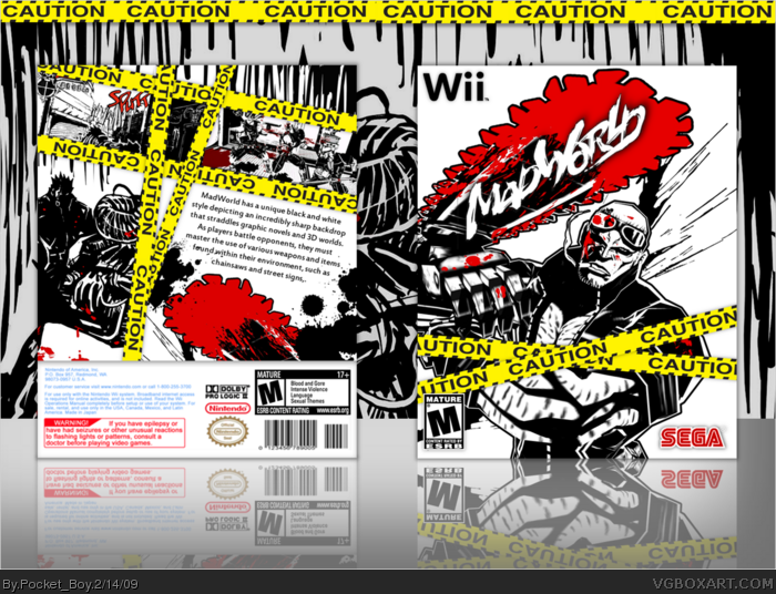
There's many flaws with this.
-Too many "CAUTION" strips.
-The text on the back would look better with
a drop shadow.
-The screenshot on the back at the top in the middle is too small, making it look very odd.
#11 I like the amount of Caution strips on it. Not gonna change.
The text is fine w/o a shadow.
That aint a screenshot, its a continuation of the one on the left.
 MadWorld Box Cover Comments
CAUTION!!! lol
[ Reply ]
Looks kinda like D@rk, but still like the others. not bad though.
[ Reply ]
It's pretty good, but at least use the right Wii template.
[ Reply ]
#3, I think it looks fine the way it is, I think it's supposed to be a slip-cover.
Edited at 1 decade ago
[ Reply ]
Its me style guys. I dont like the templates
[ Reply ]
This is great.
[ Reply ]
Nice! +fav
[ Reply ]
kwl Thanks
[ Reply ]
I wonder if this will get the hall of fame
[ Reply ]
It needs more attention.
[ Reply ]
HoF?
No...
There's many flaws with this.
-Too many "CAUTION" strips.
-The text on the back would look better with
a drop shadow.
-The screenshot on the back at the top in the middle is too small, making it look very odd.
[ Reply ]
#11 I like the amount of Caution strips on it. Not gonna change.
The text is fine w/o a shadow.
That aint a screenshot, its a continuation of the one on the left.
[ Reply ]