I like this, I think its one of the better JSR boxes on here.
Despite whats been said I think the white background can work; if a shadow is added it'd break the illusion of floating in place and if Beat is shrinked down in size it'd give a greater sense of energy and movement (since you called it JSR portable I think thats important.)
 Jet Set Radio Future Portable Box Cover Comments
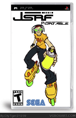
Okay so, first box! Cool JSRF font from clavis.ne.jp! I suck at doing multiple layers and stuff. Template's not so great, either. Oh well, enjoy!
Edited at 1 decade ago
[ Reply ]
It's good. Add a Background and it'll be pefect, altough I love the simple design.
[ Reply ]
Yea, the background is certainly very plain, but as you said, you aren't good with layers.
I like the arrangement though, stick around here, and you may just learn a thing or two.
*has been waiting years to say that*
[ Reply ]
ok
[ Reply ]
better than i did first time
[ Reply ]
#2, #3, #4, Thanks!
[ Reply ]
I wish they would really make this! great box i like the simple design - 4/5
[ Reply ]
I like this, I think its one of the better JSR boxes on here.
Despite whats been said I think the white background can work; if a shadow is added it'd break the illusion of floating in place and if Beat is shrinked down in size it'd give a greater sense of energy and movement (since you called it JSR portable I think thats important.)
[ Reply ]