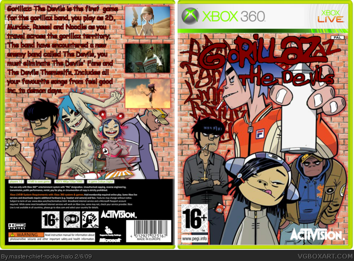
Yeah, I'd advise against using the Gorillaz font for the back, I'd correct some of those spelling errors and use some screen caps from their videos as screenshots. I like the gorillaz, and the arrangement of the art on front/back isn't bad, but instead of a gradient background for both front/back, I'd use a brick wall type texture with grafitti on it, to go with the theme of spray painting.
 Gorillaz Box Cover Comments
hope you guys like this
[ Reply ]
sorry about writing on the back, the gorillaz font is hard to read
[ Reply ]
You don't have to use the Gorillaz font for the back -_-
EDT: There's tons of spelling and grammar mistakes on the back.
Edited at 1 decade ago
[ Reply ]
Yeah, I'd advise against using the Gorillaz font for the back, I'd correct some of those spelling errors and use some screen caps from their videos as screenshots. I like the gorillaz, and the arrangement of the art on front/back isn't bad, but instead of a gradient background for both front/back, I'd use a brick wall type texture with grafitti on it, to go with the theme of spray painting.
[ Reply ]
GOOOOOORIIIILLLAAAAZ.
I just had a dream that I waas at a concert.
Anyways, box is way too plain.
[ Reply ]
#4, thanks for the tips, i will update this soon
[ Reply ]
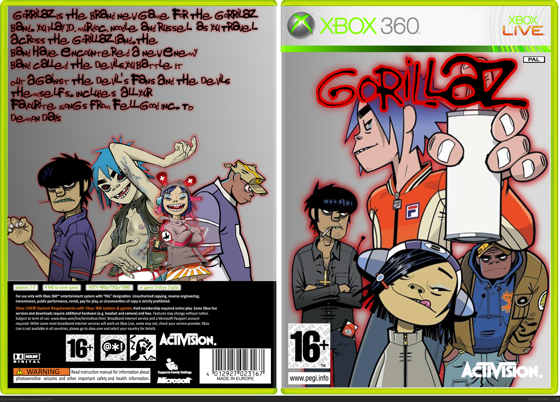
UPDATE this is now wayyy better
[ Reply ]
Looks better, but a bit choppy on the text.
Btw, PLEASEPLEASEPLEASE PM me the renders of 2D, Noodle, and Russel on the back.
[ Reply ]