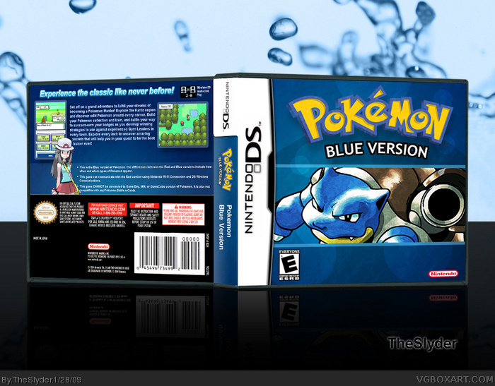
You can't have one without the other, right? They both use the same overall image, just with minor changes (The oceanic, bubbly, cover for Blue, vs the harsh, sun beam look for Red.) I had a LOT of trouble finding a decent picture of Blastoise. He almost always looks stupid, rather than cool. (It's those tiny, pudgy, arms.)
Critiques and comments are always encouraged, check out the printable version for a more detailed look.
Wow, this is just as good, if not better than the first one. And I feel your pain man---I tried getting pictures of Blastoise for a cover I was going to make, but they are pitifully small. Grats on making this work though, I like it :) I love how, instead of having just a plain blue background, or a simple gradient, you have all these little textures, and that's what I think makes this box. You should submit boxes more often.
Great job! A bit weird that the front images of this and its companion box have such different styles, though. I really like it, but wish the cutting of the Pokemon logo was better and that somehow you got rid of the small empty space on the back below the description and above the features.
The only thing you really changed from the Red box is the front, the back is exactly the same, just blue and ash :\ I can see some choppiness in the logo as well, but it still looks good.
Glad you all approve. I think I like this one better than my Red as well.
#6, I don't think I'll be making a Green or Yellow box, as neither of them have any sentimental value to me. I'm strongly considering Gold and Silver, though.
#8, Thanks, I agree about the images. In fact, I'm thinking about going back and changing Charizard's image to the official artwork for the games to match this, since I couldn't find a good Blastoise picture to compliment it. As for the negative space on the back, I like it. I really try to avoid overcrowding the back of a box. It feels more calming this way, you know? Not so hectic. I'm not sure I understand what you're saying about the "cutting" of the Pokemon logo. It's cropped to near perfection, I think it's possible you may be thrown off by the texture I added to it, which kind of gives the illusion of some white edges near the bottom. Please clarify.
#9, That's why this box only took a fraction of the time that Red took. I used Diamond/Pearl as an example to go by, and except color, everything was the same. The real focus is the cover.
 Pokemon Blue Box Cover Comments
This is a companion box for Pokemon Red ( link )
You can't have one without the other, right? They both use the same overall image, just with minor changes (The oceanic, bubbly, cover for Blue, vs the harsh, sun beam look for Red.) I had a LOT of trouble finding a decent picture of Blastoise. He almost always looks stupid, rather than cool. (It's those tiny, pudgy, arms.)
Critiques and comments are always encouraged, check out the printable version for a more detailed look.
Water wallpaper courtesy of: link
Edited at 1 decade ago
[ Reply ]
much better than the red version
[ Reply ]
Wow, this is just as good, if not better than the first one. And I feel your pain man---I tried getting pictures of Blastoise for a cover I was going to make, but they are pitifully small. Grats on making this work though, I like it :) I love how, instead of having just a plain blue background, or a simple gradient, you have all these little textures, and that's what I think makes this box. You should submit boxes more often.
Edited at 1 decade ago
[ Reply ]
I love this one, The presentation with the water drops are a bid odd though. But I love everything about the box.
[ Reply ]
Both look so god damn offcial. Great job.
Edited at 1 decade ago
[ Reply ]
Nice. Are you going to do Green or Yellow?
[ Reply ]
I like this just as much as your design for red, so I'd say this is a great companion piece. Super job sir!
[ Reply ]
Great job! A bit weird that the front images of this and its companion box have such different styles, though. I really like it, but wish the cutting of the Pokemon logo was better and that somehow you got rid of the small empty space on the back below the description and above the features.
[ Reply ]
The only thing you really changed from the Red box is the front, the back is exactly the same, just blue and ash :\ I can see some choppiness in the logo as well, but it still looks good.
[ Reply ]
I like this one just as much as the other.
[ Reply ]
Glad you all approve. I think I like this one better than my Red as well.
#6, I don't think I'll be making a Green or Yellow box, as neither of them have any sentimental value to me. I'm strongly considering Gold and Silver, though.
#8, Thanks, I agree about the images. In fact, I'm thinking about going back and changing Charizard's image to the official artwork for the games to match this, since I couldn't find a good Blastoise picture to compliment it. As for the negative space on the back, I like it. I really try to avoid overcrowding the back of a box. It feels more calming this way, you know? Not so hectic. I'm not sure I understand what you're saying about the "cutting" of the Pokemon logo. It's cropped to near perfection, I think it's possible you may be thrown off by the texture I added to it, which kind of gives the illusion of some white edges near the bottom. Please clarify.
#9, That's why this box only took a fraction of the time that Red took. I used Diamond/Pearl as an example to go by, and except color, everything was the same. The real focus is the cover.
[ Reply ]
love it, great job man, y'know to try and make this match the Red box, give Blastoise a plastic wrap effect using photoshop.You get a fav from me!
[ Reply ]
#12, I don't know about plastic wrap, but I am considering changing up Blastoise to match Charizard more. I'm still undecided.
[ Reply ]
I prefer this style of art more because the bastoise image matches the original GB box art :)
+fav
[ Reply ]