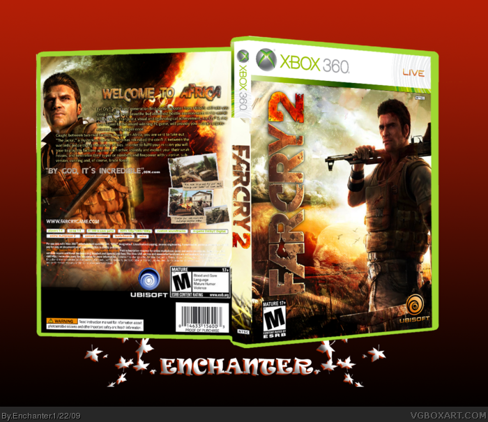
Hey everyone! This is my first box and I had a lot of fun designing it. I had to edit a lot of things to make it fit the color scheme. Credit to star89er for the 3d template i found in his tutorial, and google for the logos.
Really good for a first.
I would add a small drop shadow to the front title logo.
As for back, Move the first paragraph to top right would be better.. with tagline above it. Have 2nd paragraph half width of box, and enlarge screenshots - I prefer 3rd of width of box. :) Nice work
brilliant first, the editing on the front is really really good. a couple of tips for the back though, try to keep the screens the same size and also make the tagline abit bigger.
WELCOME TO THE SITE!
 FarCry 2 Box Cover Comments
Hey everyone! This is my first box and I had a lot of fun designing it. I had to edit a lot of things to make it fit the color scheme. Credit to star89er for the 3d template i found in his tutorial, and google for the logos.
Thanks for viewing!
#2-#3, Thanks guys:)!
Edited at 1 decade ago
[ Reply ]
Great first dude.
[ Reply ]
Excellent first.
[ Reply ]
Pretty sick but the front seems like it could benefit from more contrast. 4/5
[ Reply ]
Not bad for a first at all
good work
[ Reply ]
Great front keep up the work
[ Reply ]
pretty good for a first, the back could look better though.
[ Reply ]
#7, agreed!
[ Reply ]
welcome to the site. :)
a tagline couldve been used to fill the space at the top. or maybe some ratings but either way good first..
[ Reply ]
#9, Thanks! I will try to do that.. an update is coming soon!
[ Reply ]
Really good for a first.
I would add a small drop shadow to the front title logo.
As for back, Move the first paragraph to top right would be better.. with tagline above it. Have 2nd paragraph half width of box, and enlarge screenshots - I prefer 3rd of width of box. :) Nice work
[ Reply ]
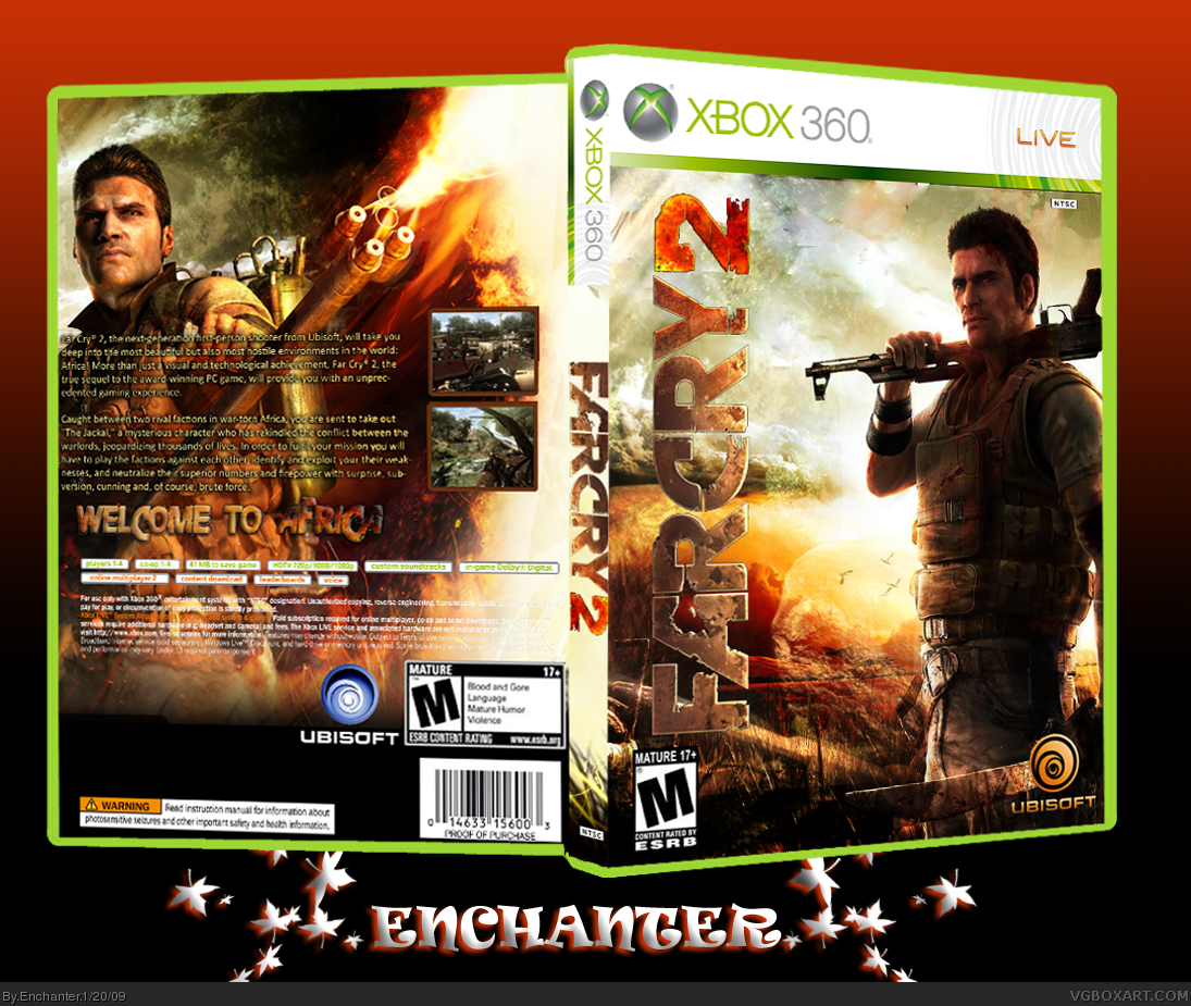
Update! I think the back looks a lot better now. Credit to google for screenshot borders.
Thanks for viewing!
[ Reply ]
This is great for a first box I love it 5 out of 5
[ Reply ]
#13, Thanks!!
[ Reply ]
brilliant first, the editing on the front is really really good. a couple of tips for the back though, try to keep the screens the same size and also make the tagline abit bigger.
WELCOME TO THE SITE!
[ Reply ]