#4, I credited youzzzz.
And I was gonna use your border, bu tit didn't got well with the box, so I had to improvise. And about the corner... I DUNT CARE.
Ugh. The faded render at the bottom makes no sense and looks bad. The don't look good and the fading out doesn't help. The tagline look terrible. The text doesn't fit the colors and just looks plain sloppy.
#6, then how about you recommend something instead of saying things like "The tagline looks terrible." If you don't like it and you not going to help at all, why bother commenting?
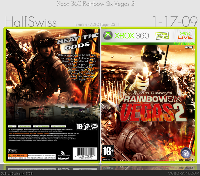
 Rainbow Six Vegas 2 Box Cover Comments
Well, (I think) I got my touch back, guys.
[ Reply ]
Wow, nice! all i can think of is mabey make the screens on the back better. GREAT JOB!
[ Reply ]
#2, meh, I had to improvise becuase I couldn't find and border that would look good on my box. Thanks, though!
[ Reply ]
That's a nice looking logo you have there.......
Where'd ya get it?
hmmmmmmmmmm?
=p
Box looks good, I don't like how the screens aren't visible.
Also there's a tip of red coming on the top left corner of the back *nitpick*
[ Reply ]
#4, I credited youzzzz.
And I was gonna use your border, bu tit didn't got well with the box, so I had to improvise. And about the corner... I DUNT CARE.
[ Reply ]
Ugh. The faded render at the bottom makes no sense and looks bad. The don't look good and the fading out doesn't help. The tagline look terrible. The text doesn't fit the colors and just looks plain sloppy.
But don't mind me.
[ Reply ]
#5, oh durrr.
Nao I feel retoided nao.
I dedn't see the credit there >_>
But don't mind me.
=p
[ Reply ]
#6, then how about you recommend something instead of saying things like "The tagline looks terrible." If you don't like it and you not going to help at all, why bother commenting?
[ Reply ]
#8, Because I'm pointing out the flaws. It's up to you as the artist to FIX them.
[ Reply ]
#9, I searched and searched for screenshot border on every single one of my boxes, and you know what I typically find? NOTHING.
[ Reply ]