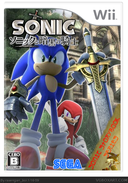
I'd get rid of the "Sonic Storybook Series" text. Especially with the asian-esque font, it really doesn't suit it at all. If you'd get rid of that and move the Sega logo over, then give Sonic something to stand on, I'd love to give this one a fav.
I actually like Knuckles there, maybe just take out the stroke around him (and Sonic, for that matter.)
#5, Shadow's hands are peaking from behind your template. Looks better. Definitely fav worthy once you remove the error, and possibly HoF worthy with a good back.
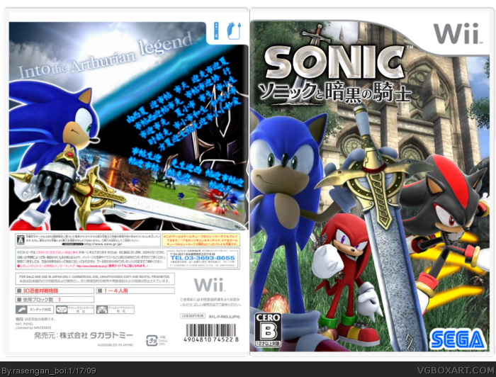
That's an American back. Take a look at my Sonic World Adventure box and compare. Front is fav worthy, the back looks like a completely different game. Needs to match the feel of the game better.
Your text should be Japanese, it doesn't even have to say anything. And then your background should be something that fits the game.
Also, I think you can delete the Player's Guide Available logo.
Sorry I keep on throwing you more things to add, but if you make those fixes, I'll be fine and quit nagging you.
#15, or I want this box to reach its full potential.
#16, Your call. I still love the front. Currently one of the best Sonic and the Black Knight covers on the site. The text layout is actually fine, and the screens, too. Just needs better choice of background and font choice is what I'm saying.
A cookie for your RB, for making a design for this game without using the default Sonic render. You know which one I mean. I think this is one of your best.
Haha,Nice render on the front :P
On the back,It looks like for the background,You put a close up of sonic's Eyes. Text should be japanese,Since the rest of the box is. Won't make much sense if Its english and the whole box is japanese =/
Also,Im starting to hate that same Shadow render,Maybe you can change it?
 Sonic and the Black Knight Box Cover Comments
Credit's to Techne for the Template, Enjoy, R_B
[ Reply ]
Finally, an original Sonic and the Black Knight box. I like the render, though knuckles is out of place and doesn't belong
[ Reply ]
#2, I could of left Knuckles out of there, but, there are enough boxes with just Sonic on them, lets give the rest of the cast a shot
[ Reply ]
I'd get rid of the "Sonic Storybook Series" text. Especially with the asian-esque font, it really doesn't suit it at all. If you'd get rid of that and move the Sega logo over, then give Sonic something to stand on, I'd love to give this one a fav.
I actually like Knuckles there, maybe just take out the stroke around him (and Sonic, for that matter.)
Edited at 1 decade ago
[ Reply ]
Updated sorta...
[ Reply ]
#5, Shadow's hands are peaking from behind your template. Looks better. Definitely fav worthy once you remove the error, and possibly HoF worthy with a good back.
[ Reply ]
#6, oh shi... gonna fix that...
[ Reply ]
Updated. Couldn't find a CERO rating for back's though...
[ Reply ]
That's an American back. Take a look at my Sonic World Adventure box and compare. Front is fav worthy, the back looks like a completely different game. Needs to match the feel of the game better.
Faving for the front.
Edited at 1 decade ago
[ Reply ]
#9, I don't have a Japanese Wii template...
[ Reply ]
#10, I hijacked my back from this link lol.
#12, No problem. I'm sure you like the box I hijacked it from, too, lol.
Edited at 1 decade ago
[ Reply ]
#11, you naughty you... thaanx for it, i'll hijack it meself now
Edited at 1 decade ago
[ Reply ]
fixed i hope... Added the text to the back which transelates to "Part of the Sonic Story Book Series"
[ Reply ]
Your text should be Japanese, it doesn't even have to say anything. And then your background should be something that fits the game.
Also, I think you can delete the Player's Guide Available logo.
Sorry I keep on throwing you more things to add, but if you make those fixes, I'll be fine and quit nagging you.
#15, or I want this box to reach its full potential.
#16, Your call. I still love the front. Currently one of the best Sonic and the Black Knight covers on the site. The text layout is actually fine, and the screens, too. Just needs better choice of background and font choice is what I'm saying.
Edited at 1 decade ago
[ Reply ]
#14, you just wanna keep me on my toes...
[ Reply ]
Sorry, but the BG and Text are staying, it was a bitch to set the back up, and I don't intend on redoing it
[ Reply ]
A cookie for your RB, for making a design for this game without using the default Sonic render. You know which one I mean. I think this is one of your best.
[ Reply ]
I dont like the background for the back, but I really like the render on the front!
[ Reply ]
Haha,Nice render on the front :P
On the back,It looks like for the background,You put a close up of sonic's Eyes. Text should be japanese,Since the rest of the box is. Won't make much sense if Its english and the whole box is japanese =/
Also,Im starting to hate that same Shadow render,Maybe you can change it?
[ Reply ]
Front = great
Back = not so much
[ Reply ]
#20, yeah, and a screen from the back goes over to the front too, on Sonics cheek
[ Reply ]
I agree with #9. If it didn't have english text on the back i'd nearly fav it.
[ Reply ]
I fav'd, but that doesn't matter much.
[ Reply ]
#23 Whats that meant to mean?
[ Reply ]
Fixed
[ Reply ]
#24, I think because he only rank 1 so he not helping get too the hof
that much
[ Reply ]
#25, Nice update, but the blue line is annoying.
[ Reply ]
whao O_o please pm me the sonic render? 4/5
Edited at 1 decade ago
[ Reply ]
rasengan please pm me the sonic render. This box is cool
[ Reply ]
#28, to me too :P
[ Reply ]
#25, Please could I have that background - It's awesome
[ Reply ]
Hey guys, I think I see tails dead, under sonic's sword.
[ Reply ]
#32, YESS!
[ Reply ]
awsome and what did you use to make this
[ Reply ]
#34, Paint.net
[ Reply ]