right, so heres my first box. im looking forward to being on the site.
please rate the box and all comments are accepted. :)
P.S i already have some PS experience so...
Its really nice, but close up view isn't that great. Just get some higher quality images and upload it in higher quality (I normally work at either 800 x 600 or 1024 x 768) and the only other thing is the choppy template. For a first this is great, I can't wait to see more from you!
Oh well, they said that about Super Sonic Galaxy too, but it's now one of the most popular boxes of the site. I think he has to update it, and try to edit with some other techniques, like a colorfilter. It's a good start and I think it does make chances for the hall, but it has to be updated perfect.
JESUS CHRIST!
You've got some good placement skills, and a nice layout going on here, unfortunately you've got horrible color composition skills. You've got to learn what colors contrast well together before the eye.
In all due respect, I know this is your first box, this is very vibrant and completely goes opposite to the theme of the game/movie. Unless this is intentional, I don't know what to say. Sorry if this sounds like I'm attacking you, but this is purely constructive criticism. I hope you take it to mind. Thanks for submitting, and enjoy the site.
II pretty much agree with Ray Blade in regards to your design, but your composition alone leads me to believe you've got a lot of promise as a designer. Keep at it!
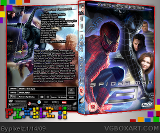
 Spiderman 3 Box Cover Comments
right, so heres my first box. im looking forward to being on the site.
please rate the box and all comments are accepted. :)
P.S i already have some PS experience so...
[ Reply ]
Edited at 1 decade ago
[ Reply ]
Edited at 1 decade ago
[ Reply ]
Edited at 1 decade ago
[ Reply ]
You know, your first box is probably gonna get into the Hall of Fame!
[ Reply ]
thanks! I would be amazed if it gets that far.
[ Reply ]
#6, Yeah, it probably will, at least it's good enough, I'm hoping my Crisis Core box will get in!
[ Reply ]
#7 I've just looked at your crisis core box... its got potential!
[ Reply ]
Its really nice, but close up view isn't that great. Just get some higher quality images and upload it in higher quality (I normally work at either 800 x 600 or 1024 x 768) and the only other thing is the choppy template. For a first this is great, I can't wait to see more from you!
[ Reply ]
#9 cheers! i might get round to fixing that later...
[ Reply ]
Ah yes, full view, quite choppy and low quality... pixelated... kinda lives up to your name, LOL! Nah, I'm just joshing!
EDIT: Could I have the logo?
Edited at 1 decade ago
[ Reply ]
#11, LOL, very true.
[ Reply ]
it's a good first but there's no way this going to get the hall. sorry. :(
[ Reply ]
#13, Never say never...SHI-
Oh well, they said that about Super Sonic Galaxy too, but it's now one of the most popular boxes of the site. I think he has to update it, and try to edit with some other techniques, like a colorfilter. It's a good start and I think it does make chances for the hall, but it has to be updated perfect.
[ Reply ]
It looks like someone took a scissors and nabbed at the end of the template.
The rest is pretty good, keep it up :)
[ Reply ]
JESUS CHRIST!
You've got some good placement skills, and a nice layout going on here, unfortunately you've got horrible color composition skills. You've got to learn what colors contrast well together before the eye.
In all due respect, I know this is your first box, this is very vibrant and completely goes opposite to the theme of the game/movie. Unless this is intentional, I don't know what to say. Sorry if this sounds like I'm attacking you, but this is purely constructive criticism. I hope you take it to mind. Thanks for submitting, and enjoy the site.
[ Reply ]
Thanks everyone! when i get the time i'll update! :)
Edited at 1 decade ago
[ Reply ]
II pretty much agree with Ray Blade in regards to your design, but your composition alone leads me to believe you've got a lot of promise as a designer. Keep at it!
[ Reply ]
too much glow
[ Reply ]